

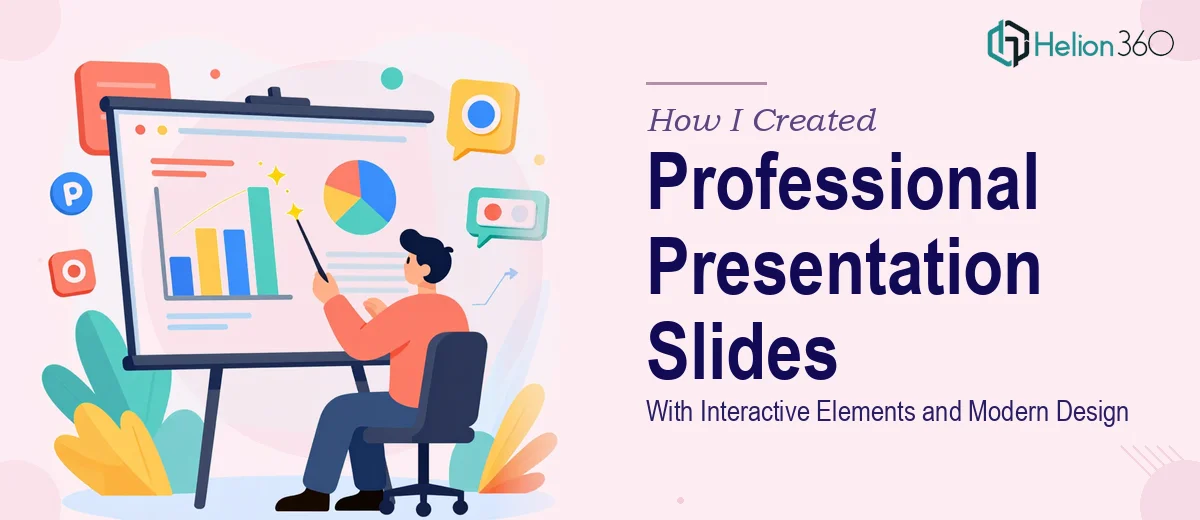
The Problem With Starting From a Blank Slide
I needed a presentation slides template that could work across multiple business contexts — internal reviews, client pitches, team briefings — without looking like it was pulled from a default theme library. The requirement was clear: clean and modern design, placeholder sections for company information, charts, images, and quotes, and interactive elements like clickable navigation and subtle animations that made the deck feel intentional rather than static.
The urgency made it worse. This wasn't a someday project. The template needed to be ready fast, and it needed to be the kind of thing that looked credible the first time someone opened it — not something that required apology or explanation. I recognized immediately that producing something at that quality level, at that speed, was not a weekend task. This needed to be done right the first time.
What I Found a Polished Template Actually Required
When I started looking into what a professional presentation slides template genuinely takes to build well, the scope became clear quickly. The visual layer alone — grid structure, type hierarchy, spacing system, color palette — is a discipline unto itself. But that's before you get to the interactive layer.
Clickable navigation, internal hyperlinks that route between sections, and entrance animations that don't look accidental require deliberate setup in the slide master and layout architecture. If the master isn't structured correctly from the start, every placeholder and every animation breaks differently on every slide — and fixing that retroactively is slower than building it correctly the first time.
Then there's the adaptability requirement. A template that works across business sectors can't be so branded that it feels locked to one company. The balance between polished and flexible is genuinely hard to calibrate — and most off-the-shelf templates fail exactly there. That combination of structural, visual, and interactive complexity signaled to me that this wasn't a job for good intentions and a few free hours.
What the Work of Building This Template Actually Involves
The structural work starts with the slide master and layout hierarchy. A properly built template uses a layered master system — one master controlling global fonts, spacing, and background logic, with individual layouts (title slide, section divider, content, data, quote) inheriting from it cleanly. Type hierarchy follows a defined scale: typically 40pt for slide titles, 24pt for subheadings, and 18pt for body text, with consistent line-height and margin rules applied at the layout level, not slide by slide. Getting this right means every new slide added to the deck inherits the rules automatically. Setting up a master system that actually propagates without breaking takes real experience — it's one of the places where template builds fall apart for people who haven't done it repeatedly.
The visual mechanics layer covers color system, grid, and component design. A well-built template uses a maximum of four brand-neutral colors — typically a primary, a secondary, a neutral, and an accent — defined as theme colors so they're globally swappable. The layout grid is typically a 12-column structure, and chart placeholders, image frames, and text blocks are all positioned relative to that grid for visual consistency. Designing chart and data placeholders that look clean with real data — not just dummy text — requires thinking through actual use cases. Getting margins, padding, and alignment to hold across widescreen and standard formats adds another layer of precision that's easy to underestimate.
The interactive elements — clickable section navigation, animated slide transitions, and entrance sequences — require deliberate trigger logic built into the deck architecture. Done well, animations use a consistent timing convention: typically 0.3–0.5 second fade or wipe entrances, not decorative effects that distract from content. Hyperlinked navigation between sections requires each anchor slide to be correctly named and linked, then tested across both editing and presentation modes. This is where templates that look good in screenshots fail in practice — the interactivity breaks, the timing feels off, or the animations conflict with each other. Doing it cleanly requires building and testing systematically, not just applying effects and hoping.
Why I Brought in Helion360 to Handle It
I looked at what the work actually involved and made the call quickly: this needed a team that builds presentation templates regularly, with the process and tooling already in place. I wasn't going to spend two weeks learning master slide architecture, animation trigger logic, and grid systems from scratch when the output needed to be at a professional standard from day one.
Helion360 handled the full project end-to-end through their business presentation design services — slide master architecture, the complete visual system, all interactive elements, and a set of sample slides demonstrating the template across real-use scenarios. What would have taken me weeks of trial and error was delivered fast. The team understood the brief at a level that meant I wasn't explaining basic concepts or correcting direction mid-way through. They came in with the expertise already built, handled the structural and visual work in parallel, and turned around a template that was ready to use — not ready to fix.
The speed mattered as much as the quality. Done in days, not weeks, with full execution depth across every layer of the build.
The Result and What I'd Tell Anyone Facing the Same Brief
What came back was a complete, sector-adaptable presentation slides template with a clean master system, a disciplined visual hierarchy, properly functioning interactive navigation, and sample slides that demonstrated the template working under real conditions. It looked intentional because it was built intentionally — every spacing rule, every animation, every placeholder was designed to hold up in actual use, not just in a preview.
The template has been used across multiple contexts since without needing to be rebuilt or patched. That's what a properly constructed template delivers — a system that works, not a file that needs babysitting.
If you're looking at a similar brief and want it handled end-to-end without the weeks of learning curve, Helion360 is the team I'd engage — they delivered fast and brought exactly the execution depth this kind of work requires.