

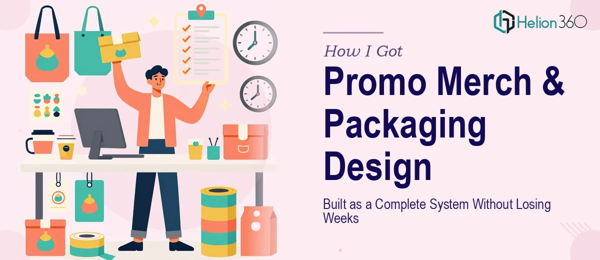
The Situation Was Bigger Than It Looked
We were preparing a brand push that touched multiple physical and print touchpoints at once — business cards, brochures, presentation box packages, and promotional merchandise. Each piece needed to feel like it came from the same place. The deadline was tied to an event, which meant slippage wasn't an option.
The stakes were real. This wasn't internal-only collateral. These materials would be the first physical impression a lot of people had of the brand. A box that looks off, a card that uses the wrong color temperature, a brochure where the type hierarchy is inconsistent with everything else — those things get noticed, even when people don't say so out loud.
I knew pretty quickly that treating this as something to patch together in the margins of everything else would be a mistake. The scope was too wide, the consistency requirements too specific, and the production handoff too technical to improvise.
What I Found Out the Work Actually Required
Before I did anything else, I spent time understanding what a project like this actually involves when it's done well. The short answer: it's a multi-layer problem that looks like a design job on the surface but is really a brand systems job underneath.
The first signal of real complexity was the consistency requirement. Every format — a folding box, a flat card, a multi-page brochure — has its own production constraints, bleed specs, and substrate behavior. A color that looks right on screen can shift significantly depending on whether it's being printed on coated card stock, kraft board, or uncoated paper. Managing that across five or six formats simultaneously isn't a design task you can wing.
The second signal was the brand application depth. If brand guidelines exist, they need to be interpreted — not just copied — for physical formats that weren't originally in scope when the guidelines were written. If they don't exist yet, they need to be established first before any of the deliverables can be designed consistently. That foundational work takes its own time.
The third signal was the print-ready production requirement. Design files for presentation boxes and merchandise aren't the same as screen or slide files. Die-line templates, fold marks, safe zones, and CMYK-specific color profiles are non-negotiable at the production stage. Getting that wrong means a reprint.
What the Work Itself Involves
The right approach to a project like this starts with a structural audit of the brand before a single deliverable gets touched. That means documenting the primary palette — typically no more than four brand colors plus neutrals — along with a type system that covers at minimum three hierarchy levels: a display size in the 36–40pt range, a body or subhead level around 18–24pt, and a supporting detail level at 10–12pt. Without this foundation locked, every format gets designed in isolation and the inconsistency shows. Getting this right for a multi-format system can take several hours of careful work even when existing brand assets are available.
Visual mechanics across physical formats introduce a distinct layer of complexity. Presentation box packages require accurate die-line templates — flat files that show exactly where panels fold, where glue tabs sit, and how much bleed extends beyond the cut line. A standard tuck-top box has six panels, each with its own compositional challenge and print constraint. Business cards demand a minimum 3mm bleed on all sides and a safe zone that keeps critical content away from the trim edge. Brochures introduce fold-type decisions — half-fold, tri-fold, z-fold — each of which changes how content is sequenced and read. Anyone new to print production can easily spend days getting these mechanics right before any actual design work begins.
Polish and cross-format consistency is where promotional merchandise systems either hold together or fall apart. The same logo mark should render cleanly at the size of a pen imprint and at the size of a box panel face — which often means preparing separate optimized versions for different scale ranges. Color discipline requires CMYK values to be specified and locked, not left as RGB approximations, because screen and print rendering diverge in ways that break visual cohesion across a system. Running a consistency pass across all deliverables — checking alignment, spacing, color, and typographic rhythm before final export — is time-intensive work that requires trained eyes and a methodical process.
Why I Brought in Helion360 to Handle It
The scope made the decision straightforward. I wasn't looking at a single asset — I was looking at a coordinated system of print and physical formats, all of which needed to express the same brand identity without visual drift across any of them. Attempting that without the right tooling, print production knowledge, and design system experience would have cost more time than I had.
Helion360 handled the full project end-to-end. That meant taking the brand inputs, establishing the design system, building out the die-line templates and format-specific files, and delivering production-ready artwork across every format in the scope. The work was turned around quickly — in days, not weeks — which mattered because the event deadline wasn't moveable.
What stood out was that the execution depth was already in place. The team didn't need time to figure out print production specs or build a consistency review process from scratch. That expertise was already there, which is exactly why the turnaround was as fast as it was.
The Outcome and What I'd Tell Anyone in My Spot
What came back was a coherent system — business cards, brochure, and presentation box packaging that all read as the same brand without looking templated or flat. The color held across formats. The type hierarchy was consistent. The box files were production-ready without a single revision cycle on the technical side.
For an event-facing debut, that consistency mattered. People pick up on brand coherence even when they don't articulate it. A system that holds together across physical touchpoints signals that the organization behind it takes quality seriously.
If you're facing a similar scope — multiple formats, a real deadline, and brand consistency that can't be faked — Helion360 is the team to engage. They delivered the full system fast and brought the production depth this kind of work actually requires.