

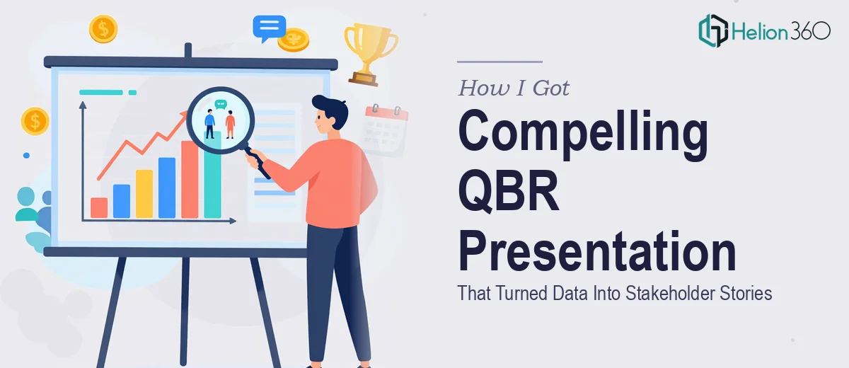
The Quarterly Review Was Coming and the Stakes Were Real
I had a quarterly business review on the calendar with a room full of senior stakeholders — people who had seen hundreds of decks and had zero patience for slides that simply dumped numbers at them. The source material I was working with was dense: multiple performance dashboards, raw pipeline data, customer satisfaction scores, and initiative progress across several teams. All of it needed to land in a single, coherent presentation that told a clear story about where the business stood and where it was heading.
This wasn't a routine internal update. The QBR was tied to a budget conversation, and the impression the presentation made would directly influence how the next quarter's priorities were resourced. Getting it wrong — or even getting it to a mediocre level of "fine" — wasn't an option. I recognized immediately that this kind of work needed to be done properly, and that properly meant more than cleaning up a slide template.
What I Found a QBR Presentation Actually Requires
When I started researching what a genuinely well-designed QBR PowerPoint presentation involves, the scope became clear fast. The first thing that stood out was that the design problem and the narrative problem are inseparable. You can't just hand someone a pile of data and ask them to make it look good — someone has to make meaningful decisions about what story the data is telling before a single slide gets laid out.
The second signal of real complexity was the data visualization layer. QBR decks typically carry a heavy chart load — trend lines, comparison bars, funnel metrics, KPI scorecards — and each of those needs to be chosen and formatted to serve the specific insight it's meant to communicate, not just dropped in because the data exists.
The third thing I noticed was the consistency challenge. A QBR covering multiple business areas can easily sprawl across twenty-five to forty slides. Keeping visual language, brand application, and hierarchy consistent across that many slides — especially when the content varies widely — is a discipline that's easy to underestimate.
What the Work Actually Involves
The Real Work Behind a QBR PowerPoint Presentation
The work starts with the structural and narrative layer. A QBR presentation needs a clear audit of the source material — identifying which metrics are load-bearing (the ones the audience will act on) and which are supporting context. The right approach maps a story arc before touching the slide canvas: a situation summary, performance against plan, key insights, and a forward-looking close. This sequencing decision shapes every slide that follows. It sounds straightforward, but working through five or six data sources and arriving at a single coherent through-line takes focused analytical time that most people building the deck themselves simply don't have in the week before a review.
The visual mechanics layer is where the presentation either earns attention or loses it. Proper QBR design relies on a disciplined layout grid — typically a 12-column structure with consistent margin gutters — so that charts, callout boxes, and text regions align precisely across every slide. Typography hierarchy matters just as much: slide titles typically run at 32–36pt, supporting headers at 22–24pt, and body or data labels at 14–16pt. Choosing the right chart type for each insight — a slope chart for two-period comparisons, a small-multiple layout for team-by-team breakdowns, a highlighted table for KPI scorecards — requires both design judgment and domain knowledge. Getting these decisions wrong produces slides that look busy even when the underlying data is clean.
Polish and consistency across a full-length QBR deck is the part that trips most people up entirely. A well-executed deck holds to a maximum of four brand colors with clear rules about when each one appears, applies the same icon style and stroke weight throughout, and uses slide master logic so that updates propagate cleanly rather than requiring manual fixes on thirty individual slides. The execution friction here is significant: rebuilding master slides correctly, applying brand standards without drifting, and doing a final consistency pass across a large deck takes hours of careful work — and any shortcut taken shows up immediately in a room full of senior stakeholders.
Why I Brought in Helion360 to Handle It
I looked at the scope — the narrative structuring work, the chart-heavy visual layer, the consistency requirement across a large deck, and the hard deadline — and I knew immediately that attempting this myself was not the smart use of my time. The learning curve alone on getting a properly structured PowerPoint master right would have cost me a full day before I'd even touched the content.
Helion360 handled the full project end-to-end. That meant taking the raw source data and dashboards, working through the narrative structure, designing the full deck with proper grid discipline and brand-consistent visual language, and delivering a presentation that was ready to present. They turned it around quickly — done in days, not weeks — and handled the kind of execution depth this work genuinely requires. There was no back-and-forth trying to explain what "good" looked like; the team already knew.
The Outcome and What I'd Tell Anyone in My Spot
The presentation landed well. The stakeholders moved through the story without friction — the data felt organized and purposeful rather than exhaustive, and the forward-looking section gave the room a clear basis for the budget conversation that followed. The deck held together visually from the first slide to the last, which sounds like a small thing until you've sat through a QBR where it clearly didn't.
What I took away from the experience was a clearer sense of how much invisible work a professional-grade QBR presentation actually involves — and how quickly that work compounds when the source material is complex and the audience is senior. If you're sitting on a quarterly review deadline with dense data and high-stakes stakeholders, and you're recognizing what I recognized, Helion360 is the team to engage — they handled this end-to-end fast, and the execution quality was exactly what the room required.