

When Campaign Data Starts Winning Against You
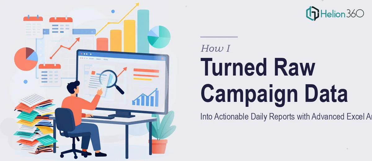
It started with one spreadsheet. Then two. Then a folder full of exports from ad platforms, CRM tools, and email dashboards — all needing to be stitched together into a coherent daily campaign report before the morning standup.
I had been managing campaign performance data for our marketing team for a few months, and the volume had quietly grown from manageable to overwhelming. Conversion rates, click-through rates, engagement metrics, cost-per-acquisition — every channel was generating its own data set, and none of it talked to the others cleanly.
The goal seemed simple: produce one clean, daily report that showed what was working, what was not, and what to do next. The reality was considerably messier.
What I Tried to Build on My Own
I knew Excel reasonably well. I could write formulas, build pivot tables, and create basic charts. So I started by pulling everything into a master workbook and building a reporting structure from scratch.
The first version worked — barely. I was using VLOOKUP to connect tables, conditional formatting to flag outliers, and manual copy-paste to consolidate data from different sources. It took about two hours every morning just to produce a report that was already half a day old by the time it reached the team.
Then the data sources changed. A new campaign platform was added, the CRM export format shifted, and suddenly my carefully constructed formulas were breaking in ways I could not quickly diagnose. The team needed real-time insights and trend identification across campaigns, not a patched-together file that required babysitting every single day.
I realized the problem was not just technical — it was structural. The reporting workflow needed to be rebuilt properly, with dynamic data connections, automated KPI tracking, and a layout that non-analysts could actually read and act on.
Bringing in the Right Support
After a particularly rough week where the daily report went out late three times, I reached out to Helion360. I explained the situation — the volume of campaign metrics, the broken Excel logic, the need for something that could scale as our campaigns grew. Their team asked the right questions upfront: what platforms were involved, what KPIs mattered most, what decisions the report actually needed to support.
From there, they took it over completely. Their Data Analysis Services transformed our entire reporting infrastructure into something sustainable and scalable.
What the Rebuilt Reporting System Looked Like
Helion360 rebuilt the entire Excel analytics framework from the ground up. The new structure used Power Query to pull and consolidate data from multiple sources automatically, which eliminated the manual copy-paste step entirely. Dynamic pivot tables updated with a single refresh, and the KPI dashboard at the front of the workbook showed conversion rates, engagement metrics, and spend efficiency in a format the marketing team could scan in under two minutes.
They also built a trend layer into the report — rolling averages and week-over-week comparisons that made it easy to spot campaign fatigue or sudden performance spikes without digging through raw rows. Every section was labeled clearly, color-coded logically, and structured so that even someone opening it for the first time could follow the narrative the data was telling.
The daily campaign report that used to take two hours now ran in about fifteen minutes, mostly automated. The team stopped asking me to explain the numbers because the numbers explained themselves.
What Changed After That
The biggest shift was not the time saved — it was the quality of conversations happening around the data. Instead of spending the morning standup reconciling discrepancies between sources, we were talking about which campaigns to scale and which to pause. The data visualization made trends visible that we had been missing entirely.
I also learned a lot just by studying what they had built. The Power Query setup, the way the KPI logic was structured, the naming conventions — it gave me a far better template to maintain and adapt going forward. For similar challenges, I found that automated PowerPoint reports from user activity data and financial data transformed into decision-ready reports demonstrated comparable approaches to solving data workflow problems.
If your team is drowning in campaign metrics and the daily reporting process feels like a second full-time job, Helion360 is worth talking to. They handled the complexity I could not crack alone and delivered something that actually made the data useful.