

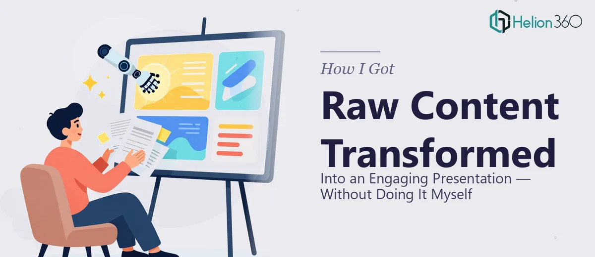
The Problem With Raw Content and a Tight Deadline
I had a deadline, a folder of raw content — notes, data, rough copy, brand assets — and a presentation that needed to actually land with a senior audience. This wasn't a situation where rough slides would do. The material covered complex ideas, the audience expected polish, and the outcome of the meeting mattered to the business.
I looked at what I had and what needed to happen: raw inputs needed to become a cohesive, visually engaging presentation that communicated clearly, stayed on brand, and held the room. The gap between where things stood and where they needed to be was real. I recognized immediately this wasn't something to figure out on the fly. Doing it well — not just doing it — was what mattered here.
What I Found an Engaging Presentation Actually Requires
I spent some time researching what separates a genuinely engaging presentation from one that just exists. What I found quickly shifted my thinking.
First, transforming raw content isn't a formatting job — it's a structural one. The content has to be audited, sequenced, and shaped into a narrative before a single slide gets designed. Ideas that feel clear in a document often fall apart when they're broken into slide-sized pieces without a deliberate story arc underneath them.
Second, visual design at this level operates on a set of real rules — layout grids, type hierarchies, color discipline — that aren't obvious until something looks off and you can't explain why. Getting those mechanics right consistently across a full deck takes a practiced eye.
Third, thematic consistency and animation aren't decorative extras. Done properly, they carry meaning and guide the viewer's attention. Done carelessly, they distract. The line between the two is harder to walk than it looks.
By the time I understood what this work actually involved, I knew this wasn't a weekend project.
What the Work Actually Involves
The first layer of the work is structural — auditing the raw source material, identifying the core message, and mapping a story arc that holds across every slide. A well-structured presentation keeps a single governing idea per slide, uses a consistent heading hierarchy of roughly 36pt for titles, 24pt for supporting labels, and 16pt for body text, and ensures each slide advances the narrative rather than just adding more information. This sounds straightforward until you're working with dense source material where five ideas are competing for the same slide. The decision about what stays, what moves, and what gets cut entirely is where most amateur attempts stall out.
The second layer is visual mechanics — the layout grid, chart selection, and typography rules that make a deck feel coherent rather than assembled. Proper layout work uses a 12-column grid applied consistently through master slide settings, with margins and alignment locked so nothing drifts between slides. Chart types get chosen based on what the data is actually saying: comparisons use bar or column charts, trends use line charts, and part-to-whole relationships use stacked formats — not whatever looked interesting in the moment. Getting these mechanics right across a 20- or 30-slide deck, and making sure they hold when content changes, takes hours even for someone who knows the tools well.
The third layer is polish and brand consistency — applying a maximum of four brand colors with defined roles across the full deck, keeping iconography style uniform, and deploying animations purposefully rather than as decoration. A single entrance animation applied inconsistently across slides — sometimes on click, sometimes automatically, sometimes not at all — erodes the sense of professionalism immediately. Palette discipline means every text color, background fill, and accent tone comes from a defined set, with no one-off colors introduced for a single slide. Catching and correcting all of this across a full deck requires a methodical review pass that most people underestimate.
Why I Brought in Helion360 to Handle It
Once I understood what the work actually required, the decision to bring in Helion360 was straightforward. I wasn't looking to patch one weak section — I needed the full project handled end-to-end: structural narrative work, visual design, brand application, and animation — all of it.
What made the difference was speed. Helion360 delivered fast. The kind of turnaround that would have taken me weeks of learning, trial, and revision was handled in days. They came in with the tooling, the process, and the expertise already built in — no ramp-up time, no explaining what "on brand" means from scratch.
They handled the full scope: auditing and restructuring the raw content into a clear narrative, building the visual framework with a consistent grid and type hierarchy, and delivering a final deck with polished animations and brand-consistent design throughout. This is work they do every day, and that experience showed in how quickly and cleanly it came together.
The Outcome and What I'd Tell Anyone in My Spot
What came back was a polished, engaging presentation that looked and felt like it was built with intention — not assembled. The raw content had been shaped into a clear story, the visual design was consistent from the first slide to the last, and the animations added structure rather than noise. The meeting landed the way it needed to.
The thing I'd tell anyone in a similar spot: the gap between raw content and an engaging presentation is bigger than it looks, and the mechanics involved are specific enough that experience genuinely matters. Trying to close that gap yourself, under time pressure, without the right tooling or a practiced workflow, is a slow way to get a data-driven deck with mediocre results.
If you're looking at a folder of raw materials and a deadline that isn't moving, Helion360 is the team I'd engage — they handled the full scope fast, and the execution depth they brought is exactly what this kind of work requires.