

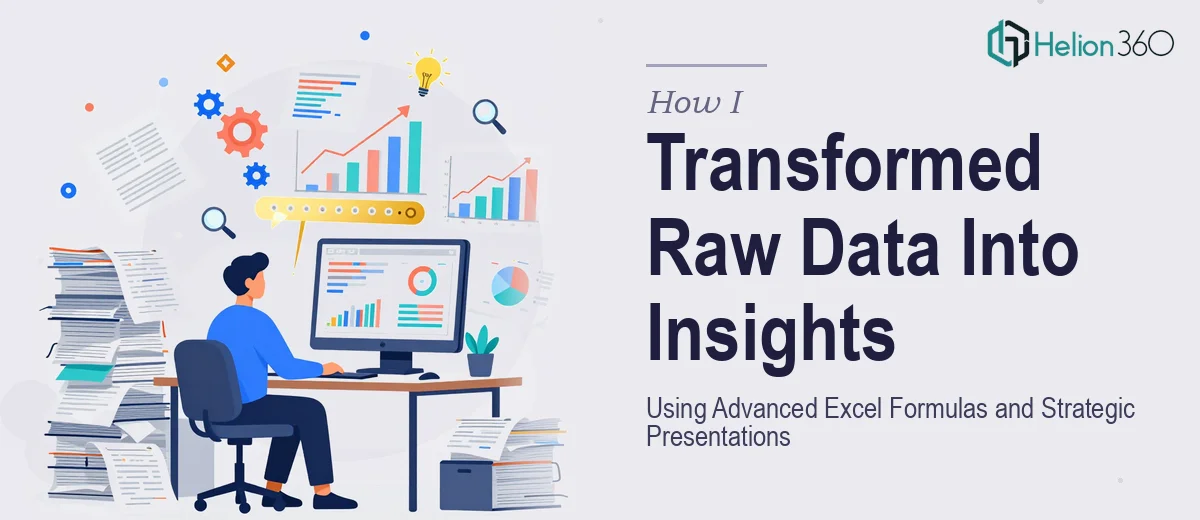
The Data Was There. Making Sense of It Was the Real Problem
I had a reporting deadline bearing down on me and a spreadsheet that looked like a city map — hundreds of rows, multiple data sources, and a leadership team expecting a clear story out of it by end of week. The raw numbers existed, but they weren't saying anything useful yet. Without proper structuring and analysis, the data was noise. With the right approach — advanced Excel formulas, clean data modeling, and a presentation built to communicate findings rather than just display them — it could actually drive a decision.
The stakes were real. This wasn't an internal draft. It was going in front of decision-makers who needed to act on what they saw. I knew that doing this halfway — running a few basic formulas, dropping the output into a generic slide deck — wasn't going to cut it. This needed to be done properly.
What I Found Out This Work Actually Requires
When I started digging into what a proper data-to-insights project actually involves, the scope became clear fast. It isn't just a matter of writing a VLOOKUP and throwing a bar chart on a slide.
The analytical layer alone — structuring data models with dynamic named ranges, using INDEX/MATCH or XLOOKUP for multi-condition lookups, building nested IF logic or SUMIFS arrays across large datasets — requires both formula fluency and an understanding of how data behaves at scale. One misconfigured formula cascades errors across an entire model.
Then there's the translation problem. Even perfectly accurate data analysis fails if the presentation doesn't communicate it clearly. The chart types, the data hierarchy, the narrative flow from slide to slide — all of it needs deliberate design decisions. And those two disciplines — rigorous data work and strategic presentation design — rarely live in the same person.
That's when I realized I wasn't looking at a weekend task. I was looking at a specialist-level project.
What the Work Actually Involves
The first layer of the work is structural — auditing the source data, cleaning inconsistencies, and building a logical model before any analysis begins. This means establishing a single source of truth across sheets, resolving duplicate or conflicting entries, and deciding which metrics actually answer the questions the audience is asking. Done well, this phase involves mapping a clear analytical hierarchy: primary KPIs at the top, supporting metrics below, and contextual data underneath that. Skipping this step is exactly where most self-built reports fall apart — the numbers are technically correct but the structure makes them impossible to act on.
The second layer is the formula and modeling work itself. A well-built Excel model for insights reporting typically uses dynamic arrays, conditional aggregation with SUMIFS or COUNTIFS across multiple criteria, and XLOOKUP chains that pull from normalized reference tables rather than hard-coded cell ranges. The type hierarchy matters too — dates formatted inconsistently break formula logic silently, and most people don't catch the error until the totals don't reconcile. Building a model that holds up under real data volume — thousands of rows, multiple input tabs, refresh cycles — takes significant technical depth and disciplined build habits that only come from repetition.
The third layer is the presentation itself. Translating analytical output into a strategic presentation means choosing chart types that match the data relationship being communicated — a clustered bar for comparison, a waterfall for variance, a slope chart for trend between two points — and applying a consistent visual hierarchy across every slide: typically a 36pt headline, 24pt subhead, 16pt body, no more than four brand colors, and a layout grid that keeps the eye moving logically. Each slide needs to answer one question. When analysts try to build this themselves after the Excel work, they're usually too close to the data to make those editorial decisions cleanly.
Why I Brought in Helion360 to Handle It
I looked at what this project actually required and made a quick decision: this wasn't the place to learn on the job. The combination of advanced data modeling and strategic presentation design — both done to a professional standard, under a tight deadline — wasn't something I was going to pull off solo without significant cost to quality or timeline.
Helion360 handled the full project end-to-end. That meant taking the raw source data, building the analytical model with proper formula architecture, and then designing the presentation to communicate findings clearly to a non-technical leadership audience. They turned it around quickly — what would have taken me weeks of learning and iteration was delivered in days. The data model was clean, the formula logic was sound, and the slides were built with the kind of visual discipline that makes insights land with the right audience. No back-and-forth on basics. No time lost to trial and error.
The Outcome and What I'd Tell Anyone in My Spot
What came back was a presentation that actually moved the room. The data told a coherent story — the right metrics surfaced, the variance was explained clearly, and the visual design made it easy for leadership to orient quickly and focus on decisions rather than trying to decode the slides. The analytical model underneath it was also built in a way that could be refreshed with new data without rebuilding from scratch — which turned out to matter more than I expected.
If you're sitting on a dataset needing presentation and you're up against a real deadline with real stakes, Helion360 is the team I'd engage. They handled everything end-to-end, delivered fast, and brought the kind of execution depth this work genuinely requires.