

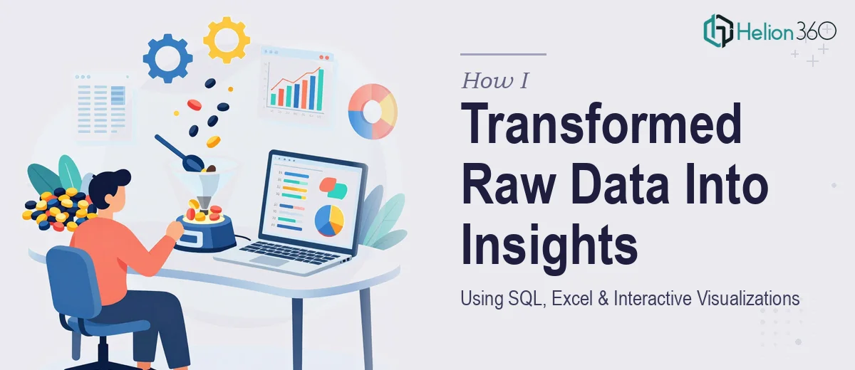
When the Data Was There but the Story Was Not
I had everything I needed — or so I thought. Months of transactional records, customer behavior logs, and performance metrics all sitting in a SQL database, ready to be turned into something meaningful. The goal was straightforward: extract strategic insights that leadership could actually act on, and present those findings in a way that both the technical team and the executive group could follow.
I started confidently. I wrote queries, pulled the data into Excel, and began building what I hoped would be a clean, compelling dashboard. The numbers were there. The trends were visible. But somewhere between the raw output and the finished presentation, things started falling apart.
Where It Got Complicated
The first problem was volume. The dataset was far larger than anything I had worked with in isolation. Queries were taking time to optimize, and once I had the output in Excel, I was dealing with thousands of rows that needed to be aggregated, filtered, and structured in a way that actually made sense for a strategic audience.
The second problem was visualization. I knew what the data was saying, but translating that into interactive charts and graphs that told a coherent story — without overwhelming the viewer — was a different skill set entirely. I tried several approaches: pivot charts, conditional formatting, dynamic dropdowns. Each version felt either too dense or too simplified. I was spending more time formatting than analyzing.
The third problem was the presentation layer itself. Even if I cracked the Excel dashboard, converting those insights into a clean, professional slide deck that could hold up in a boardroom was another challenge altogether. Data visualization in Excel and data visualization in a presentation format are not the same thing.
Bringing In the Right Support
After a week of iteration with results that still felt unfinished, I reached out to Helion360. I explained the scope — large datasets, SQL-sourced data, Excel dashboards, and a final presentation that needed to communicate strategic insights clearly to a mixed audience. Their team asked the right questions upfront: what decisions would these insights support, who was the final audience, and what level of interactivity was needed in the visuals.
That conversation alone shifted how I was thinking about the project. Instead of building around what the data contained, the focus moved to what the audience needed to walk away understanding.
How the Work Came Together
Helion360's team took the structured data exports I provided and built out a layered approach. The Excel dashboard was organized around key performance themes rather than raw metric categories, which made it significantly easier to navigate. Interactive charts allowed users to filter by time period and segment without losing the overall narrative thread.
The accompanying presentation translated those dashboard insights into a slide-by-slide strategic story. Each section moved from context to finding to implication — a structure that worked for both the technical reviewers who wanted to interrogate the numbers and the executives who needed quick, clear takeaways.
What I had been trying to build over a week came together in a form that was actually presentation-ready. The data visualization was consistent, the charts were clean, and the strategic recommendations had visible data support behind them.
What I Took Away From This
The gap between having data and presenting strategic insights is wider than most people expect. SQL queries and Excel skills will get you the raw material, but turning that material into something decision-makers can act on requires a different kind of thinking — part analytical, part design, part communication strategy.
Data analysis projects like this one rarely fail because of missing data. They stall because the translation layer — from numbers to narrative — does not get enough attention. Having a team that understood both the data side and the presentation side made the difference between a functional output and one that actually landed.
If you are working through a similar project and finding that interactive charts and dashboards are not coming together, Helion360 is worth reaching out to — they handled the parts I was stuck on and delivered exactly what the project needed.