

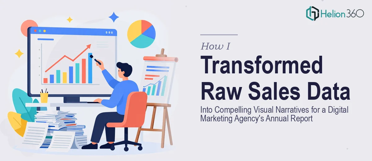
When the Numbers Are Ready But the Story Isn't
Running a digital marketing agency means you're constantly surrounded by data. Clicks, conversions, customer engagement rates, campaign performance — it never stops. So when it came time to put together our annual report presentation, I assumed pulling the numbers together would be the hardest part. It wasn't.
The real challenge was turning all of that raw sales data and customer engagement metrics into something an audience would actually want to look at. I had spreadsheets. I had charts that looked like they were built in 2009. I had a story I wanted to tell, but no clear way to tell it visually inside PowerPoint.
What I Tried on My Own
I started by building out the slides myself. I'm comfortable with PowerPoint — I've used it for years — so I figured I could handle a few data visualization components without too much trouble.
I pulled the engagement metrics into bar charts and line graphs. I color-coded things. I tried adjusting fonts and layouts to make it feel more polished. But every version I produced looked either too cluttered or too plain. The charts weren't communicating the insights I needed them to. They were accurate, but they weren't compelling. For an annual report that would be seen by stakeholders and potential partners, "accurate but dull" wasn't going to work.
I also realized I was spending hours on design tweaks that weren't moving the needle. Time I didn't have, given the deadline sitting one week out.
Handing It Off to Someone Who Could Actually Solve It
After hitting a wall with my own attempts, I came across Helion360. I explained the situation — a tight deadline, an annual report presentation with a heavy data component, and a need for data visualization that felt clean and professional without losing the depth of the numbers.
Their team took it from there. I shared the report outline, the raw data, and some notes about our agency's brand and audience. Within a short turnaround, they came back with a set of slides that genuinely impressed me.
What the Final Slides Actually Looked Like
The difference between what I had built and what Helion360 delivered was significant. The engagement metrics that had lived in flat bar charts were now part of a visual flow that guided the viewer through the story behind the numbers. Trend lines were contextualized. High-performing campaign results were highlighted using color and layout in a way that naturally drew the eye.
The data visualization work on the key metrics slide was particularly strong. Instead of overwhelming the audience with a wall of numbers, the slide broke down customer engagement data into clearly segmented visual zones — each one building on the last. It was the kind of presentation design that makes complex information feel accessible without dumbing it down.
The slides also stayed consistent with our agency's visual identity, which mattered. This wasn't a generic template dropped on top of our content — it felt like our brand.
What This Experience Taught Me About Presentation Design
I came away from this project with a clearer understanding of where the real skill gap is in most internal presentation work. It's rarely the content. Most teams have the data, the insights, and the narrative. The gap is in translating data into visual storytelling that holds an audience's attention from the first slide to the last.
Data visualization inside a PowerPoint is not just a design task. It requires understanding how people read slides, how color and hierarchy guide attention, and how to balance information density against visual clarity. That combination is harder to execute than it looks, especially under deadline pressure.
The annual report ended up being one of the stronger presentations we've put in front of an external audience. Stakeholders commented specifically on how readable the data sections were, which validated the approach.
If you're in a similar position — sitting on solid data but struggling to make it land visually — compelling PowerPoint presentations are worth the investment. Helion360 handled what I couldn't within the time I had, and the final product spoke for itself.