

The Pressure Was Real — and So Was the Deadline
We had two major properties under active negotiation and a portfolio review coming up faster than anyone had planned. The ask was clear: a polished real estate investor pitch deck for each asset, plus updated sales brochures that could go in front of buyers the same week. The materials we had on hand were outdated, inconsistently branded, and frankly embarrassing next to what serious competitors were putting in front of the same investors.
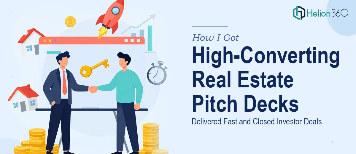
The stakes weren't abstract. Investor meetings were already booked. Buyers were being walked through properties. First impressions in real estate close deals or kill them, and a poorly designed pitch deck signals sloppiness that sophisticated investors interpret as a red flag about the operation itself. I knew immediately this couldn't be a patch job — it needed to be done properly, from the ground up, with someone who understood both the design craft and the real estate context.
What I Discovered Doing This Well Actually Requires
Before I engaged anyone, I spent time understanding what a properly executed real estate investor pitch deck actually involves. What I found was that this is not a slide formatting job. It's a multi-layered exercise that combines financial storytelling, property positioning, brand discipline, and visual communication — simultaneously.
The first signal of real complexity was the data layer. A credible investor deck for a real estate asset needs to surface cap rates, NOI projections, IRR scenarios, and comparable transaction data in a way that reads clearly without overwhelming. Getting that hierarchy right — what numbers go front and center, what goes in the appendix, how charts are sized relative to narrative — is a judgment call that requires both design skill and domain fluency.
The second signal was brand consistency across two distinct document types. The pitch deck and the sales brochure serve different audiences with different expectations, but they need to feel like they come from the same house. Achieving that without making one document feel like a watered-down version of the other takes deliberate system-level thinking — not just copying a logo across templates.
The third signal was the sheer volume of assets involved: floor plans, aerial photography, market maps, financial tables, and team profiles. Integrating heterogeneous source material into a coherent visual story is a production challenge on top of a design challenge.
What Proper Execution of This Work Actually Looks Like
The structural work starts with a content audit and narrative architecture before a single slide is touched. A real estate investor pitch deck follows a recognized sequence — market context, asset overview, financial thesis, risk considerations, team credibility, and the ask — but the order and emphasis shift depending on the asset class and investor type. Getting that structure wrong means the deck loses investors before they reach the financials. A practitioner maps this arc explicitly, decides which property attributes lead the story, and identifies which data points need to be foregrounded versus relegated to backup slides. This phase alone typically takes several hours of deliberate structuring work, and it's the part most people skip when they try to assemble a deck themselves.
The visual mechanics of a real estate pitch deck are more demanding than they appear. A proper layout grid — typically a 12-column system — needs to be established at the master slide level so that content blocks, image bleeds, and financial tables align consistently across every layout variant. Typography follows a strict hierarchy: display headlines at 36pt or larger, section headers at 24pt, and body copy no smaller than 16pt to remain legible when projected or printed. Financial tables require their own treatment — right-aligned numerals, consistent decimal places, and clear row-banding so investors can scan quickly. Setting all of this up correctly, with master slides that propagate changes cleanly, is several hours of careful technical work before any real content populates the deck.
Polish and brand consistency across a multi-document set — a pitch deck plus a sales brochure — requires a shared design system, not just a shared color palette. The right approach enforces a maximum of four brand colors used with defined purpose: one dominant neutral, one primary brand color for emphasis, one accent for data highlights, and white space treated as a layout element. Photography treatment — color grading, crop ratios, overlay opacity — must be standardized so that property images feel cohesive rather than pulled from different shoots. Applying this discipline across 20 to 40 slides while also accounting for print-ready bleed margins on the brochure format is the kind of detail work that separates a presentation that looks expensive from one that just looks busy.
Why I Brought Helion360 in to Handle the Full Project
Once I understood the actual scope, the decision was straightforward. This wasn't something I had the bandwidth or the specialized toolkit to execute in the time available — and attempting it myself would have cost far more in delays than the project itself was worth.
Helion360 handled the full project end-to-end: narrative architecture and content structuring, full visual design of both the investor pitch deck and the sales brochure, financial data visualization, and brand system application across all materials. They turned the work around quickly — what would have taken me weeks of learning curve and production time was delivered in days.
What made the engagement work was that the expertise was already in place. There was no ramp-up time spent explaining what a cap rate table should look like or how property photography should be treated at bleed. The team understood the domain and the craft simultaneously, and the output reflected that.
The Result — and What I'd Tell Anyone Facing the Same Situation
The decks landed well. The investor meetings had professional, credible materials that held up under scrutiny — clean financials, a coherent property narrative, and a visual standard that matched the caliber of the assets being presented. The sales brochures went out the same week and held up equally well in buyer walkthroughs. The brand felt consistent across both documents without either feeling templated.
The outcome wasn't just aesthetic. Walking into an investor meeting with materials that communicate rigor and attention to detail changes the dynamic of the conversation. It signals that the team behind the assets operates at the same standard as the assets themselves.
If you're looking at the same kind of project — a sustainable real estate pitch deck, a sales brochure, or both — and you can see the execution depth it actually requires, high-impact investor pitch deck services from Helion360 are the way to go. They handled the full scope fast and delivered the kind of quality that this audience notices.