

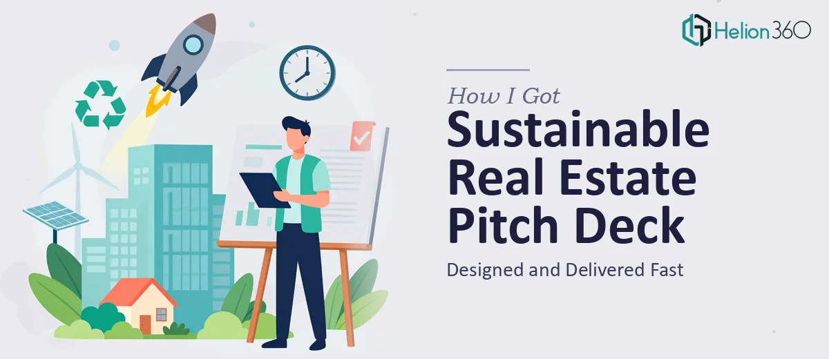
The Problem With Our Real Estate Pitch Was Bigger Than I Expected
We had a compelling real estate venture — a sustainable development concept built around smart living solutions and low-impact design. The fundamentals were strong. The vision was clear internally. But when it came time to present to potential investors, what we had on paper simply didn't do the work justice.
The stakes were real. Investor meetings were lined up, and first impressions in that room carry serious weight. A deck that looks rough, reads like a brochure, or buries the financial logic under generic language doesn't just underperform — it actively signals that the team hasn't done the work. I knew we needed a real estate pitch deck that could hold its own in a room of experienced investors, and I knew that wasn't something to wing.
This needed to be done properly, which meant understanding what properly actually looked like.
What I Found Out a Proper Investor Pitch Deck Actually Requires
When I started researching what separates a forgettable deck from one that moves investors to act, a few things became immediately clear.
First, the copywriting is not just descriptive — it is argumentative. Every slide needs to advance a specific investor thesis: here is the market gap, here is why we are positioned to capture it, here is why now. That is a different skill set from marketing writing or internal documentation.
Second, the visual design for a real estate pitch deck carries extra responsibility. Investors in this space expect to see renders, site context, and project scale communicated visually — not just described. The design has to make the development feel real and investable before a single number is scrutinized.
Third, the narrative arc and the financial slides have to be coherent with each other. When the story says one thing and the numbers page implies something different, sophisticated investors notice immediately. Alignment between the written pitch and the data visualization isn't optional — it's the credibility test.
At that point it was obvious this was not a weekend project.
What the Work on a Deck Like This Actually Involves
The first layer of work is structural — auditing the source material and building a story arc that holds up under investor scrutiny. For a real estate pitch deck, that means sequencing the narrative so that the problem statement, the market opportunity, the development concept, and the investment thesis each land in the right order and each earns the next slide. The rule practitioners follow here is that no slide should exist without a clear job to do in the sequence. Getting this architecture right before a single visual is placed can take a full day of structured work on its own, and skipping it is the most common reason decks feel scattered even when the underlying business is sound.
The second layer is visual mechanics — translating the narrative into slides that communicate at a glance. Done well, a real estate investor deck uses a disciplined layout grid, typically a 12-column structure, with a strict typographic hierarchy: around 36pt for headline statements, 24pt for supporting data labels, and 16pt for body context. Color palette discipline matters here too — a maximum of four brand-aligned colors applied consistently so the deck reads as a unified document rather than a collection of slides. The execution friction is significant: propagating a master slide system correctly across a full deck, especially one that includes property renders, market maps, and financial charts, requires both technical fluency in the design tool and a designer's eye for spatial balance.
The third layer is data visualization — converting market sizing, return projections, and development timelines into charts and visuals that investors can read in seconds. The right chart type for each data story matters: a stacked bar for phase-by-phase capital deployment reads differently than a waterfall for return attribution, and choosing wrong creates confusion rather than confidence. Each chart needs clean axis labeling, a clear headline takeaway above it, and formatting consistent with the rest of the deck. This is where many self-built decks fall apart — the numbers are right but the visualization makes them harder to trust.
Why I Brought Helion360 in to Handle the Full Project
Once I understood the actual scope — the narrative architecture, the investor-grade copywriting, the visual system, and the data visualization all needing to work as one coherent document — it was clear this wasn't something to attempt internally.
I engaged Helion360 to handle the project end-to-end. The decision was straightforward: this is a team that does this work constantly, with the process and tooling already in place. They handled the full scope — story structure and slide-by-slide copywriting, visual design built on a proper master slide system, and chart and data visualization formatted to investor standards. The investor pitch deck came together quickly, turned around in a fraction of the time it would have taken to build the skill, the process, and the output quality from scratch internally. Done in days, not weeks, with the kind of execution depth that investor-facing material actually requires.
What I didn't have to do was manage the back-and-forth of learning what good looks like while simultaneously trying to produce it under deadline pressure.
The Result and What I'd Tell Anyone Who's Looking at the Same Problem
What came back was a polished investor pitch deck that felt genuinely investable — visually polished, narratively coherent, and credible at the level of detail that sophisticated investors probe. The development concept read the way it deserved to read. The visual design made the project feel real. The financial slides supported the story rather than contradicting it. The investor meetings went the way they needed to go.
If you are sitting on a strong real estate concept and the gap between what you have and what investor-ready looks like feels significant, that gap is real and it matters. The work involved in closing it — story architecture, investor copywriting, visual design, data visualization — is specialized and time-intensive when done properly.
If you are in that position and want it handled end-to-end without the weeks of learning curve, Helion360 is the team to engage — they delivered fast and brought exactly the execution depth this kind of project needs.