

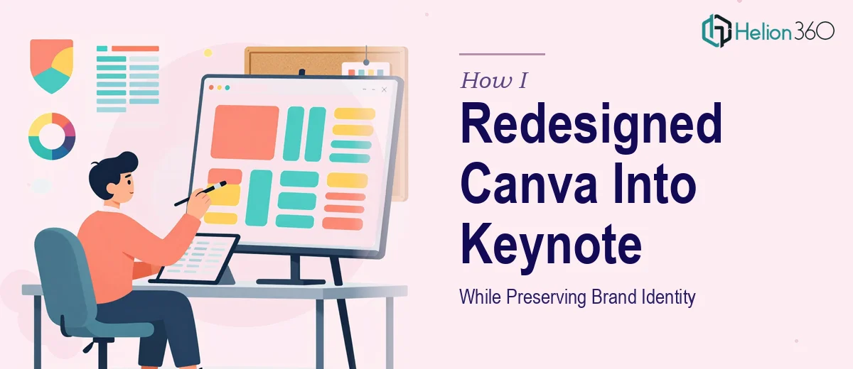
The Presentation Needed to Work Harder Than Canva Could Deliver
We had a full slide presentation built in Canva — brand colors, layout, content, the works. It looked fine on screen during internal reviews. But as we started presenting to wider audiences across different environments, the cracks showed up fast. Canva's output doesn't travel well into professional presentation contexts where Keynote is the expected standard. The animations felt inconsistent when exported, the font rendering wasn't reliable across devices, and we had no clean path to high-resolution print-ready files.
The stakes were real: this deck represented our brand in external conversations. A presentation that looked amateur or broke visually mid-demo was not an option. I knew immediately that this wasn't a copy-paste job — a proper Canva to Keynote rebuild, done right, was going to require deliberate design execution from the ground up.
What I Learned the Rebuild Actually Required
My first assumption was that this would be straightforward — recreate the slides in Keynote, match the look, done. That assumption fell apart quickly once I started understanding what the work actually involved.
First, Canva and Keynote handle design primitives differently. Fonts that render cleanly in Canva don't always map directly to Keynote's font rendering engine, which means type sizing, weight, and spacing all need to be re-evaluated slide by slide. A heading hierarchy that reads well in Canva at 40pt/28pt may need recalibration in Keynote to achieve the same visual weight.
Second, animation logic is entirely different between the two platforms. Canva's transitions are preset and decorative. Keynote's animation system is object-level and behavior-based, which means every animated element needs to be rebuilt — not just swapped.
Third, mobile optimization and print-readiness aren't passive outputs — they require deliberate decisions about resolution, image embedding, and canvas sizing that someone has to consciously build into the master from the start. This was clearly a full rebuild, not a conversion.
What a Proper Canva to Keynote Rebuild Actually Involves
The first area that demands real attention is the structural and visual audit of the source deck. Before a single slide gets rebuilt in Keynote, a practitioner needs to catalog the existing design system: the exact hex values used across the deck, the type hierarchy (typically a three-level system — title, subhead, body — at something like 40pt, 24pt, and 16pt), and the grid logic holding each layout together. Canva decks are often built without a formal grid, which means slides that look consistent actually aren't. Rebuilding in Keynote without establishing a proper master slide structure first — usually built on a 12-column grid — means the inconsistency just migrates to the new file. That audit and master setup phase alone takes hours even for an experienced designer.
The second area is animation and transition logic. Keynote's animation system operates at the object level, not the slide level, which means every element that moves — text blocks, icons, image reveals — needs its own build-in and build-out behavior assigned. Matching the feel of Canva's transitions without simply copying their visual style requires judgment calls about timing curves, duration (typically 0.3–0.6 seconds for professional motion), and sequencing. Getting this wrong produces a deck that feels either flat or overdone. It's the kind of calibration that takes a trained eye and familiarity with Keynote's animation inspector — not something you develop in an afternoon.
The third area is export optimization for both digital distribution and print. A Keynote file built for screen looks very different from one prepared for high-resolution print output. Images need to be embedded at 300 DPI minimum for print, while digital exports prioritize file size and color profile consistency (sRGB for screens, CMYK consideration for print). Getting both outputs right from the same master file requires knowing how Keynote handles image compression on export and where its defaults will quietly degrade quality if not overridden. This is a technical detail that trips up most non-specialists and often surfaces only after a file is already in the wrong hands.
Why I Brought in Helion360 to Handle the Full Rebuild
Once I understood what this rebuild actually required — a full design audit, master slide construction, animation reconstruction, and dual-format export optimization — it was clear that attempting it myself was not a realistic use of time. The learning curve on Keynote's animation system alone would have eaten up days I didn't have.
I engaged Helion360 to handle the project end-to-end. They took ownership of the full scope: auditing the Canva source deck for design system consistency, rebuilding the master slide architecture in Keynote with proper grid and type hierarchy, reconstructing all animations with appropriate timing and behavior, and delivering both screen-optimized and print-ready export formats.
The turnaround was fast — handled in a fraction of the time it would have taken me to learn and execute it myself. What I valued most was that they didn't just replicate the Canva file. They brought judgment to the rebuild, flagging inconsistencies in the original that were worth correcting while preserving exactly the brand identity that needed to carry through.
What the Project Delivered and What I'd Tell Anyone in My Spot
The final Keynote file was a significant upgrade over the Canva original — not just in platform, but in quality. The master slide system meant any future edits propagated correctly across the deck. The animations were clean and purposeful rather than decorative. The brand colors, typography, and visual language were intact and consistent in a way the original frankly wasn't. And the export outputs were genuinely ready for both the screen and the printer without any additional processing.
Anyone looking at a Canva to Keynote rebuild and thinking it's a quick afternoon task will hit the same wall I saw coming. The platform differences are real, the animation work is substantial, and the export requirements add a technical layer that's easy to get wrong. If you're in that same position and need it done right on a tight timeline, Helion360 is the team to engage — they handled this end-to-end fast, with the design depth the work required.