

The Brand Manual Was Over a Decade Old — and It Showed
I was preparing for an important industry event when someone pulled up our corporate presentation on the conference room screen. The fonts looked dated, the color palette hadn't kept up with our brand evolution, and the layout felt like it belonged to a different era — because it did. The source document traced back to 2011.
The stakes were real. We were about to put our brand in front of prospective partners and clients who would form an impression within the first thirty seconds. A corporate identity manual that looks outdated signals something broader about how an organization operates. I knew this couldn't stay as-is. It needed a proper rebuild — not a quick patch — and it needed to be done before the event calendar got any tighter.
What I Found a Proper Brand Manual Rebuild Actually Requires
I started by mapping out what a genuinely modernized corporate identity manual in PowerPoint actually involves, and it stopped looking like a weekend fix pretty quickly.
The existing CI/CD file had most of the raw brand elements — logo variants, a color system, some typography direction — but they were fragmented across old documents with inconsistent specifications. Pulling that together into a coherent, professionally structured PowerPoint brand manual isn't just assembly work. It requires brand design judgment: knowing which elements to carry forward, which to retire, and how to codify the updated rules in a way that holds across every future use case.
Then there's the PowerPoint-specific execution layer — slide masters, theme files, layout grids — which is its own technical discipline. Done correctly, a brand manual built in PowerPoint becomes a living system, not just a static document. That distinction matters enormously when other people in the organization need to use it.
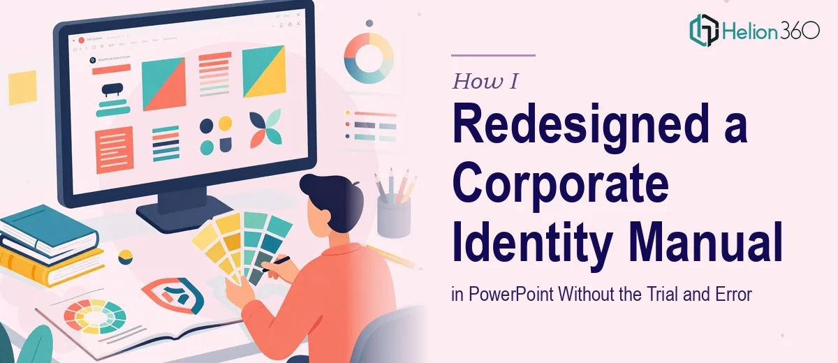
What the Work Actually Involves
The right approach starts with a full audit of the existing brand assets — logo files, color hex and CMYK values, typeface families, spacing rules, and any established usage guidelines. Even when most of the assets exist, they rarely exist in a consistent, deployment-ready state. The practitioner's job is to resolve conflicts between old specifications and current brand reality, establish a canonical set of values, and map out the full scope of what the manual needs to cover. This audit phase alone can take a full day when source files span different formats and years.
Visual mechanics come next, and this is where corporate identity manuals either hold up under use or fall apart. Proper brand manual slides are built on a consistent layout grid — typically a 12-column structure — with a defined typographic hierarchy (often 36pt for section headers, 24pt for body titles, 16pt for supporting text) and a locked palette of no more than four primary brand colors plus defined secondary tones. Building these rules into PowerPoint's slide master system, so they propagate correctly across every layout variant, is technically demanding. Someone unfamiliar with master slide architecture can easily create a file that looks right on the surface but breaks the moment another user touches it.
Polish and consistency across the full document is the third layer, and it's where most self-directed attempts run out of steam. A brand manual typically spans thirty to sixty slides covering logo usage rules, color application examples, typography specimens, imagery guidelines, icon systems, and real-world mockup examples. Maintaining exact pixel alignment, consistent margin treatment, and proper brand color discipline across that volume — without a single slide drifting — requires both design rigor and the kind of focused execution time that most people simply don't have sitting free in their schedule.
Why I Brought in Helion360 to Handle It
I looked at what the rebuild genuinely required — the asset audit, the slide master architecture, the full manual layout across dozens of slides — and it was immediately clear this wasn't something to attempt in spare hours between other priorities. The event timeline was fixed, and a half-finished or inconsistently built brand manual would have been worse than the outdated one we already had.
Helion360 handled the full project end-to-end. That meant going through the existing CI/CD materials, resolving the inconsistencies in the legacy assets, building a properly structured PowerPoint master system from the ground up, and producing the complete brand manual with all sections — logo rules, color system, typography, layout templates, and usage examples — finished and consistent throughout. The turnaround was fast. What would have taken me weeks of learning curve and back-and-forth was delivered in days, with the kind of execution depth the work actually demands. The file they delivered works as a real system, not just a good-looking document.
The Result — and What I'd Tell Anyone Facing the Same Situation
We went into the industry event with a brand manual that reflected where the company actually is today — not where it was thirteen years ago. The presentation held up on screen, in print, and when shared digitally with partners afterward. More importantly, the PowerPoint file is now built correctly, so anyone on the team can use it without breaking the layout or drifting from the brand specifications.
The broader lesson I'd pass along: when the work involves both brand design judgment and technical PowerPoint architecture, and the source materials are fragmented across a decade of different documents, the complexity compounds fast. It's not a project that rewards optimism about how quickly you can pick it up.
If you're looking at a similar situation — an outdated corporate identity manual that needs a proper rebuild in PowerPoint before it goes in front of an important audience — Helion360 is the team I'd engage. They handled the full scope for me quickly, and the execution quality is exactly what this kind of work requires. Learn more about cohesive PowerPoint presentations and discover what building customizable PowerPoint templates actually requires to keep your brand identity consistent.