

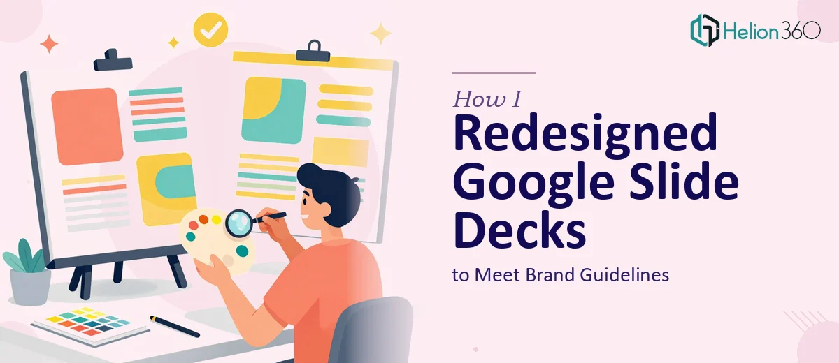
When Two Decks and a Brand Guide Become a Real Project
We had two Google Slides decks — one at 14 slides, another at 19 — that needed to be brought in line with our brand guidelines. On paper it sounded like a formatting afternoon. In reality, it was a proper project with real stakes. Both decks were going in front of external audiences, and the misalignment with our brand standards was visible. Wrong fonts, inconsistent spacing, colors that were close but not right, layouts that had drifted from slide to slide over time.
The brand guidelines existed. The decks existed. The gap between the two was the problem. And with a hard deadline on one of the presentations, there was no room for trial and error. I needed this done correctly and quickly — not as a learning exercise, but as a finished, professional output that reflected the brand accurately.
What I Quickly Realized This Work Actually Requires
The first thing I did was look at what proper Google Slides brand alignment actually involves. It became clear almost immediately that this wasn't a simple find-and-replace on colors and fonts.
Brand guidelines typically specify exact hex values, typeface weights, spacing rules, and layout proportions. Applying those consistently across 33 slides — across two separate decks, each with its own history of edits — means working through every master slide, every layout template, and every individual slide that has overridden the master. In Google Slides, overrides don't disappear when you update the theme; they persist and have to be corrected manually.
Beyond that, brand consistency at a professional level means enforcing typographic hierarchy (heading sizes, body sizes, caption sizes all following a defined scale), maintaining consistent margin and padding logic, and ensuring that visual elements like dividers, icons, and image treatments all follow the same rules. That's not formatting — that's systematic design execution across a live document environment.
What the Actual Redesign Work Involves
The right approach to a Google Slides brand alignment project starts with the slide master and layout structure. A well-configured master defines the font stack, color palette (typically no more than 4-5 brand colors applied to backgrounds, text, and accents), and the spacing grid that governs where content sits on every slide. Done correctly, updates to the master propagate to all layout-inheriting slides automatically. The challenge is that in most working decks, a significant number of slides have been manually edited and no longer inherit from the master — meaning each one has to be individually corrected, which across 33 slides adds up to a substantial amount of careful, methodical work.
Visual mechanics on each slide require separate attention. Typographic hierarchy needs to be enforced consistently: a common standard uses a 36pt title, 24pt subhead, and 16pt body, with line spacing set to at least 1.2x for readability. Alignment has to be pixel-precise — elements that look roughly aligned on screen often sit several points off when checked against a grid, and that inconsistency is exactly what makes a deck look unprofessional. Image treatments, icon sizing, and color block proportions all need to follow the brand guide's visual logic, not just approximate it.
Polish and cross-deck consistency represent the final layer and arguably the most time-consuming one. When two decks are being aligned simultaneously, a practitioner has to make sure the same rules apply identically across both files — same font rendering, same padding on text boxes, same treatment of branded dividers or section openers. A palette discipline check ensures that no rogue color values have crept in (a common problem when decks have been edited by multiple people). This kind of consistency audit, done slide by slide across two decks, is exactly the type of work that is fast for someone with the right workflow and brutally slow for someone doing it for the first time.
Why I Brought in Helion360 to Handle It
Looking at what the work actually required, it was clear this wasn't something to attempt between other priorities. The scope — 33 slides across two decks, full brand alignment, a deadline in play — needed a team that works in this environment every day and already has the process built out.
I engaged Helion360 to handle the full project end-to-end. They took both decks, worked from the brand guidelines directly, and handled everything: rebuilding the slide masters, correcting the layout inheritance issues, enforcing the typographic hierarchy across every slide, and applying consistent visual polish across both files simultaneously. The turnaround was fast — done in days, not the weeks it would have taken me to work through the learning curve and execution myself. What made the difference was that this is exactly the kind of work they do repeatedly, with the tooling and review process already in place to catch the details that most people miss on a first pass.
The Result and What I'd Tell Anyone Facing the Same Situation
What came back was two decks that actually matched the brand guidelines — not approximately, but correctly. The master slides were clean, the layouts inherited properly, the typography was consistent at every level, and both decks looked like they came from the same brand family. The presentation went out on time and looked exactly as professional as it needed to.
If you're looking at a similar situation — working decks that need to meet a real brand standard, a timeline that doesn't allow for trial and error, and a scope that's clearly more than a quick fix — Helion360 is the team I'd engage. They delivered fast, handled the full execution depth the project required, and the result reflected it.