

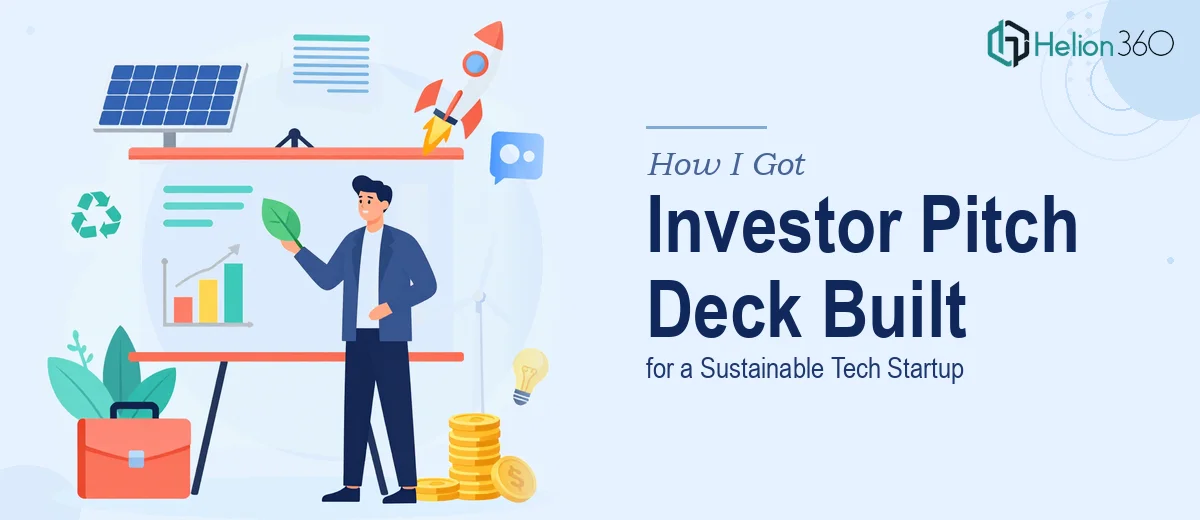
The Presentation That Had to Work
When I was preparing to take my sustainable tech startup in front of investors, I knew the investor pitch deck wasn't something I could treat as an afterthought. This wasn't an internal briefing or a team update — it was the document that would determine whether serious capital conversations even got started. The stakes were real: a compressed timeline, a specific investor audience, and a story that needed to land cleanly across 15 to 20 slides.
The content I had was scattered across documents, spreadsheets, and rough notes — a mission statement here, market sizing figures there, financial projections in a model that needed translating into something visual. I could see immediately that pulling this into a coherent, professionally designed investor pitch deck was a full project in itself, not a weekend task. It needed to be done right.
What I Found Out This Work Actually Requires
Before I engaged anyone, I did enough research to understand what a strong investor pitch deck genuinely involves. The short answer: considerably more than formatting slides.
The narrative architecture comes first. Investors evaluate decks in a specific sequence — problem, solution, market, traction, team, financials — and the story has to flow logically from one section to the next without the reader needing to fill in gaps. Getting that structure right means auditing every piece of source content and making deliberate decisions about what belongs where and what needs to be cut entirely.
Then there's the visual layer. A sustainable tech startup pitch isn't just about data accuracy — it's about communicating credibility and vision simultaneously. Charts need to be chosen to support specific arguments, not just to display numbers. Typography, color palette, and layout all need to signal the kind of company you are to an audience that reads dozens of these decks.
And then there are the financial slides, which carry their own conventions. Investors have specific expectations about how projections are presented — what assumptions are surfaced, how growth curves are visualized, and how the numbers connect to the market opportunity framing earlier in the deck. Getting that wrong doesn't just look unprofessional — it raises flags.
What the Build Actually Involves
The work starts with structural and narrative development. A proper investor pitch deck audit means going through every source — notes, models, research — and mapping a slide-by-slide story arc before a single layout is touched. The standard structure for a startup pitch runs through eight to ten logical beats: problem, solution, why now, market size, business model, traction, team, and financials. Deciding what evidence lives on each slide, what gets cut, and how the transitions between sections create momentum — that's the real design work, and it happens before any visual software opens. Founders who skip this step end up with beautiful slides that don't argue anything.
Visual mechanics are the next layer. A professional startup pitch deck design relies on a consistent layout grid — typically a 12-column structure — that governs alignment across every slide. Typography follows a strict hierarchy: roughly 36pt for headlines, 24pt for subheads, and 16pt for body text, with no more than two typefaces in use across the full deck. Chart selection is deliberate: a TAM/SAM/SOM market analysis uses nested circles or stacked bars, not pie charts; a revenue projection uses a clean area or bar chart, not a table. Each of these decisions takes judgment and experience to execute consistently across 20 slides — and inconsistencies between slides are exactly what signal an amateur build to an experienced investor.
Polish and brand consistency close the loop. A sustainable tech company has a visual identity — colors, iconography, a tone — and applying that with discipline across a full deck is painstaking work. A well-managed palette uses no more than four brand colors, with one dominant, one accent, and neutrals for backgrounds and text. Every icon set, every divider line, every chart color needs to stay within that system. On a 20-slide deck, maintaining that consistency manually — across master slides, section openers, and data-heavy financial pages — is where unmanaged projects fall apart. Slide masters that aren't set up correctly at the start mean hours of correction at the end.
Why I Brought in Helion360 to Handle It
I didn't attempt to build this myself. Looking at what the project actually required — narrative architecture, visual system design, financial slide conventions, and consistent brand application across 20 slides — I recognized quickly that this was a job for a team that builds investor pitch decks all day, with the process and tooling already in place.
Helion360 handled the full project end-to-end. That meant taking my scattered source material and building the story arc from scratch, designing the full visual system — grid, type hierarchy, palette — and executing every slide including the financial projections section with the level of craft that investor audiences expect. The pitch deck was turned around quickly — done in days, not weeks — at a level of execution depth that would have taken me far longer to attempt and still not match.
The speed mattered as much as the quality. Investor windows don't wait, and having a team that could move fast without sacrificing the detail work made the difference between being ready and scrambling.
What I'd Tell Anyone Facing the Same Situation
The deck that came back was exactly what the project needed: a clean, modern 20-slide investor pitch deck with a logical narrative flow, consistent visual identity, and financial slides that communicated the opportunity clearly without overcomplicating the numbers. The response from early investor conversations confirmed it — the presentation was doing its job.
If you're a founder looking at the same kind of project — scattered source material, a real investor audience, and a timeline that doesn't leave room for a learning curve — the move is to engage a team that already has this process built. Helion360 delivered end-to-end, fast, and at the execution depth this kind of work demands.