

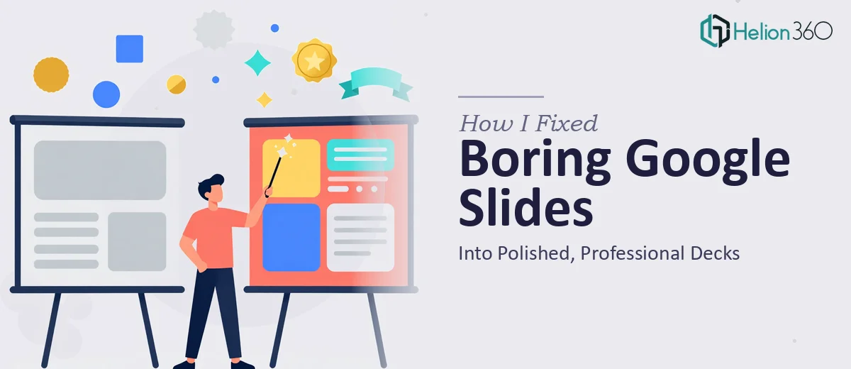
The Problem With My Presentations Was Costing Me Credibility
I run a small but growing business, and presentations are part of every client conversation I have. Proposals, service overviews, quarterly updates — I was building them all in Google Slides, and they looked exactly like what they were: slides thrown together by someone who knows the content but doesn't know design.
The decks were technically functional. The information was accurate. But the moment I'd share my screen in a client meeting, I could feel the visual gap between what I was presenting and what a polished, professional business looks like. That gap has real consequences — it affects how seriously people take you, how much they trust the numbers on screen, and whether they see your company as buttoned-up or still figuring things out.
I knew the presentations needed to be fixed properly, not patched. And I knew that "properly" was more involved than I initially assumed.
What I Discovered Good Presentation Design Actually Involves
When I started researching what professional Google Slides design actually requires, a few things stopped me in my tracks.
First, it isn't just about making things look prettier. A well-designed deck has a visual hierarchy that guides the viewer's eye — heading sizes, spacing rules, and text weight choices that aren't arbitrary. Done correctly, these follow a strict typographic scale: typically a 36pt/24pt/16pt hierarchy across title, subhead, and body that signals to the reader where to look and in what order.
Second, color isn't as simple as picking a palette you like. Effective presentation color work involves limiting the palette to three to four brand-aligned colors, understanding contrast ratios for readability across projectors and screens, and applying those colors consistently across every single slide — backgrounds, text, chart fills, icon tints, and accent lines all need to follow the same rules.
Third, charts and data visuals are their own discipline. Choosing the wrong chart type for a data set (a pie chart where a bar chart belongs, for instance) actively misleads the reader. Proper chart formatting inside Google Slides — cleaning up gridlines, standardizing label sizes, applying brand colors to series fills — is painstaking, manual work that multiplies across every data slide in the deck.
By the time I understood what doing this well actually required, I wasn't surprised that my own attempts had fallen short.
What the Work of Fixing a Google Slides Deck Actually Looks Like
The first thing that needs to happen is a structural and narrative audit of the existing deck. This means reading every slide not just for accuracy but for logical flow — does the story move clearly from problem to solution to evidence to ask? Slides that carry too much text get broken apart; slides that are underdeveloped get expanded or cut. The practitioner working this phase is essentially functioning as both an editor and an information architect, and the decisions made here determine whether the visual work that follows actually lands. Rushing this stage almost always produces a deck that looks better but still doesn't communicate clearly.
The visual mechanics phase is where the slide master and layout grid get rebuilt from the ground up. A standard approach uses a 12-column grid applied through the slide master, so that text blocks, images, and chart containers all snap to consistent positions across the entire deck. Typography gets locked to a defined scale — 36pt for titles, 24pt for section headers, 16pt for body text — and font choices are limited to two complementary typefaces. For someone who hasn't worked inside Google Slides' master editor before, this phase alone can consume a full working day of trial and error, especially when existing content keeps breaking the new grid.
Polish and consistency is the final phase, and it's where many self-directed attempts quietly fall apart. Every chart series, icon, and accent element needs to be re-colored to match the brand palette — typically no more than four colors, applied with deliberate purpose across all slides. Image treatments need to be standardized: consistent crop ratios, matching corner radii if rounded frames are used, and uniform opacity on any overlay elements. Running this consistency check across a 20- to 30-slide deck is methodical, detail-intensive work. Miss even a handful of slides and the overall impression of professionalism breaks down immediately.
Why I Brought Helion360 In to Handle the Full Project
Once I understood what the work actually involved, attempting it myself wasn't a realistic option. I didn't have the design background, I didn't have the tooling set up, and I certainly didn't have the hours to spend learning Google Slides' master editor from scratch while also running my business.
Helion360 handled the full project end-to-end — structural narrative cleanup, slide master rebuild, typography system, chart reformatting, and full polish pass across every slide. They turned the work around quickly, in a fraction of the time it would have taken me to learn and execute it myself. What I handed over was a disjointed, visually inconsistent set of slides. What came back was a cohesive, professional deck with a design system I could actually maintain going forward.
The speed mattered as much as the quality. I had client meetings coming up and no runway to iterate through weeks of revisions on my own.
The Result and What I'd Tell Anyone Seeing the Same Problem
The delivered deck looked like it came from a company operating at a level above where I actually am — which is exactly the impression you want to make when you're growing. Client conversations felt different. The materials were doing work I hadn't been able to do before: signaling organization, attention to detail, and professionalism before I'd said a word.
The bigger lesson was simpler: the gap between a Google Slides deck that looks "fine" and one that looks genuinely professional is wide, and closing it takes real design skill and time. If you're seeing what I saw — polished, professional business presentations that are technically correct but visually undermining your credibility — and you want it handled properly without the weeks of trial and error, consider how transforming cluttered PowerPoint presentations or converting complex PDFs into accessible presentations might restore the credibility your materials deserve. Helion360 is the team I'd bring in — they delivered fast, handled every layer of the work, and the result spoke for itself.