

The Pitch Was Real and the Stakes Were Higher Than I Expected
We had just launched our first product line and landed a meeting with a room full of investors. The timeline was tight — about two weeks from confirmation to presentation day. I needed a pitch deck that would carry the full weight of our story: the problem we solve, our competitive edge, market data, early traction, the team, and a clear ask.
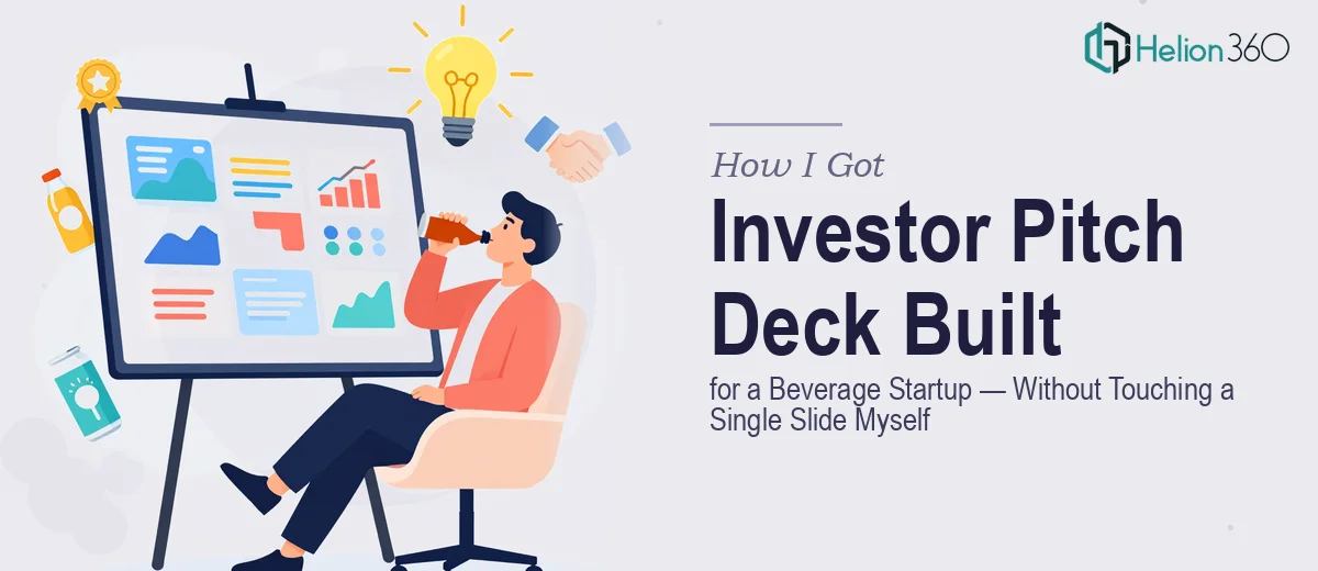
This wasn't a classroom exercise. The deck was going to be the first serious impression these investors got of our company. A generic template with misaligned text and stock chart aesthetics wasn't going to cut it. I needed something that looked like we'd already figured out what we were doing — because in most of the ways that mattered, we had. The presentation just had to prove it.
I knew immediately this needed to be done right, not done fast by whoever had a spare evening.
What I Found a Professional Investor Pitch Deck Actually Required
When I started researching what separates a forgettable pitch deck from one that actually moves investors, a few things stood out quickly.
First, the structure is non-negotiable. Investors read dozens of decks. The narrative arc — problem, solution, market, traction, team, ask — has to flow without gaps or redundancy, and each slide has to earn its place. Getting that right isn't a layout task; it's an editorial one.
Second, data visualization is where most decks fall apart. Market size charts, competitive positioning maps, traction graphs — these need to be legible, honest, and visually credible at a glance. A bar chart pasted from a spreadsheet doesn't do that job.
Third, brand consistency across 15 to 20 slides is harder than it looks. Font hierarchy, color palette discipline, icon style, image treatment — if any of these drift between slides, the deck starts to feel amateur, even if the content is strong. For a beverage brand with a specific visual identity, this layer of craft matters enormously.
I could see the scope clearly. This was not something I was going to pull off in a weekend.
What the Work Actually Involves
The foundation of a strong investor pitch deck is the narrative structure. The right approach starts with a full audit of the available content — product positioning, market research, competitive landscape, early user data — and maps it against a proven story arc. For a startup deck, that typically means 12 to 16 slides with a strict one-idea-per-slide rule. Each slide has a single message, supported by one visual and minimal text. Getting the arc right requires editorial judgment: knowing what to cut, what to lead with, and where the emotional high points of the story belong. This is where most self-built decks stall — the content exists, but the sequencing doesn't hold investor attention past slide four.
Visual mechanics are the layer that determines whether the deck looks credible or cobbled together. A proper slide layout uses a 12-column grid with consistent margin gutters — typically 40px on a 1920×1080 canvas — and a three-level type hierarchy: 36pt for headlines, 24pt for subheads, 16pt for body or callout text. Data visualizations require chart types matched to the story each data point tells: a TAM/SAM/SOM breakdown calls for a nested circle diagram, not a pie chart; a traction timeline calls for a slope chart, not a table. Recreating these cleanly inside PowerPoint or Illustrator, with correct proportions and readable labels, takes precision. A practitioner working in these tools daily moves through this in hours; someone learning as they go can lose days.
Brand application across a full deck is the layer that ties everything together. For a beverage brand, the design system typically draws from packaging — the primary palette is usually 3 to 4 brand colors with one neutral, and photography style needs to stay consistent across every slide that uses imagery. Applying this correctly means updating master slides first, then carrying the palette and style rules into every content slide without drift. The execution friction here is real: a change to one master element can cascade incorrectly through dependent slides if the file architecture isn't set up cleanly from the start. Without that discipline built in from the beginning, the back half of the deck starts to visually diverge from the front.
Why I Brought in Helion360 to Handle It
Looking at what the work actually required — the editorial structuring, the data visualization layer, the brand system application across 15-plus slides — I recognized immediately that attempting this myself wasn't a realistic option. Not with this timeline, and not with an audience that would notice the difference.
I brought in Helion360 to handle the full project end-to-end. They took the raw materials — our positioning notes, market data, product visuals, and brand guidelines — and built the complete deck from the ground up. The narrative structure was mapped and refined before a single layout was touched. The data slides were designed with the right chart types for each story. The brand system was applied cleanly across every slide, from the cover through the team page to the closing ask.
The whole thing was turned around quickly — done in days, not weeks, and handled in a fraction of the time it would have taken me to learn and execute it myself. They do this kind of work at depth, with the tooling and process already in place.
What the Deck Delivered and What I'd Tell Anyone in the Same Spot
The final deck was clean, coherent, and exactly the right length. Every slide had a clear job to do, the data visualizations were sharp and readable, and the brand felt consistent from the first slide to the last. Walking into that investor meeting, the presentation matched the quality of what we were actually building — which is exactly what it needed to do.
If you're looking at an investor pitch meeting on a short timeline and you can see what this kind of deck actually takes to do well, Helion360 is the team to engage — they deliver fast, handle the full depth of execution, and bring the kind of structured process that turns raw content into a presentation that holds up in the room.