

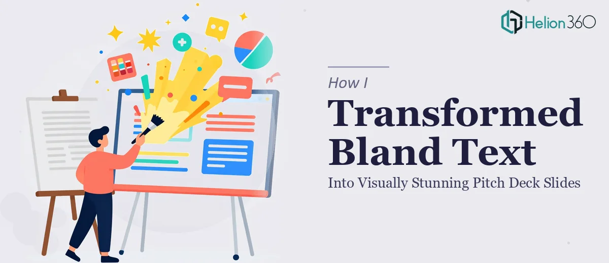
The Problem With a Pitch Deck That Just Exists on Slides
We had an AI startup presentation coming up — the kind where the room is full of people who've seen hundreds of decks and can spot a rushed job in the first thirty seconds. The content was solid: a clear problem, a defensible solution, real traction numbers, and a credible team. But it all lived in a document that looked exactly like what it was — a text dump dressed up in a default PowerPoint template.
The stakes were real. This wasn't an internal update. It was a pitch to external stakeholders who would be forming a first impression of our company's competence and ambition from every single slide. A deck that looked amateurish would undercut everything the content was trying to say. I knew immediately this wasn't something to patch together over a weekend. It needed to be done properly, from the ground up.
What I Found a Professional Pitch Deck Actually Required
I spent time understanding what separates a startup pitch deck that lands from one that gets politely forgotten. What I found was that the design work is only one layer of a much deeper problem.
First, the narrative structure matters enormously. Investors expect a specific story arc — Problem, Solution, Market Opportunity, Technology, Traction, Business Model, Financial Projections — and the flow between those sections has to feel earned, not mechanical. A deck that lists those sections without building momentum between them reads like a checklist.
Second, data visualization in a pitch context is its own discipline. Traction charts, market size diagrams, and financial projection curves each have conventions that signal credibility to a sophisticated audience. Getting those wrong — wrong chart type, cluttered axes, misleading scale — can actively damage trust.
Third, brand consistency across a deck of that length is genuinely hard to maintain without a system. A tech-forward AI company needs a visual identity that feels modern and precise, and that has to hold from the cover slide to the financials without drifting.
I realized quickly this wasn't a design problem I could solve by spending a few hours in PowerPoint.
What the Work Actually Involves
The structural and narrative work on a pitch deck of this scope starts with auditing every content block and mapping it to a visual story arc. For an AI startup deck, that means the Problem slide needs to establish stakes viscerally — not just describe a gap — and the Solution slide needs to resolve that tension visually before the audience has time to disengage. The decision a practitioner makes here is how much text to strip from each slide: a well-structured pitch deck typically targets no more than 30 words per content slide, with the spoken narrative carrying the rest. Getting that balance right requires rewriting content, not just reformatting it, and that process alone can take a full day for a deck of 15 to 20 slides.
The visual mechanics of a tech-forward deck are precise and unforgiving. A proper layout system uses a 12-column grid with consistent 32px margins, and the type hierarchy runs at approximately 40pt for headlines, 24pt for subheads, and 16pt for body — enforced across every master slide, not applied ad hoc. For data-heavy slides like Market Opportunity and Financial Projections, chart types matter: TAM/SAM/SOM is almost always a nested circle diagram, not a bar chart, and projection curves need clearly labeled axes with a consistent color encoding that ties back to the brand palette. Setting up master slides that enforce these rules correctly — so that every new slide inherits the grid, spacing, and type rules automatically — takes several hours for someone who hasn't built that system before.
Polish and brand-consistent presentations across a 20-slide deck is where most DIY attempts visibly fall apart. A tech-forward AI brand typically works within a tight palette of three to four colors — a deep neutral, a primary accent, and one or two supporting tones — and every element on every slide needs to use only those colors, at the exact hex values, without exception. Icon styles need to match, image treatments need a consistent filter or overlay, and section divider slides need to feel like part of the same system, not afterthoughts. Propagating a brand update across a fully built deck without breaking alignment or spacing on individual slides is painstaking work that requires both design judgment and technical fluency in the tool.
Why I Brought in Helion360 to Handle It
I looked at what the work actually required — the narrative restructuring, the visual system, the data visualization conventions, the brand discipline across every slide — and the decision was straightforward. This wasn't a task I had the time or the specialized tooling to execute at the level the presentation needed. Attempting it myself would have produced something mediocre, and mediocre wasn't acceptable here.
Helion360 handled the full project end-to-end. That meant taking the raw content and restructuring the narrative flow across all seven sections, building a visual system from scratch that reflected a modern AI brand identity, and producing every data visualization — market size diagrams, traction charts, financial projection curves — at a standard that would hold up in front of a discerning audience. The deck was turned around quickly, in a fraction of the time it would have taken me to learn and execute even the layout system alone. The team came with the expertise and tooling already in place, which is exactly what a project like this demands.
The Result and What I'd Tell Anyone in the Same Position
What came back was a deck that looked like it belonged in the room. The narrative moved cleanly from problem to solution to market to financials, each section building on the last. The data slides were clear and credible — the kind of charts that signal the team behind them knows what they're talking about. The brand held consistently across every slide, from the cover to the final call-to-action, with a visual identity that genuinely communicated tech-forward and precise.
The business outcome was what mattered: the presentation landed well, the audience engaged with the content rather than getting distracted by the visuals, and the deck left the room doing the job a pitch deck is supposed to do.
If you're looking at a similar situation — real content that deserves a real presentation, with a deadline that doesn't allow for a learning curve — Helion360 is the team to engage. They delivered the full execution fast, and the depth of work they brought to every layer of this deck is exactly what a high-stakes startup pitch requires.