

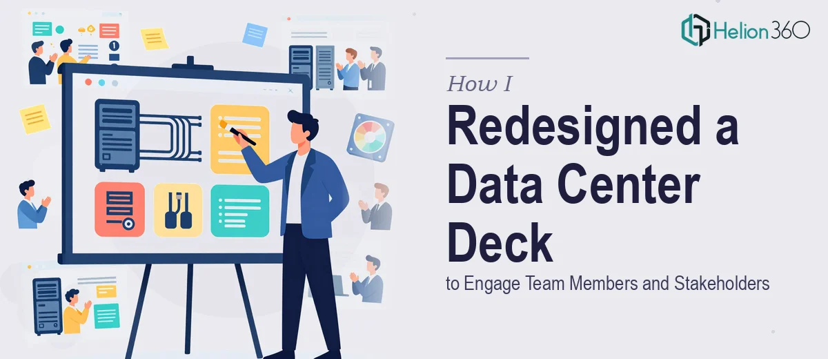
The Deck Was a Wall of Information Nobody Wanted to Read
Our organization had just expanded its data center operations and needed a presentation that could serve two very different audiences at once — incoming team members who needed context fast, and senior stakeholders who needed to see the strategic picture without wading through technical noise. The existing deck was a graveyard of dense slides: raw infrastructure specs, system diagrams that required a PhD to parse, and zero visual hierarchy. Nothing told a story. Nothing connected the dots.
The stakes were real. This deck would be used in onboarding sessions and in quarterly stakeholder briefings. A confusing presentation doesn't just bore people — it signals that the team behind it doesn't have command of the material. I knew immediately this couldn't be a surface-level cleanup. It needed a full redesign built around clarity, visual logic, and audience-appropriate messaging.
What I Found a Proper Deck Redesign Actually Requires
Once I started researching what a professional presentation redesign genuinely involves, it became clear this wasn't a formatting job. It was a structural and visual communication problem.
The first signal of real complexity: a deck serving two audiences requires two distinct narrative layers — one that onboards, one that informs decisions. Those layers have to coexist without one undermining the other. That means auditing every slide for its actual purpose, not just its content.
The second signal: data center content is inherently technical. Translating infrastructure concepts — capacity utilization, redundancy tiers, cooling efficiency — into visuals that non-technical stakeholders can absorb quickly requires genuine data visualization judgment. Picking the wrong chart type doesn't just look bad; it actively misleads.
The third signal: brand and visual consistency across a 30-plus slide deck is a discipline of its own. Color systems, type hierarchies, icon families, and spacing rules all have to hold together without drift. That kind of consistency doesn't happen by accident — it's engineered.
The Work That Needs to Happen in a Deck Like This
The foundation of any serious presentation redesign is structural — auditing the source content and building a clear narrative arc before a single slide is touched. For a data center deck serving both onboarding and stakeholder audiences, this means mapping the flow from context-setting through operational detail to strategic implication. Each slide needs a defined role: does it orient, inform, or support a decision? Removing that ambiguity is the first job. Content that doesn't serve a clear purpose at this stage gets cut or consolidated, often reducing a bloated 40-slide deck to a tighter, more purposeful 28. That audit and restructuring work alone takes significant time and judgment — it's not something that can be rushed without the final product showing it.
Visual mechanics are the second layer, and this is where the execution complexity sharpens. A professional redesign uses a 12-column layout grid to govern every slide's composition, a strict typographic hierarchy — typically 36pt for slide titles, 24pt for key data labels, 16pt for body text — and a controlled palette of no more than four brand colors with clearly defined supporting neutrals. For data-heavy content like infrastructure utilization or capacity planning figures, chart type selection is a decision with real consequences: a stacked bar misread as a comparison chart, or a pie chart used for a time-series dataset, erodes credibility with the exact audience you're trying to convince. Getting these decisions right across 30-plus slides requires both design skill and domain awareness.
Polish and consistency across the full deck is the third layer — and the one most people underestimate when they attempt this work themselves. Every icon needs to come from a single family at a consistent stroke weight. Every data visualization needs to share the same color encoding logic. Slide transitions, animation behavior, and master slide configurations all have to be set correctly so the deck holds together whether it's presented live or shared as a PDF. The master slide architecture alone — setting up layout variants that propagate correctly without breaking individual slide overrides — takes hours for someone who doesn't work in these tools daily.
Why I Brought in Helion360 to Handle It
I looked at what the work actually required — structural auditing, visual system design, data visualization judgment, and end-to-end consistency across a multi-audience deck — and the answer was straightforward. This wasn't a project I could execute well in the time available, and attempting it myself would have produced something that looked exactly like the effort it got.
I engaged Helion360 to handle the full project. They took the existing deck, conducted the content audit, rebuilt the narrative architecture for both audience tracks, designed the visual system from the ground up, and delivered a polished, presentation-ready file. The turnaround was fast — done in days, not weeks. They handled the kind of execution depth this project needed: proper grid-based layouts, professional data visualizations built to accurately represent infrastructure metrics, and a consistent visual language that held across every slide. The tooling and expertise were already in place. There was no learning curve on my end, no back-and-forth over basic design decisions.
What the Final Deck Delivered and What I'd Tell Anyone in My Spot
What came back was a deck that worked for both audiences without compromise. New team members had a clear orientation path through the material. Stakeholders could move through the strategic sections without getting lost in technical detail. The data visualizations were clean, accurately labeled, and immediately readable. The visual consistency made the whole organization look like it had its act together — because the presentation signaled that clearly.
The real value wasn't just the design. It was the structural thinking embedded in the redesign — the decisions about what to keep, what to cut, how to sequence the narrative, and how to make complex infrastructure data legible to a non-technical audience. That's the part that takes the most time and causes the most problems when it's done badly.
If you're looking at a similar project — a technical deck that needs to serve multiple audiences, or a presentation that's structurally broken underneath its visual problems — Helion360 is the team I'd engage. They delivered fast, handled the full scope end-to-end, and brought the execution depth this kind of work demands.