

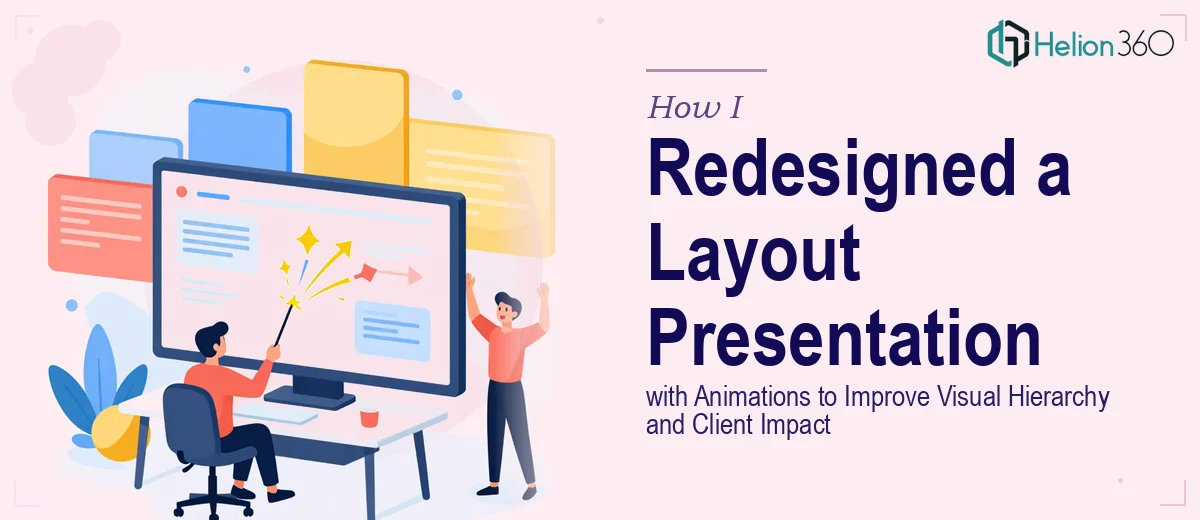
The Presentation Wasn't Landing — and I Knew Why
I had a design layout presentation that looked fine on paper but fell completely flat in the room. The slides were dense, the hierarchy was muddy, and nothing guided the eye from point to point. Clients were politely nodding, but I could tell the content wasn't hitting the way it should. The stakes were real — these were decision-maker conversations where first impressions shaped whether we moved forward or didn't.
I looked at the deck and recognized two compounding problems: the visual structure wasn't doing the story any favors, and the absence of purposeful animation meant every slide landed like a static wall of content. There was no pacing, no emphasis, no sense of sequence. I knew immediately this wasn't something I could patch with a few tweaks on a Saturday morning. Getting it right — the kind of right that actually moves a client — required a fundamentally different approach.
What Doing This Well Actually Required
I started researching what a properly animated, visually structured presentation actually involves, and the scope came into focus fast. Professional PowerPoint animation isn't decorating slides — it's a choreography problem. Each element needs an entrance, a purpose, and a timing that matches how a presenter talks through the content. That's entrance sequences, motion paths, timing offsets, and trigger logic — all applied consistently across dozens of slides.
On top of that, fixing visual hierarchy isn't just choosing a bigger font. It means establishing a clear typographic scale — something like 36pt headers, 24pt subheads, 16pt body — and enforcing it across every master slide so changes propagate correctly. Then there's the layout grid underneath it all, which controls how text, images, and data elements align and breathe.
Three things signaled to me that this was real complexity: the number of interdependencies between slide masters and individual slides, the precision required to make animation feel smooth rather than gimmicky, and the fact that device-to-device rendering differences can silently break everything after the fact.
The Work That Needs to Happen
The right approach to a project like this starts with an honest audit of the existing structure. A practitioner needs to map every slide against the intended narrative arc — identifying where the story stalls, where information is competing for attention on a single slide, and where the sequence of reveals needs to match the verbal flow of a live presentation. This structural pass often means consolidating content, splitting overloaded slides, and reordering sections before a single animation is applied. Getting this wrong at the start means animating a broken story, which no amount of motion will fix.
Visual mechanics are where the real technical depth lives. Proper hierarchy means committing to a typographic system — typically a three-level scale applied through slide masters — so that headings, supporting points, and captions are instantly readable at a glance. Layout grids, usually a 12-column or 8-column structure, govern how elements are placed so that alignment is intentional rather than approximate. For someone who hasn't built a properly linked master slide system before, establishing this foundation and propagating it correctly across a full deck can easily consume a full workday before any design work begins.
Animation sequencing is the layer that most people underestimate. Done well, it means assigning entrance animations with deliberate timing offsets — often 0.3 to 0.5 second delays between related elements — so that content appears in the order a presenter would naturally speak it. Custom motion paths, emphasis effects, and trigger-based reveals require per-element configuration that compounds quickly across a large deck. One missed trigger or misaligned duration disrupts the entire rhythm of a slide, and catching those inconsistencies requires reviewing the deck in presentation mode, slide by slide, more than once.
Why I Brought in Helion360 to Handle It
I didn't attempt this myself. The moment I understood what the work actually involved — the master slide architecture, the typographic system, the animation sequencing across every slide — it was clear that the gap between where I was and where this needed to be was not a gap I could close with the time I had available.
Helion360 handled the full project end-to-end. That meant the structural audit of the existing deck, the rebuild of the slide master system with proper hierarchy and grid, and the animation layer applied across all slides with consistent timing and sequencing. They turned it around quickly — done in days, not weeks — which mattered because the next client meeting wasn't moving.
What made the difference was that this is the kind of work Helion360 does continuously. The tooling, the process, and the judgment calls about what animation serves the content versus what distracts from it — all of that was already in place. I didn't have to figure any of it out.
The Result and What I'd Tell Anyone Looking at the Same Problem
The delivered deck was a different experience than what I started with. The hierarchy was immediately readable — clients could orient themselves on each slide within seconds. The animations guided attention through the content in the order it was meant to land, without ever feeling like a slideshow effect for its own sake. The next client meeting ran noticeably differently. People were tracking the content, asking questions at the right moments, and engaging with the material rather than trying to parse it.
The business outcome was straightforward: a presentation redesign that had been creating friction started doing the job it was supposed to do.
If you're looking at a similar situation — a deck that structurally isn't working, animations that need to be done with real precision, and a timeline that doesn't allow for a learning curve — Helion360 is the team I'd engage. They handled the full scope fast, and the execution depth this kind of work requires was already built in.