

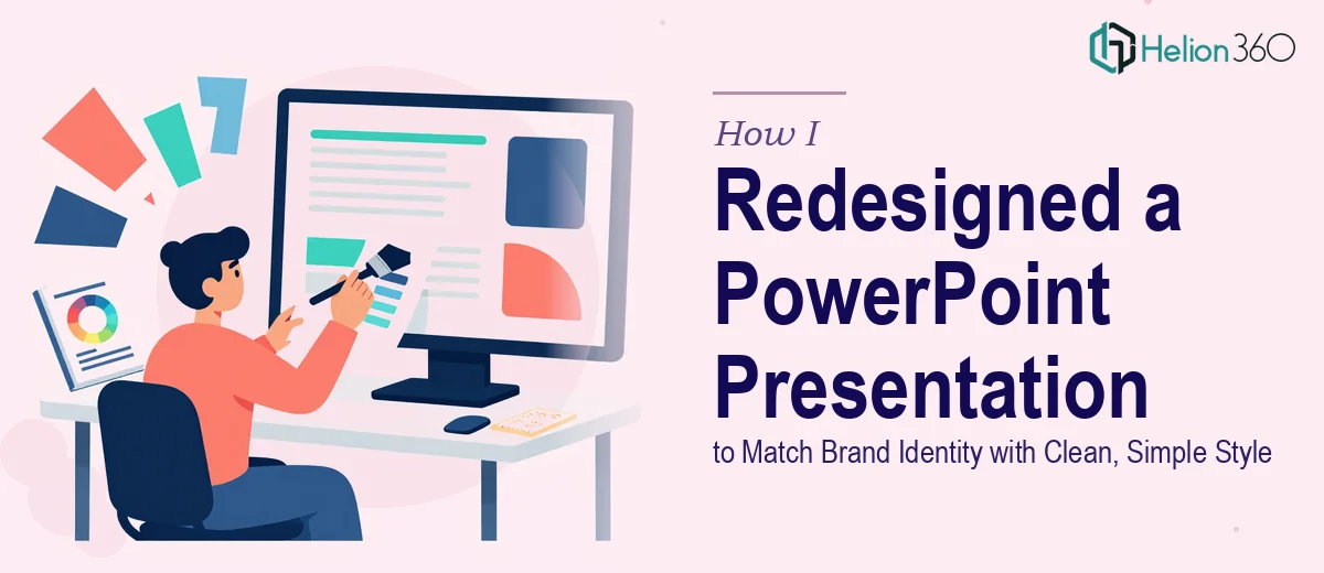
The Presentation Was Fine. The Brand Alignment Was Not.
I was handed an existing PowerPoint deck that had solid content — good data, the right messaging, a clear narrative. But visually, it looked like it had been built in three different sittings by three different people. Fonts clashed, colours were inconsistent, and the layout felt nothing like what the company projected on its website or in its other pitch materials.
The task was straightforward on paper: revamp the presentation design to match the company's brand identity, keep it clean and simple, and make it feel like a cohesive, professional deck. But the challenge was in the details.
Why I Couldn't Just Fix It Myself
I started by pulling up the company's website and existing reference materials. I tried mapping the colour tones manually — pulling hex codes, setting up a new slide master, rearranging layouts. I made progress, but the results kept feeling off.
The issue wasn't technical. It was aesthetic judgment. Knowing which shade of the brand colour to use as a background versus an accent, how much white space was enough, how to visually represent a process without making it look cluttered — these decisions require a trained eye for graphic design, not just PowerPoint skills.
I also ran into a language precision problem. Some of the slides had graphics and labels that needed to communicate specific ideas accurately. A designer with strong English comprehension and a sense of context was essential to get those visual metaphors right.
After spending more time than I had available on slide three alone, I decided to bring in expert support.
Bringing In the Right Support
After hitting that wall, I came across Helion360. I explained the situation: existing content, a clear brand reference from the company website, reference pitching materials, and a need for a clean, simplified visual style. Their team asked the right questions upfront — what tone the company wanted to project, how dense the existing slides were, and what the presentation would be used for.
That level of upfront clarity made a real difference in what came back.
What the Redesign Process Actually Looked Like
The Helion360 team started by extracting the brand identity from the company's website — primary and secondary colours, typography conventions, spacing patterns, and the overall visual tone. They used the reference pitch materials to understand what a polished version of this company's communication style looked like.
From there, they built a custom slide master in PowerPoint that locked in the correct fonts, colour palette, and layout grid. Every slide was then rebuilt within that system rather than patched.
For the more complex slides — process flows, comparison sections, and any slide with multiple data points — they restructured the visual hierarchy so the eye moved naturally through the information. Dense bullet-point slides were broken into cleaner layouts with supporting icons and balanced spacing.
The graphics were redesigned with attention to what each one was actually trying to say. Because the designers understood the English context of the content, the visual choices supported the message rather than just decorating around it.
The Before and After
The original deck felt like a working document. The redesigned presentation looked like something you'd confidently open in front of a boardroom or a potential investor. Same content. Completely different experience.
Colours were consistent from slide one to the last. The typography was clean and readable at any screen size. Each layout had breathing room. The brand identity that lived on the company's website was now reflected — properly — in the presentation.
What I Took Away From This
Presentation redesign for brand alignment is more than applying a colour scheme. It's about making every visual decision — from icon style to text weight to spacing — reflect the same identity consistently. That requires both design sensibility and a clear understanding of the content being communicated.
When the complexity of a project outpaces what you can manage alone, the smartest move is to hand it to people who do this every day. The output I received from Helion360 saved significant time and delivered a result I could not have matched independently.
Need Help Aligning Your Presentation to Your Brand?
If your existing deck doesn't reflect how your company actually looks and feels — or if you've inherited a presentation that needs a clean, professional redesign — Helion360 can take it from there. Their team handles the design complexity so you can focus on the message.