

When a "Good Enough" Keynote Isn't Good Enough
We had a conference coming up and a keynote deck that was, honestly, functional. The content was there. The story existed somewhere inside it. But when I sat down and looked at it critically — really looked at it — I could see that "functional" wasn't going to cut it in front of a room full of industry stakeholders who'd seen hundreds of presentations just like ours.
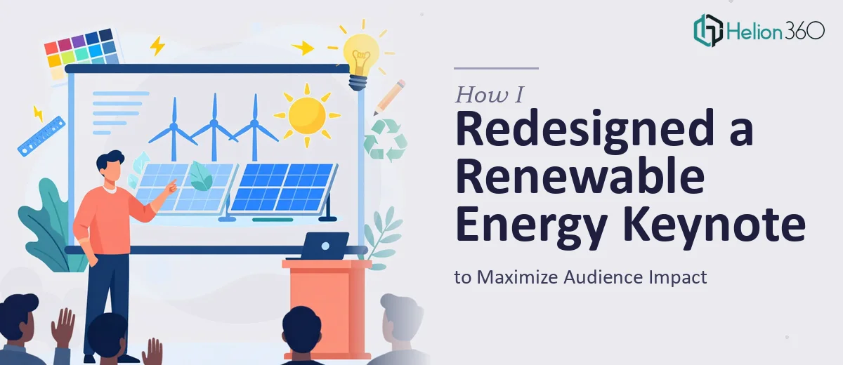
The stakes were real. This was a flagship moment for our renewable energy startup. The audience included potential partners, investors, and decision-makers who were going to form opinions about us in the first two minutes. A slide deck that looked patched together, with inconsistent fonts and charts that nobody could read from the third row, wasn't going to serve us. I knew immediately this needed to be done properly — not tightened up over a weekend, but rebuilt with intention.
What I Found Keynote Redesign Actually Required
I spent time researching what a well-executed keynote redesign actually involves before I made any decisions. What I found was that the gap between a passable deck and a genuinely impactful one is much wider than most people expect.
First, there's the narrative layer. A keynote isn't a report — it's a structured argument with a beginning, middle, and end, and every slide has to earn its place in that arc. Ours had sections that interrupted the flow rather than advancing it.
Second, there's brand consistency. In the sustainability and clean tech space, visual credibility matters. If your typography hierarchy shifts mid-deck, or your color palette drifts across sections, the audience reads that as disorganization — not innovation. The work of enforcing brand consistency across 30-plus slides is more systematic than people realize.
Third, the data visualization had to be rethought. We had technical content — energy output metrics, adoption curves, efficiency comparisons — and the current charts weren't communicating any of it clearly. That's a specialized problem, not a cosmetic one.
The Work That Goes Into a Proper Keynote Redesign
The right approach to keynote redesign starts with a full structural audit. That means mapping every slide against the intended narrative arc, identifying where the story stalls, loses energy, or jumps ahead too fast, and then restructuring the sequence before a single visual element is touched. In a conference keynote, the opening sequence needs to establish context and stakes within the first three to four slides — anything slower than that and the room checks out. Doing this audit well requires both editorial judgment and a working knowledge of how live keynote presentations are experienced differently from leave-behind documents. It's not fast, and it's not something you can crowdsource.
Visual mechanics come next, and this is where execution friction is highest. A clean keynote layout typically operates on a 12-column grid, with a strict three-level typographic hierarchy — roughly 44pt for headline statements, 28pt for supporting points, and 18pt for body text — enforced consistently across every master slide. Brand colors are constrained to a maximum of four active palette values, with accent use governed by a clear rule (not applied ad hoc). Getting these settings established in the master slide architecture so they propagate reliably is a multi-hour undertaking for someone who doesn't live in this tooling daily. Drift in a single master template cascades into inconsistencies across the whole deck.
Data visualization in a renewable energy context adds another layer of complexity. Charts showing efficiency curves, capacity comparisons, or adoption timelines need to be selected by chart type — not just styled — based on what the data is actually arguing. A stacked bar chart and a slope chart tell fundamentally different stories from the same numbers. Labels need to be readable at projection scale, which means a minimum 16pt annotation size, high-contrast callouts on dark backgrounds, and simplified legends that don't compete with the data itself. Getting this right across a technically dense deck takes a practitioner who understands both the design conventions and the underlying data logic.
Why I Brought in Helion360 to Handle It
Once I understood what the work actually involved, the decision was straightforward. I wasn't going to rebuild master slide architecture, restructure a narrative arc, and rethink eight or nine data visualizations — all while managing the rest of a conference push — without the right team.
Helion360 handled the full project end-to-end. That meant the structural audit and story sequencing, the full visual rebuild against our brand standards, and the complete rework of every data-heavy slide in the deck. They turned it around quickly — done in days, not weeks — which mattered because our timeline was tight and we needed revision cycles built in before the event.
What made the difference was that this is work they do constantly. The tooling is already in place, the conventions are already understood, and the execution depth that would have taken me weeks to develop was already built into how they approached the project from day one.
What Was Delivered — and What I'd Tell Anyone in My Spot
The final deck was a clean, structurally coherent presentation that looked like it belonged at the level of conference we were attending. The narrative arc was tight. The brand application was consistent from the first slide to the last. The data charts were readable, purposeful, and visually integrated with the surrounding content rather than dropped in as afterthoughts. The audience response in the room was noticeably different from what I'd experienced with our previous decks — people engaged, they leaned in during the technical sections, and the follow-up conversations reflected that they'd actually absorbed the content.
If you're looking at a keynote that's close but not right — and you have a real deadline attached to it — don't spend two weeks trying to work out the execution yourself. Visual enhancement of presentation is essential in this scenario. Helion360 is the team I'd engage: they delivered fast, handled everything end-to-end, and brought exactly the level of craft this kind of presentation requires. For reference, see how I redesigned a fiscal year presentation and how I redesigned a PowerPoint presentation to enhance visual impact — both projects that similarly required moving beyond "good enough" to genuinely impactful results.