

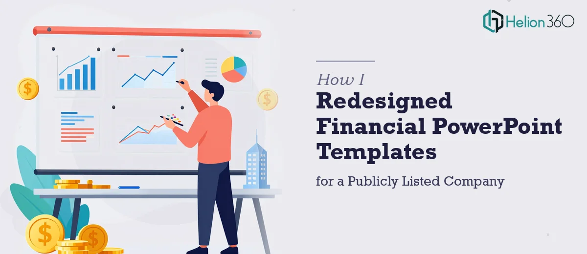
When the Old Templates Just Could Not Keep Up
I was handed a straightforward-sounding task: take the existing PowerPoint templates used for quarterly reports and financial presentations, and bring them up to standard. The company was publicly listed, which meant these slides went out to investors, board members, and analysts. The stakes were not small.
The current templates had clearly been built years ago and patched together over time. Layouts were inconsistent across slides, charts used different color schemes on different pages, and the branding felt more like a collection of past decisions than a deliberate identity. On top of that, some slides had data tables that were either broken or styled in ways that made the numbers harder to read than they needed to be.
I started by going through each template file systematically — identifying what could be salvaged and what needed to be rebuilt from scratch. Some of the master slide logic was tangled enough that editing one element would shift another unexpectedly. The interactive components the company needed, like clickable footnotes and hyperlinks to supporting financial documents, added another layer of complexity.
Where It Got Complex
I had a working knowledge of PowerPoint and understood the basics of master slides and theme settings. But corporate-level financial presentation design is a different discipline. Getting charts to render consistently across PC and Mac without formatting shifts, building a master slide structure that non-designers could actually use, and maintaining strict brand compliance throughout — all at the same time — was more than I could manage cleanly on my own without pushing the timeline.
I also realized that the visual language of a financial presentation for a publicly listed company carries specific expectations. Information hierarchy, data table formatting, legibility at projection scale — these details matter to an audience that reads financial documents professionally. Getting them slightly wrong would undermine the credibility of the work.
That is when I reached out to Helion360. I explained the scope: a full financial PowerPoint template rebuild, quarterly report layouts, branded charts and data tables, interactive elements, and cross-platform compatibility. Their team understood the requirements immediately and took it from there.
What the Rebuild Actually Involved
Helion360 approached it methodically. They started by auditing the existing files and mapping out what needed to be restructured at the master slide level before touching any individual layout. This was the right call — fixing the foundation first meant every slide built on top of it would behave consistently.
The chart and data table work was handled with the financial audience in mind. Clean grid structures, readable type sizes, consistent color application tied to the brand palette. Nothing decorative for its own sake — every visual decision was in service of clarity.
The interactive features were integrated cleanly. Clickable footnotes linked to the right reference points, and the navigation structure made sense for a presenter moving through a quarterly report in front of a live audience. The templates were also tested across both PC and Mac environments to catch any rendering inconsistencies before delivery.
The Outcome
What came back was a coherent template system — not just a set of prettier slides, but a proper framework the internal team could actually maintain going forward. The brand guidelines were embedded into the master structure, so future users could not easily break the design by accident. The quarterly report layout in particular looked like something a publicly listed company should be using: clear, professional, and easy to navigate.
The biggest thing I took away from this was understanding the difference between knowing a tool and knowing how to apply it at a professional standard. PowerPoint template design at this level is genuinely a specialist skill, especially when financial data presentation and cross-platform reliability are both in scope.
If you are working on something similar — a corporate financial presentation rebuild, a quarterly report template overhaul, or anything where brand consistency and data clarity both matter — Helion360 is worth a conversation. They handled the complexity I could not and delivered work that held up under scrutiny.