

The Product Launch Window Was Too Short to Get This Wrong
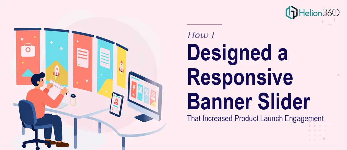
We had a product launch coming up fast, and the hero banner slider on our website was the first thing every visitor would see. It wasn't a decorative afterthought — it was the opening statement of the entire campaign. Done right, it would pull visitors toward our sales page. Done poorly, it would undermine the credibility of the launch before anyone even read a word of copy.
The brief was clear enough on the surface: a responsive banner slider, brand colors #FF6F91 and #34C759, a clean modern aesthetic, and a call-to-action button that converted. We needed at least five distinct design directions explored before locking anything in. The deadline was tight — two weeks from sign-off to final delivery. That left almost no room for false starts or learning-on-the-job experimentation.
I knew quickly that this wasn't something to improvise. A responsive banner slider for a product launch sits at the intersection of visual design, front-end behavior, and brand strategy. Getting all three right at once requires a level of craft and efficiency that only comes from doing this work repeatedly.
What I Found a Well-Built Banner Slider Actually Requires
Once I started looking into what proper responsive banner slider design involves, the complexity became obvious. It isn't just about making something look attractive on a single screen size. The design has to be architected so that it holds together across breakpoints — desktop at 1440px wide, tablet around 768px, and mobile at 375px — without the layout collapsing, the typography becoming illegible, or the CTA button disappearing into dead space.
Beyond responsiveness, there's the brand application problem. Two colors — #FF6F91 and #34C759 — sounds simple, but using them well across five distinct design concepts means understanding contrast ratios, how each color reads against light versus dark backgrounds, and how to create variation without drifting off-brand. Getting five genuinely different directions that all feel cohesive is a design problem in itself.
And then there's the CTA button — a small element that carries significant weight. Placement, size, contrast, and micro-copy all affect whether users click. Done carelessly, it blends in. Done with intent, it converts.
What the Design Work Actually Involves
The work starts with structural and narrative decisions — establishing what story each banner slide needs to tell and in what order. A banner slider isn't just a gallery of images; each slide has a visual hierarchy: a headline at roughly 48–56pt for desktop, a supporting subhead at 24–28pt, and a CTA at 16–18pt with sufficient padding around it. The typographic scale has to be intentional, and it has to compress correctly at smaller viewports without requiring the user to squint or scroll sideways. Getting this hierarchy mapped across five distinct concepts before a single pixel is placed takes real planning time — and misjudging it early creates rework at every stage after.
The visual mechanics layer on top of that structure. Each slide needs to work within a defined layout grid — typically a 12-column system — so that imagery, text blocks, and CTA buttons land consistently across breakpoints. With brand colors #FF6F91 and #34C759, the practitioner has to make deliberate choices about which color carries the primary action (typically the more energetic of the two) and which provides contrast or background tone. A maximum palette discipline of 3–4 applied tones keeps the designs from fragmenting across five concepts. Designers who skip this step produce concepts that look fine in isolation but feel inconsistent when presented side by side — which kills the client's ability to compare and choose confidently.
Polish and consistency across all five concepts is where the real time investment lives. Every design variant has to feel like it belongs to the same brand family while still being meaningfully different. That means aligning spacing rules (typically 8pt or 16pt base grid increments), keeping border radius, shadow depth, and button styling consistent across all variants, and ensuring that the CTA button passes a minimum 4.5:1 contrast ratio against its background on every slide. For someone without the templates, the muscle memory, and the QA checklist already built in, this alone can consume a full week.
Why I Brought Helion360 in to Handle the Full Project
I didn't attempt any of this myself. The moment I understood what doing it well actually required — five coherent design directions, responsive behavior across three breakpoints, brand color discipline, and a CTA button that earns its placement — it was obvious that the right move was to engage a team that already had this process built in.
Helion360 handled the project end-to-end. That meant translating the brief into a structured design framework, developing all five banner concepts with the correct typographic hierarchy and grid discipline, applying the brand colors with intentionality across every variant, and delivering assets that were production-ready. The turnaround was fast — done in days, not weeks — and the depth of execution was exactly what the launch required. There was no back-and-forth over basics, no version one that missed the brief, and no time lost to a learning curve.
A team that does this work all day already has the tooling, the templates, and the judgment in place. That's not something you replicate quickly.
The Result and What I'd Tell Anyone Facing the Same Situation
What came back was a set of five fully realized banner slider concepts — each visually distinct, each on-brand, each responsive and CTA-ready. The design that went live drove measurably stronger engagement during the launch window compared to the static hero we'd used previously. Visitors were moving toward the sales page at a higher rate, and the visual first impression matched the quality of the product behind it.
The cleaner outcome wasn't just aesthetic — it was about having a finished asset that was ready to deploy without a round of emergency fixes.
If you're looking at a similar situation — a tight deadline, a product launch that needs a strong visual entry point, and a design scope that's more complex than it first appears — Helion360 is the team I'd engage. They delivered fast, handled the full scope, and brought the kind of execution depth this work genuinely needs.