

The Brief Looked Simple Enough at First
When our product team decided we needed a dedicated desktop application for managing customer information and tracking orders, I volunteered to lead the build. The scope seemed manageable — four to five pages, a clean modern UI, and core functionality like user registration, a dashboard view, order tracking, and customer communication tools. It needed to run well on both Windows and Mac.
I had some frontend experience and felt confident enough to get started. A few days in, I realized the gap between "I can build a functional app" and "I can build a polished, scalable, responsive desktop application" was wider than I had expected.
Where Things Started to Get Complex
The first challenge was the responsive layout. A desktop application behaves very differently from a web app — managing window resizing, keeping UI components proportional, and maintaining a consistent experience across operating systems all required careful planning that went beyond my usual skill set.
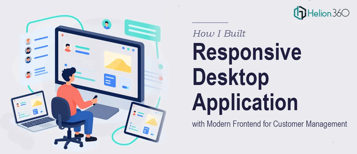
The dashboard view alone had multiple moving parts. It needed to display real-time customer data in a way that was visually clear and easy to scan. I tried building it with a React-based setup, and while the logic worked, the interface looked rough. Spacing was inconsistent, the component hierarchy wasn't clean, and the order tracking section felt cluttered no matter how I rearranged it.
I also underestimated how much thought goes into modern UI design at this level — things like component states, micro-interactions, and maintaining visual hierarchy across five distinct pages while keeping the experience cohesive. The frontend design wasn't just a coat of paint. It was structural.
Bringing in the Right Team
After about a week of incremental progress and growing frustration, I reached out to Helion360. I explained where I was — working code, but lacking the design polish and frontend architecture that the project deserved. Their team assessed what I had built, identified the gaps, and took it from there.
They restructured the component layout using a cleaner React architecture, introduced a consistent design system across all five pages, and resolved the cross-platform rendering issues that had been bothering me. The dashboard got a full visual overhaul — data was presented through well-organized cards and summary panels that made it genuinely easy to use. The order tracking page became a proper flow rather than a list of fields stacked on top of each other.
Every page — registration, dashboard, order tracking, customer profile, and the communication panel — now shared a unified visual language. Typography, spacing, color usage, and interactive states all felt intentional and consistent.
What the Final Application Looked Like
The finished desktop application was exactly what the brief had called for. It was responsive within the desktop environment, handled different screen sizes gracefully, and ran without visual inconsistencies on both Windows and Mac.
The customer management workflows were intuitive. A new user could register and land on a dashboard that immediately surfaced the most relevant information. Order tracking gave a clear view of status without overwhelming the interface. The communication tools were integrated naturally into the customer profile page rather than feeling like a separate module bolted on.
From a technical standpoint, the codebase was clean and structured in a way that would be easy to extend as the product grew. That scalability piece — which had been part of the original brief — was something Helion360 specifically addressed in how they organized the component structure.
What I Took Away from This
Building a responsive desktop application with a genuinely polished frontend is a different discipline than building a functional one. The logic and the data flow are one part of the problem. The visual design, the component architecture, and the cross-platform consistency are another part entirely — and they matter just as much when the tool is something your team will use every day.
I learned to be more honest early about where a project requires deeper expertise than I currently have. Getting the frontend right the first time saved the kind of rework that would have cost far more time down the line.
If you're working on a similar desktop application build and the frontend design is holding you back, Helion360 is worth a conversation — they stepped in at exactly the right point and delivered something the whole team was genuinely proud of.