

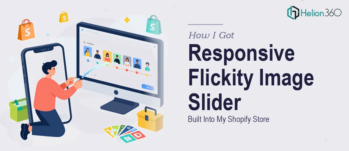
The Problem With My Shopify Product Images
I run an e-commerce store on Shopify, and the default image display just wasn't doing the job anymore. Products with multiple angles, lifestyle shots, and detail close-ups were being buried in a static grid that no one scrolled through. I needed a slider — specifically a Flickity-powered slider — that would showcase images in a way that actually matched how the brand presents itself.
The stakes were straightforward but real. We had a product launch coming up, the storefront needed to feel polished before traffic hit it, and the existing theme wasn't going to get us there without custom work. I knew what the end state needed to look like. What I didn't know was exactly how much was involved in getting from the current theme to a live, responsive, brand-consistent Flickity slider. So I looked into it.
What I Found the Solution Actually Required
Flickity is a well-regarded JavaScript slider library, but integrating it cleanly into an existing Shopify theme is not a drag-and-drop exercise. The first thing I realized is that Shopify themes have their own JavaScript architecture — they use their own asset pipeline, section schema, and sometimes their own slider logic already baked in. Dropping Flickity on top of that without understanding those conflicts creates bugs that are hard to diagnose.
The second complexity is responsive behavior. A slider that looks right on desktop can completely break on mobile if the image aspect ratios, container widths, and Flickity's contain and adaptiveHeight options aren't configured correctly for each breakpoint. That's not a one-setting fix — it requires testing across actual device sizes.
The third signal that this wasn't a quick task: brand consistency. The slider needed to match specific color, typography, and interaction patterns. Custom CSS had to be scoped carefully to avoid bleeding into other theme elements — a common problem when working inside a Shopify theme's global stylesheet.
What the Work Actually Involves
The right approach starts with a thorough audit of the existing Shopify theme's JavaScript and CSS structure. Many themes — particularly popular ones — already include a lightweight slider or carousel script. Before Flickity can be introduced, a practitioner needs to identify those conflicts, decide whether to disable the native script selectively or namespace Flickity's initialization to prevent collisions. This audit phase alone can uncover four or five edge cases that don't surface until testing. Skipping it means building on an unstable foundation, and the bugs that result tend to show up only in production.
Visual mechanics are where the real configuration depth lives. Flickity exposes a dense options object: cellAlign, wrapAround, autoPlay, pageDots, prevNextButtons, adaptiveHeight, lazyLoad, and more. Each choice has downstream consequences for how the slider behaves across breakpoints. Proper responsive implementation means writing breakpoint-specific initialization logic — typically using JavaScript matchMedia or a resize listener — so the slider reconfigures itself at mobile widths rather than simply scaling down. Image containers need explicit aspect ratio rules (commonly a 16:9 or 4:3 padding-trick wrapper) to prevent layout shift during load. Getting these settings right and stable across Chrome, Safari, and mobile browsers takes methodical iteration.
Polish and brand consistency is the final layer, and it's where a lot of DIY implementations fall short. Navigation controls — arrows and dots — need to be replaced with custom SVGs or CSS-drawn elements that match the brand's visual system. Button hover states, transition timing (typically 200–300ms ease), and active-cell highlight colors all need to be defined and scoped using specific CSS selectors so they don't inherit or override unrelated theme styles. On a Shopify theme, this means working inside the correct {% stylesheet %} block or a dedicated snippets file, not the global stylesheet, to keep changes maintainable and theme-update-safe.
Why I Brought in Helion360 to Handle It
Once I understood what the work actually involved, the decision was immediate. I didn't have the time to work through Shopify's theme architecture from scratch, and I certainly didn't have the hours to iterate through responsive breakpoint testing and cross-browser QA. This was a real technical project with real consequences if it shipped broken.
I engaged Helion360 to handle the full build. They took it end-to-end: theme audit and conflict resolution, full Flickity integration with correct responsive configuration, and all the custom CSS scoping needed to match the brand. The whole project was delivered fast — done in days, not the weeks it would have taken me to climb the learning curve myself. What I got back was a working, polished slider that behaved correctly across every device size I tested, with no visual bleed into the rest of the theme.
What I'd Tell Anyone Looking at the Same Problem
The Flickity slider itself is not the hard part. The hard part is the integration context — the Shopify theme's existing structure, the responsive configuration that actually holds up on real devices, and the CSS discipline required to keep everything brand-consistent without breaking other parts of the storefront. Each of those layers takes real time and real experience to get right.
The project outcome was exactly what was needed: a responsive image slider live on the storefront before the product launch, with no last-minute firefighting. If you're looking at the same kind of Shopify front-end work and want it handled properly without spending weeks on it yourself, Helion360 is the team to engage — they delivered the full build fast and brought the technical depth the work required.