

The Idea Was Simple. The Execution Was Not.
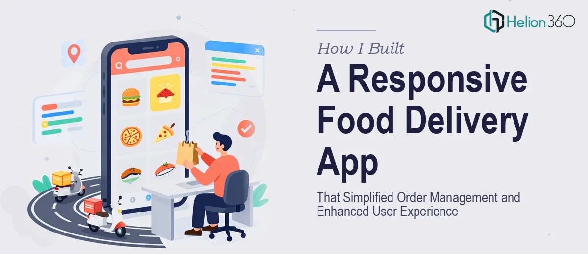
When our startup set out to build a food delivery app, the concept felt straightforward enough. We wanted a clean, responsive interface where users could browse menu items, place orders, and track deliveries — all without friction. The vision was clear. The path to get there was anything but.
I took on the initial development myself. I had a decent handle on React and enough JavaScript experience to feel confident. I mapped out the core features, sketched the user flows, and started building. For the first few weeks, progress felt solid.
Then the complexity crept in.
Where Things Started to Break Down
Responsive design across devices was the first real challenge. What looked clean on a desktop broke apart on mobile. Menu layouts collapsed awkwardly, the order placement flow lost its logic on smaller screens, and load times started suffering as the feature set grew. Every fix introduced a new edge case.
Beyond the technical side, there was the user experience layer. A food delivery app is not just a functional tool — it has to feel good to use. The visual hierarchy needed to guide users toward ordering without overwhelming them. The cart, the checkout, the order confirmation — each step needed to feel seamless. I was building features, but I was not building an experience.
I also had a product manager and a designer on the team pushing for brand consistency across every screen. Aligning the UI components with the brand identity, keeping the design system coherent, and simultaneously optimizing performance was more than one developer managing a full build could sustain.
Bringing in the Right Support
After hitting that wall, I came across Helion360. I explained the situation — a food delivery app mid-build, responsive design falling short, user experience lacking cohesion, and a timeline that was not getting any longer. Their team took it from there.
What stood out immediately was how they approached the problem. They did not just jump into fixing code. They looked at the full picture — the user journey, the visual presentation of food items, the flow from browsing to checkout — and identified where the experience was losing people. They brought structure to what had become a sprawling build.
What the Rebuild Actually Looked Like
The team focused on three areas where the app was weakest. The responsive layout was restructured so that the interface adapted cleanly across devices without sacrificing the visual quality of the food presentation layer. This mattered more than I had initially given it credit for — users browsing a menu on their phone need to see dish imagery and descriptions rendered well, not squished into an afterthought.
Order management was the second major area. The flow from selecting items to confirming a delivery was simplified significantly. Steps were consolidated, unnecessary friction was removed, and the confirmation experience was made clearer. Small changes with a real impact on how intuitive the app felt to use.
The third area was performance. Page loads were optimized, unnecessary renders were reduced, and the app began behaving the way a modern food delivery platform should — fast, stable, and consistent across both Android and iOS browser environments.
What I Took Away from the Experience
Building a food delivery app is not just a development problem. It sits at the intersection of technical performance, visual design, and user psychology. I understood the technology well enough, but the experience design and the responsive polish required a different kind of attention — one that is hard to give when you are also managing the underlying architecture.
Working with Helion360 on the presentation and interface layer of the product taught me something concrete: the gap between a functional app and a usable app is almost entirely about design decisions. How food items are presented, how the order flow is structured, how the interface responds on a 375px screen versus a 1440px monitor — these are not afterthoughts. They are the product.
The app launched on schedule. The order completion rate improved noticeably in early testing. Users were not dropping off at the checkout step the way they had been in our beta.
If you are building something similar and finding that the technical side is manageable but the experience layer keeps falling short, consider how compelling demo decks and thoughtful visual design approaches can communicate your product's value. Helion360 is worth reaching out to — they stepped in at exactly the right moment and delivered what the project needed.