

The Problem With Our Homepage First Impression
Our website's hero section was static, dated, and doing nothing to showcase the range of products we'd added over the past year. Every new visitor landed on the same flat image they'd seen six months ago. For a brand trying to signal energy, relevance, and variety, that was a real problem.
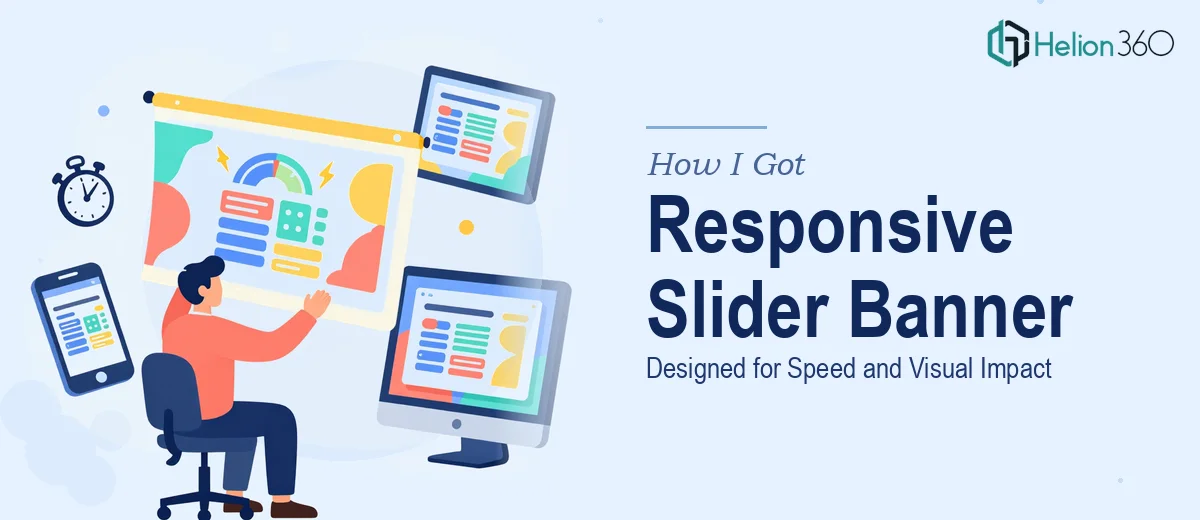
The timing made it worse. We had a product push coming up, and the homepage needed to reflect that — not next month, but within the next two weeks. A well-designed responsive slider banner was the answer: something dynamic, brand-consistent, and fast-loading that could cycle through our latest offerings and actually pull visitors in rather than lose them in the first three seconds.
I knew right away this wasn't something to patch together with a free template. The banner needed to work on every screen size, load without slowing the page, and look like it belonged to a brand — not like it came from a stock plugin library. That combination of requirements made it clear this needed to be done properly, by people who knew exactly what they were doing.
What I Found Out a Slider Banner Actually Requires
Once I started looking at what a well-executed responsive slider banner actually involves, the scope became clear very quickly. This is not just a case of dropping images into a carousel widget and calling it done.
First, responsiveness isn't a checkbox — it's a design system. A banner that looks sharp on a 1440px desktop can completely fall apart at 375px mobile if the layout, type hierarchy, and image cropping haven't been thought through for each breakpoint. Each slide needs its own responsive logic.
Second, visual impact and fast loading are genuinely in tension. High-quality imagery is what makes a slider feel premium, but unoptimized assets will tank page speed scores and frustrate users on mobile connections. Resolving that tension takes deliberate technical and design decisions working together.
Third, brand consistency across multiple dynamic slides is harder than it sounds. When each slide is showcasing a different product or message, maintaining a coherent visual identity — same typographic rules, same spacing rhythm, same color application — requires a system, not just good taste slide by slide.
That combination of factors told me this was a job that needed real expertise, not a weekend experiment.
What the Work Actually Involves
The foundation of a well-built slider banner is the structural and narrative layer — deciding how many slides, what each one communicates, and in what sequence. Done properly, this means mapping a clear visual hierarchy per slide: a headline no longer than six to eight words set at a dominant size (typically 48–60pt on desktop, scaling down to 28–32pt on mobile), a supporting subline, and a single call-to-action element per frame. The sequencing matters too — the first slide carries the most weight and should anchor the brand positioning immediately. Getting this content architecture wrong means even a beautifully designed banner fails to convert attention into action. It takes careful editorial judgment to get right, and it's easy to underestimate how long that takes.
The visual mechanics layer is where the technical complexity lives. A properly responsive slider operates on a fluid grid — typically a 12-column structure that reflows gracefully at standard breakpoints (1440px, 1024px, 768px, and 375px). Images need to be prepared at multiple resolutions and served conditionally, and foreground design elements — type, buttons, overlays — need to reposition and resize without breaking alignment at any viewport. Transition timing and easing curves (usually ease-in-out between 300–500ms) have to be calibrated so the motion feels smooth without being distracting. Each of these details requires testing across real devices, not just a browser resize handle, and the edge cases add up fast.
Polish and brand consistency across all slides is the final layer, and it's where inconsistency tends to creep in when the work isn't handled as a unified system. The right approach applies a fixed palette discipline — typically no more than three to four brand colors used with defined roles — and a consistent typographic scale that holds across every slide regardless of the background image or product being featured. Overlay treatments, button styles, and spacing increments need to be locked down in a shared component logic so that nothing drifts between slides. This level of finish is what separates a banner that looks professionally designed from one that looks like it was assembled separately and then combined.
Why I Brought Helion360 in to Handle It
I didn't attempt any of this myself. Once I understood what the work actually required — responsive layout systems, image optimization, brand-consistent design execution across multiple slides — it was obvious that the time investment to learn and execute it properly wasn't available to me. The two-week deadline made that even clearer.
Helion360 handled the full project end-to-end and delivered fast. That meant the content architecture and slide sequencing, the full responsive design across all four major breakpoints, image preparation and optimization for web performance, and brand application across every slide frame. They came in with the tooling and the process already in place — this is work they do at volume, and that showed immediately in how quickly things moved. The project was done in days, not weeks, with room for review and refinement before the deadline.
What I didn't have to do was figure out the responsive grid system, research image compression formats, or iterate my way through breakpoint edge cases. That work was already accounted for in how they operate.
The Result and What I'd Tell Anyone in the Same Position
The delivered banner was exactly what the homepage needed — clean, modern, on-brand, and genuinely fast. Each slide loaded without drag, the transitions felt intentional rather than mechanical, and the layout held up on every device I tested it on. More importantly, it actually communicated what we wanted it to: that the brand was current, well-considered, and worth paying attention to.
The product push launched on schedule with a homepage that matched the energy of the campaign behind it. That alignment mattered more than I expected it to.
If you're looking at a similar situation — a hero section that needs to work hard, on a deadline, across every screen size — Helion360 is the team I'd engage. They handled the full scope of web banner design quickly and at the level of execution this kind of work demands.