

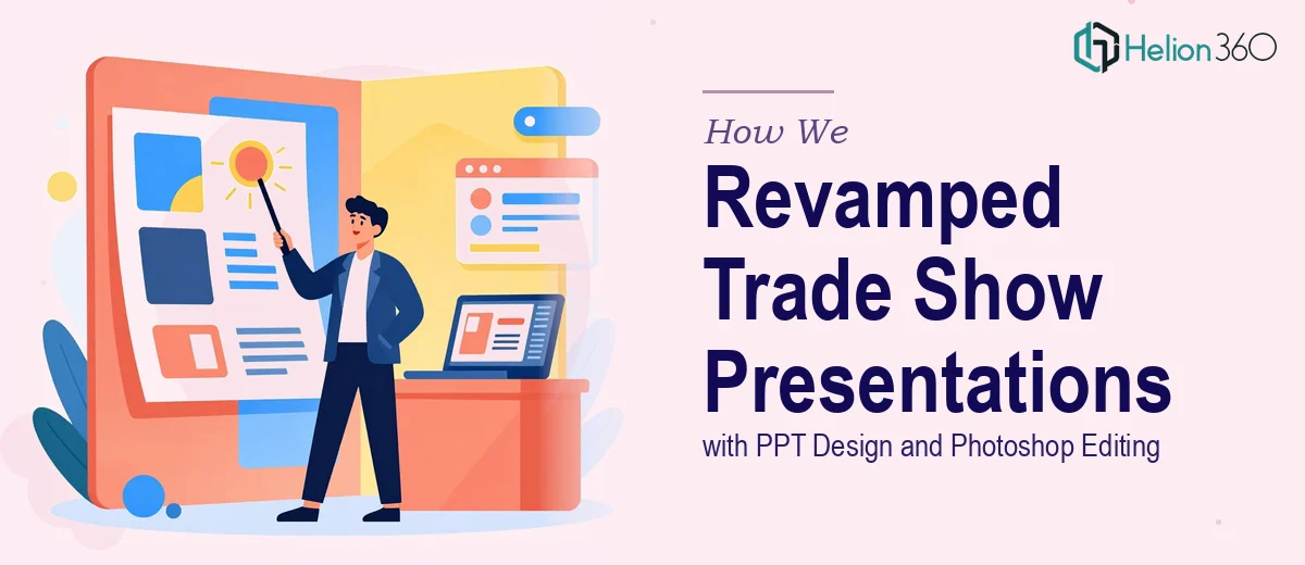
The Pressure of an Upcoming Trade Show
A few months ago, I was sitting with a stack of PowerPoint files that had been built over the past two years. Each one looked slightly different — different fonts, inconsistent colors, mismatched image styles. These presentations were about to go on display at a major industry trade show, and I knew the moment I scrolled through them that they were not ready.
The content was solid. The problem was purely visual. The slides felt like internal documents rather than something designed to stop a busy attendee in their tracks at an event booth.
I had basic PowerPoint skills. I could clean up a layout, fix spacing, maybe swap a font. But what these decks needed was a full redesign — consistent branding, sharp Photoshop-edited graphics, and a visual language that actually matched where we were as a company. That was a different level of work entirely.
What I Tried to Do on My Own
I spent about a week attempting to standardize the slides myself. I picked a color palette, tried to apply it across 60-plus slides, and quickly realized how time-consuming it was to maintain consistency manually. Some slides used embedded images that needed background removal and color correction — work that required Photoshop skills I didn't have at a professional level.
I also tried a few online template tools. They looked decent in previews but fell apart when I tried to customize them to match our brand. The typography options were limited, and the graphic quality wasn't close to what you'd expect at a professional trade show.
Two weeks before the event, I still had presentations that looked patched together. The Photoshop editing alone — image retouching, custom graphic creation, background cleanup — was going to take longer than I had.
Bringing in Outside Help
After hitting a wall, I came across Helion360. I explained the situation: multiple PowerPoint presentations that needed a visual overhaul, Photoshop-edited graphics to replace or enhance existing images, and a consistent design system that could be reused across future slides.
Their team asked the right questions upfront. What industry events would these be shown at? Who is the audience? Did we have a brand guide or were we building one from scratch? That conversation alone helped clarify what the decks actually needed versus what I thought they needed.
What the Redesign Actually Involved
Establishing a Visual System First
Before touching a single slide, the team built a master slide template that locked in our brand colors, typography hierarchy, and spacing rules. Every subsequent slide was built on top of that foundation. This is something I had tried to do myself but never fully executed — having a real master template made the difference between a patchwork deck and a cohesive one.
Photoshop Editing That Actually Elevated the Slides
Several of our product images had inconsistent lighting, cluttered backgrounds, or low resolution. The Photoshop editing work handled all of that — background removal, color grading, shadow adjustments, and custom graphic elements that tied into the overall slide aesthetic. The result was that every visual element looked like it belonged together.
Clean Typography and Slide-by-Slide Redesign
Each slide was reviewed individually. Text-heavy slides were restructured so the key message came through in three seconds or less. Charts were replaced with cleaner visual versions. Section dividers were added to give the presentation a sense of flow and rhythm during live presentations.
The Result Before the Event
When I saw the revised decks, the difference was immediate. The presentations looked like they had been built by a design team with a clear brief — not assembled over two years by different people with different ideas about what a slide should look like.
At the trade show, the booth materials and presentation screens worked together visually for the first time. Several attendees asked about the deck directly, which had never happened before.
What I Learned
PPT design at a professional level is not just about making things look nice. It is about visual consistency, understanding how a live audience reads a slide, and knowing when a graphic needs Photoshop-level treatment versus a quick crop. These are skills that take time to develop, and when a deadline is involved, bringing in the right team is simply the practical choice.
If your PowerPoint presentations are heading toward a high-stakes event and they are not where they need to be visually, Helion360 is worth reaching out to. They handle the kind of detailed, multi-layered design work that is easy to underestimate until you are in the middle of it. If you want to see what a full PowerPoint presentation redesign can look like in practice, or how others have tackled 40 high-quality PPTX slides under tight deadlines, those are worth a read before you decide how to move forward.