

The Situation Was Urgent and the Stakes Were Real
I was sitting on a risk management presentation that needed to go in front of senior leadership within the week. The source material was there — risk registers, mitigation frameworks, probability matrices — but it existed across a half-dozen documents in formats that ranged from spreadsheet tabs to dense Word reports. The brief was clear: turn this into a presentation that could actually inform strategy, not just check a compliance box.
This wasn't a generic overview. The audience would be asking hard questions, and the deck needed to hold up under scrutiny. Risk categories had to be clearly separated, severity levels had to read at a glance, and the narrative had to make sense to both technical stakeholders and executives who wanted the bottom line fast. I knew immediately that getting this wrong wasn't an option — and that doing it right was more involved than it looked.
What I Found a Risk Management Presentation Actually Requires
When I started looking at what a well-executed risk management PowerPoint presentation actually involves, the scope became clear quickly. This isn't a slide deck where you drop in bullet points and add a logo. The work starts with structuring raw risk data into a coherent hierarchy — separating strategic, operational, financial, and compliance risks in a way that flows logically rather than just listing everything in sequence.
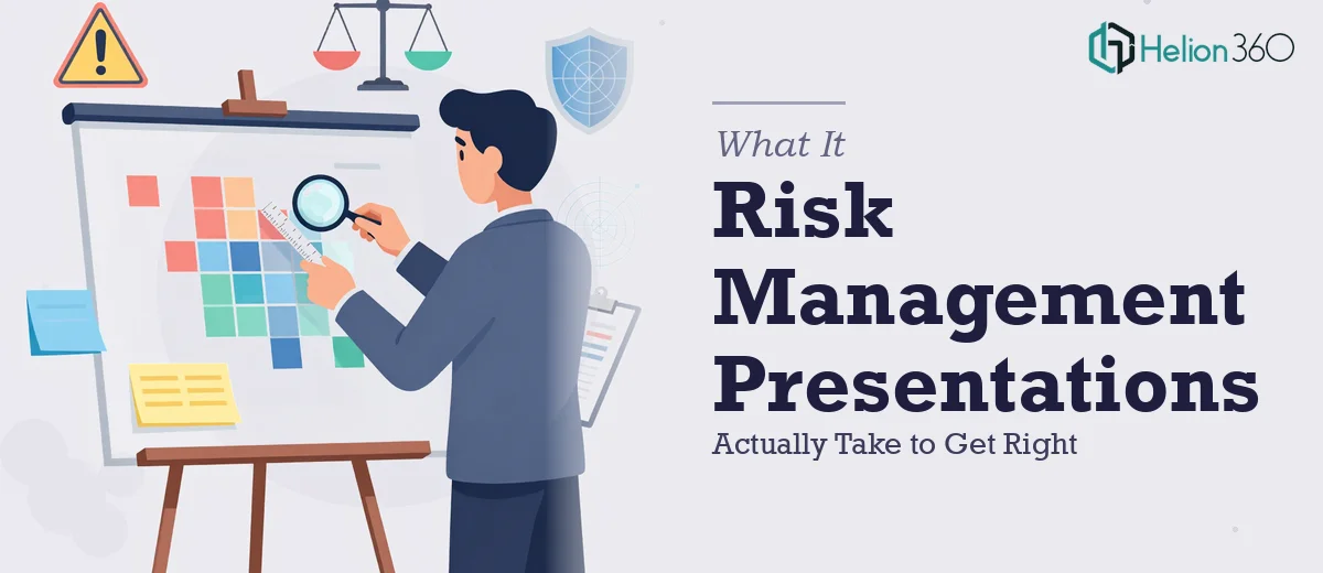
Beyond structure, the visual language matters enormously. Risk heat maps, probability-impact matrices, and status indicators are the domain-standard tools here, and they have to be built correctly. A heat map where the axis labels are ambiguous or the color scale is inconsistent undermines the entire message. And then there's the consistency problem: a deck covering multiple risk categories across twenty or more slides has to maintain visual coherence throughout — same grid, same type hierarchy, same palette discipline — or it starts to feel like it was assembled by different people on different days, which erodes credibility with a senior audience.
Those three signals — structural complexity, domain-specific visual tools, and consistency at scale — told me this was a real project, not a weekend task.
The Work That Needs to Happen
The foundation of a strong risk management presentation is a clear narrative architecture. The right approach audits every source document first, then maps a slide-by-slide story arc that separates risk categories without losing the thread of how they connect. In practice, this means deciding which risks get a full treatment (context, likelihood, impact, mitigation) versus which are grouped into summary views. Getting this architecture wrong means slides that feel disconnected — leadership reads four slides on operational risk and then loses track of where financial risk fits in. Rebuilding the story arc mid-project is one of the most common and expensive sources of rework in this type of deck.
The visual mechanics of a risk deck are specific. A probability-impact matrix needs clearly labeled axes, a defensible color scale (typically three to five severity bands moving from green through amber to red), and consistent symbol sizing so relative risk levels read instantly. Type hierarchy should follow a strict rule: title text at 32–36pt, body callouts at 20–24pt, annotation text no smaller than 14pt for screen legibility. Layouts typically sit on a 12-column grid so elements align cleanly across slide types. The challenge is that these rules interact — changing one element (say, a wider legend) cascades across a dozen slides if the master layout wasn't built with flexibility in mind from the start.
Polish and consistency across the full deck is where amateur efforts most visibly fall apart. A risk management presentation presented to senior leadership carries an implicit credibility signal: if the deck looks assembled rather than designed, the content gets discounted. Proper palette discipline means no more than four brand colors applied through a defined hierarchy, with one accent color reserved strictly for critical-risk callouts. Icon sets need to come from a single family, and every divider slide, section header, and data table needs to share the same visual logic. Maintaining this across twenty-plus slides — especially when content revisions keep coming in — requires working from a properly built master slide file, not a copy-paste workflow.
Why I Brought in Helion360 to Handle It
I looked at what the project genuinely required — the structural work, the domain-specific visuals, the consistency demands — and recognized immediately that attempting it myself wasn't realistic given the timeline. I didn't have the master slide infrastructure built, I hadn't worked with risk heat maps at this level of detail before, and even if I had, the time cost of learning and executing it properly would have blown the deadline entirely.
I engaged Helion360 to handle the full project end-to-end. They took the source documents, built the narrative structure, created the probability-impact matrices and risk category visuals to the right standard, and delivered a polished, consistent deck done in days. The turnaround was fast — handled in a fraction of the time it would have taken me to work through the learning curve alone. What came back was a presentation built on a properly structured master file, with every slide aligned to the same grid and visual logic, ready for leadership review without a round of cleanup.
The Result and What I'd Tell Anyone Facing the Same Problem
The deck performed exactly as it needed to. Leadership could navigate the risk categories clearly, the heat maps read instantly without explanation, and the presentation held together visually in a way that reinforced rather than distracted from the content. The project moved from scattered source documents to a boardroom-ready presentation on a timeline that would have been impossible working solo.
If you're looking at a risk management PowerPoint presentation — or any high-stakes internal deck where the source material is complex and the audience won't forgive a rough finish — Helion360 is the team I'd engage. They handle full end-to-end execution fast, with the tooling and expertise already built in.