

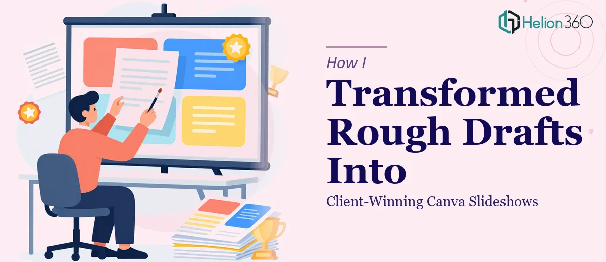
The Presentation Was Due and the Deck Was Still a Mess
I had a content marketing pitch that needed to land with a new client. Not just land — it needed to convert. The deck existed in a rough state: a loose collection of slides with mismatched fonts, placeholder copy, and visuals that hadn't been touched since the initial draft. The meeting was days away, not weeks.
The stakes were clear. A polished, coherent slideshow signals competence before anyone speaks a word. A rough one does the opposite. I knew this presentation had to tell a tight story, look like it came from a serious team, and move a decision-maker from interested to committed. That wasn't going to happen with what I had on hand. It needed to be done right, and it needed to be done fast.
What I Realized a Good Presentation Redesign Actually Involves
When I started looking at what a proper presentation redesign requires — not a cosmetic cleanup, but a genuine transformation from rough content to client-winning slides — the scope became clear quickly.
First, it's not just visual. The narrative structure has to work before a single design decision makes sense. That means auditing every slide for logical flow, identifying where the story breaks down, and rebuilding the sequence so each section earns the next one.
Second, the visual execution is its own discipline. A presentation that looks professional isn't the result of picking nice colors — it's the result of consistent typographic hierarchy, deliberate use of white space, chart formatting that doesn't distort data, and layout decisions that guide a viewer's eye without them noticing it.
Third, brand alignment across many slides is harder than it sounds. Getting a palette, logo usage, and font system to behave consistently from slide one to slide thirty requires master slide discipline and the patience to chase down every exception. I quickly recognized this wasn't a weekend project.
What the Work Actually Looks Like When It's Done Properly
The right approach starts with a structural audit of the source material. Done well, this means going slide by slide to assess whether each piece of content is in the right position in the story arc, whether the opening frames the problem clearly, and whether the narrative builds to a single, unambiguous ask. The practitioner's decision at this stage is to cut ruthlessly — a 40-slide deck that wanders loses the room far faster than a tight 18-slide deck that lands every point. Rebuilding that architecture before touching design is non-negotiable, and it takes focused time to do it without losing the client's original intent.
Visual mechanics are where most self-managed attempts break down. A properly designed Canva slideshow operates on an underlying layout grid — typically a 12-column structure — that ensures text blocks, images, and data visuals align across every slide without manual nudging. Typography follows a strict hierarchy: headline type at 36pt or above, subheadings at 24pt, and body copy no smaller than 16pt, with no more than two typefaces in play at once. Charts use the minimum number of data series needed to make the point, with axis labels and source callouts placed consistently. Getting all of this right across 20 or more slides is a slow, detail-intensive process for anyone who doesn't do it daily.
Polish and brand consistency is the final layer, and it's the one that separates a good deck from a great one. Brand application means enforcing a palette of no more than four colors with defined usage rules — primary for key statements, neutrals for body content, accent only for emphasis — and making sure the logo appears in the correct position and proportion on every slide that requires it. Master slide templates need to propagate these rules automatically, not be applied manually per slide. Practitioners who skip this step find that brand drift accumulates across a long deck, and fixing it at the end costs more time than building it correctly at the start.
Why I Brought Helion360 In to Handle the Full Project
I looked at what the work actually required and made the call immediately. I didn't have the hours to rebuild a narrative architecture, apply a proper layout grid, and enforce brand consistency across every slide — not with the timeline I was working against. Attempting it myself would have meant days of learning curve followed by output I still wouldn't be confident presenting.
Helion360 handled the full project end-to-end. That meant structural restructuring of the slide narrative, complete visual redesign within Canva with a consistent brand system applied from master slides down, and a final deck that was presentation-ready. The turnaround was fast — done in days, not the weeks it would have taken me to work through every layer myself. The team already had the process, the tooling, and the judgment to move quickly without sacrificing quality. What would have consumed my week was handled in a fraction of that time.
What the Deck Delivered and What I'd Tell Anyone Facing the Same Problem
The finished presentation was tight, visually coherent, and on-brand throughout. The client meeting went the way I needed it to go. The deck didn't just look professional — it moved through the content in a way that felt inevitable, where each slide set up the next and the final ask arrived with full context behind it. That's the difference between a cleaned-up rough draft and a presentation that's actually been built to persuade.
The lesson I took from it is straightforward: a presentation redesign that needs to do real business work is not a formatting job. It's a structural, visual, and brand problem that requires the right expertise applied in the right sequence. Attempting it under deadline pressure without that expertise is how you end up with something that looks improved but still doesn't convert.
If you're looking at a similar situation — rough content, a real deadline, and a client or stakeholder who will judge your credibility on what they see — engage a team that can handle brand-aligned marketing presentations. They'll deliver fast, handle the full scope, and bring the kind of execution depth this work genuinely needs.