

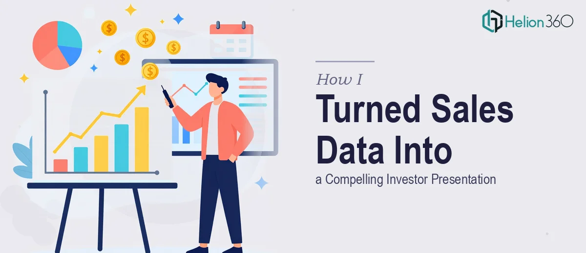
The Data Was Ready. The Problem Was Making It Mean Something.
I had a full quarter's worth of sales data sitting in spreadsheets, and a meeting with investors on the calendar. The numbers told a strong story — or at least I believed they did. The problem was that raw tables and export files don't walk into a room and make an argument. Someone has to shape the data into a narrative, choose the right visuals, and present it in a way that a room full of investors can absorb quickly and act on confidently.
The stakes were real. This wasn't an internal review. It was a conversation about funding, about whether the trajectory we'd been on was credible and worth backing. A deck full of cluttered charts or unexplained figures wouldn't just fail to impress — it would actively undermine confidence. I recognized early that this needed to be done properly, not patched together in a few evenings.
What I Found Out This Kind of Work Actually Requires
When I started looking seriously at what a good data-to-presentation project involves, it became clear that the gap between "I have the data" and "I have a compelling investor-ready presentation" is much wider than most people assume.
First, there's the analytical layer. The data needs to be interrogated before it can be visualized — trends need to be isolated, anomalies explained, and the right metrics selected. Not every number deserves a slide. Choosing what to show and what to leave out is itself a strategic decision that shapes how the story lands.
Second, there's the visualization layer. The chart type matters enormously. A waterfall chart and a clustered bar chart tell fundamentally different stories from the same data. Using the wrong one doesn't just look unprofessional — it misleads. And beyond chart choice, there's layout, hierarchy, and the visual weight of every element on the page.
Third, there's the design consistency layer. A professional investor presentation needs to hold together visually across every slide. That means brand discipline, color palette control, and typographic hierarchy applied uniformly — not slide-by-slide decisions made on the fly.
I had the data. I didn't have the time or specialized depth to do all three of those things well.
What Doing This Well Actually Involves
The structural work starts before any slide is opened. It requires auditing the source data for completeness and cleaning it — removing duplicates, normalizing date formats, confirming that period-over-period comparisons are actually apples-to-apples. Then comes the narrative mapping: deciding which metrics anchor the story (revenue trend, deal velocity, average contract value) and in what order they build the case. This sequencing work alone typically takes several hours and requires someone who understands both the data and the audience's decision-making logic. Getting the story arc wrong means the visuals, however polished, won't land.
The visual mechanics layer is where most non-specialists lose the thread. Effective data visualization for an investor audience follows specific conventions: combo charts for trend-plus-volume stories, waterfall charts for showing contribution and attrition within a period, and scatter plots reserved for correlation arguments only. Typography hierarchy runs at approximately 32pt for slide titles, 20pt for data callouts, and 14pt for supporting labels — and those sizes need to hold consistently across every chart in the deck. A 12-column layout grid keeps chart placement and text blocks aligned across slides. Setting this up correctly in master slides, and making sure every chart inherits it rather than sitting slightly off-grid, is meticulous work that trips up even experienced PowerPoint users.
Polish and consistency across a multi-slide deck is the third layer — and it's the one that audiences register subconsciously but respond to powerfully. A professional data presentation operates within a maximum of four brand colors, with one accent color reserved exclusively for the key insight on each chart. Every axis label, legend, and data callout needs to match in font weight, size, and color treatment — no exceptions. In a deck covering a full quarter's data, that might mean reviewing and standardizing formatting across 30 or more individual chart objects. The time required to do this without automation or pre-built templates is significant, and one inconsistency in a chart shown to investors reads as a lack of rigor in the underlying analysis.
Why I Brought in Helion360 to Handle It
I didn't attempt to build this myself and then look for help after hitting a wall. I looked at the scope clearly — the data structuring, the narrative design, the visualization work, the polish pass — and recognized immediately that this was a full project, not a weekend task.
Helion360 handled it end-to-end. That meant taking the raw sales exports, making sense of the data story, selecting the right chart types for each insight, building the full presentation with consistent visual design, and delivering something that was investor-ready without me having to micromanage each decision.
What stood out was the speed. The work was turned around in days — handled in a fraction of the time it would have taken me to work through the learning curve on the visualization choices alone, let alone the design execution. The team operates with the tooling and expertise already in place, which means they move fast without cutting corners.
The Result and What I'd Tell Anyone Looking at the Same Problem
What came back was a clean, coherent presentation that moved through the quarter's data with a clear argument: here's where we started, here's what moved, here's what it signals about trajectory. Every chart was purposeful. The visual consistency held across every slide. The insights were legible at a glance — which is exactly what an investor audience needs.
The meeting went well. The data that had been sitting in spreadsheets finally communicated what it was always capable of communicating — it just needed the right hands to shape it.
If you're looking at a similar project — sales data that needs to become an investor-ready presentation, fast and done properly — Helion360 is the team to engage. For projects requiring rapid turnaround without sacrificing execution depth, the approach I took mirrors what works best in custom infographic design for PowerPoint. They delivered end-to-end, quickly, and at exactly the execution depth this kind of work demands.