

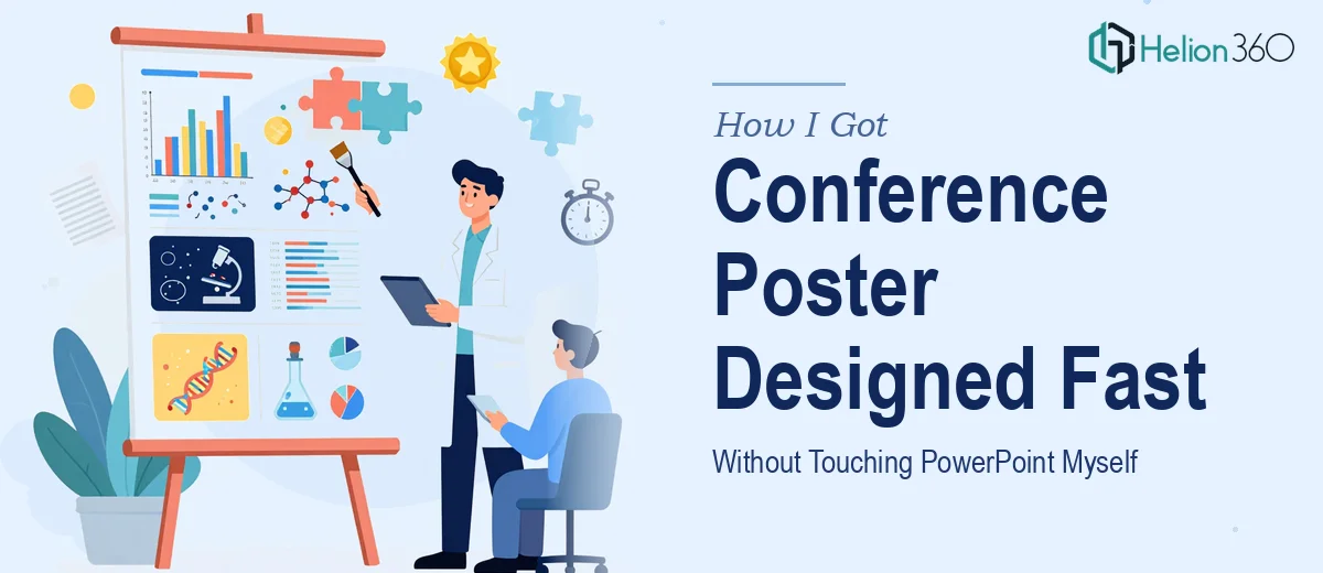
The Conference Deadline Was Real, and So Was the Pressure
Our research team had done the hard part — months of data collection, analysis, and synthesis. The findings were solid. The problem was the deadline sitting two weeks out for a major academic and industry conference covering AI, blockchain, and cybersecurity. We needed a scientific poster that could hold its own in a room full of polished academic and professional presentations.
A poster like this isn't just a summary. It's a first impression for the entire body of work. The audience — researchers, practitioners, technical reviewers — would spend roughly 30 to 90 seconds scanning it before deciding whether to stop and engage. If the layout was confusing, the charts unreadable, or the hierarchy unclear, the research itself would get dismissed before anyone read a word of it.
I knew this couldn't be a rushed internal job. It needed to be done properly, by someone who understood both the visual mechanics and the conventions of scientific poster design.
What I Found Out This Work Actually Requires
Before engaging anyone, I spent time understanding what a well-executed scientific poster actually involves. What I found was more involved than I had assumed.
First, the information architecture is genuinely complex. A scientific poster has to compress an entire research project — methodology, data visualizations, results, and conclusions — into a single readable surface, typically 36×48 inches or A0, without it feeling cramped or losing logical flow. Every section has to earn its real estate.
Second, the data visualization layer is significant on its own. Research findings in fields like AI and cybersecurity often involve dense datasets — network diagrams, performance benchmarks, comparative models. Translating those into charts and graphics that are legible at poster scale, under conference lighting, requires deliberate choices about chart type, scale, color contrast, and label sizing.
Third, conference scientific posters follow domain conventions that matter to the audience. Academic reviewers and technical peers notice when those conventions are ignored. Section ordering, citation placement, methodology framing — these aren't arbitrary, and getting them wrong undercuts credibility.
That combination told me clearly: this wasn't a weekend project.
What the Actual Design Work Involves
The right approach to a scientific poster starts with structure — auditing the source material and mapping a clear visual hierarchy before a single element is placed. A well-designed poster uses a defined column grid, typically three or four columns at A0 scale, with section breaks that guide the eye from problem statement through methodology to results and conclusion. Type hierarchy follows strict sizing rules: section headings at 36–40pt, body text no smaller than 20pt for readability at standing distance, and captions sized at 14–16pt. Getting this grid set up correctly in PowerPoint so it holds across the full poster surface, with consistent margins and bleed, takes precision — and it's easy to get wrong if you're working from scratch without a template built for large-format output.
Data visualization on a scientific poster is its own discipline. Each chart needs to be chosen for what the data is actually saying — a bar chart for categorical comparison, a line graph for performance over time, a heatmap or network diagram for relational data in fields like cybersecurity or AI modeling. Color choices aren't decorative; they carry semantic weight and need to hold up for colorblind readers, which means relying on luminance contrast rather than hue alone. Axis labels, legends, and data callouts need to be sized so they're readable at arm's length. Rebuilding charts at poster resolution in PowerPoint, rather than pasting low-resolution exports, is fiddly work that takes longer than most people expect.
Consistency across the full poster surface is the third layer where execution gets difficult. Brand colors, font usage, icon style, and whitespace treatment all need to stay coherent across a document that, when printed, is roughly the size of a door. In PowerPoint, this means working from master slide settings, keeping styles locked through the design panel, and doing a final pass at 100% zoom across every section to catch the drift that inevitably creeps in. For a research team presenting at a competitive conference, visual inconsistency reads as carelessness — and no amount of strong findings recovers from that first impression.
Why I Brought in Helion360 to Handle It
I looked at what the work required and made a straightforward call: I didn't have the time to learn large-format PowerPoint layout conventions, rebuild charts at poster resolution, and do the polish pass this needed — not in two weeks alongside everything else.
Helion360 handled the full project end-to-end. That meant taking our raw research material — the data exports, methodology write-up, and key findings — and building the entire poster from structure through final output. They handled the column grid and type hierarchy, rebuilt the data visualizations properly for poster-scale display, and applied consistent visual treatment across every section. The work was turned around quickly — done in days, not weeks — which meant we had time for a proper review cycle before the print deadline.
What made the difference was that this is the kind of work their team does continuously. The tooling, the templates, the judgment calls on chart type and layout — it was already in place. There was no learning curve on our end to manage.
The Result and What I'd Tell Anyone in the Same Spot
The poster held up exactly as intended. At the conference, it communicated the research clearly and professionally — the hierarchy was readable at a distance, the data visualizations were clean and accurate, and the layout reflected the credibility of the work behind it. Several attendees stopped to engage with the findings in the way you hope for: because the poster invited them to.
The research was the hard part. The presentation of it should not have been — and with the right team handling it, it wasn't.
If you're looking at a similar situation — solid research, a real deadline, and a poster that needs to actually perform in a competitive conference environment — Helion360 is the team I'd engage. They delivered fast, handled the full execution depth this kind of work requires, and the result spoke for itself.