

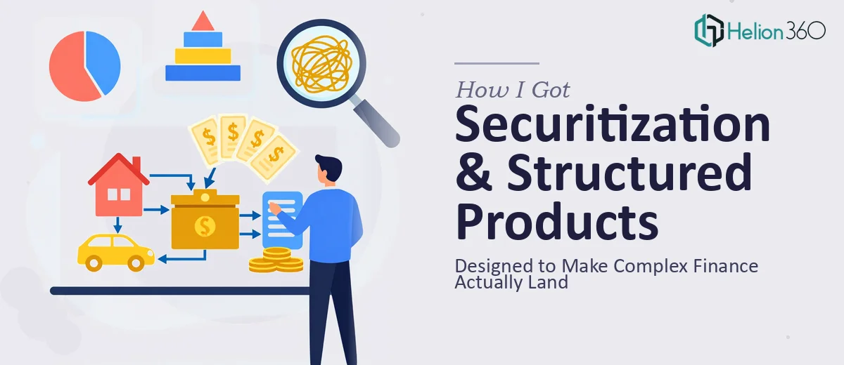
The Problem With Presenting Complex Finance to a Mixed Room
I was looking at a brief that would make most people nervous: a comprehensive association presentation covering securitization and structured products, aimed at a broad audience that ranged from seasoned practitioners to professionals newer to the space. The goal wasn't just to inform — it was to inspire, demonstrate mission and impact, and make a legitimately complex topic feel accessible without dumbing it down.
The stakes were real. This was an association's flagship presentation — the kind of deck that gets shared after the room clears, forwarded to members, and used to represent the organization's credibility at events. If it looked rough, felt disorganized, or collapsed under the weight of technical content, it would undercut everything the association had built.
I knew immediately this needed to be done right — not assembled quickly from a template.
What I Found This Kind of Presentation Actually Requires
When I started looking at what a presentation like this genuinely involves, I realized the technical subject matter was only part of the challenge. Structured products and securitization carry a lot of conceptual weight — asset pools, tranching, cash flow waterfalls, credit enhancement mechanisms — and making those ideas land visually requires real decisions about how to sequence information and what to show versus what to explain in words.
Beyond the content architecture, there was the visual dimension. Charts and data tables are unavoidable in this domain, but raw financial data dropped onto slides is its own communication failure. Done well, the data needs to be re-expressed — not just copied in from a spreadsheet. And the association context added another layer: the presentation also needed to carry advocacy messaging, achievement highlights, and community impact alongside the technical material, without those elements feeling like a jarring gear-shift.
Any one of those layers is a day's work on its own. All three together, coherently held in a single presentation? That's a specialist project.
What Doing This Presentation Well Actually Takes
The first thing that needs to happen is a structural and narrative audit of the source material. A presentation spanning technical finance content, mission statements, and impact data doesn't have a natural linear flow — it has to be built deliberately. The right approach maps each section to a specific audience need: what does this audience need to understand first before the next idea makes sense? In a mixed-expertise room, that sequencing decision gets made at every slide transition. Getting it wrong means losing part of the room by slide eight. The structural work alone — mapping the story arc, deciding what belongs in the deck versus the speaker notes, and editing for cognitive load — typically takes longer than people expect, even before a single slide is designed.
The visual mechanics of a finance-focused association deck are genuinely specific. Typography hierarchy in this context typically runs 36pt for section headers, 24pt for slide titles, and no smaller than 16pt for body content — anything smaller and the data-dense slides become unreadable in a projected environment. Chart selection matters enormously: a cash flow waterfall structure, for instance, needs a purpose-built diagram, not a default bar chart. Infographics representing impact statistics need to be sized and spaced so that they communicate a single clear idea per visual, not four ideas competing for attention. Executing this consistently across 25 to 40 slides, with intentional white space and a contained color palette, is where amateur decks visibly fall apart.
Polish and consistency across an association presentation is the work that separates a finished deck from a draft. In practice, this means applying a single master slide structure with defined layout zones — usually built on a 12-column grid — so that every slide sits in visual alignment with every other slide. Brand colors stay to a maximum of four values, used with discipline so the palette reinforces hierarchy rather than creating noise. Icon style, image treatment, and chart formatting all need to match across the full deck. Each inconsistency is small on its own, but in a projected presentation in front of a professional audience, accumulated inconsistency reads as lack of care — and for an association presentation, that's reputational.
Why I Brought in Helion360 to Handle It
When I looked at the full scope — narrative architecture, financial diagram design, data visualization, brand application across a multi-section deck — I didn't hesitate. This wasn't a project I was going to work through on weekends. The expertise gap was real, and so was the time pressure.
Helion360 handled the full project end-to-end: content restructuring and story mapping across the technical and advocacy sections, custom diagram and chart design for the structured products material, and full visual production with consistent branding applied across every slide. The deck was turned around quickly — done in days, not weeks — at a level of execution depth that would have taken me far longer to attempt on my own, even setting aside the learning curve on the finance visualization side.
What made the difference was that this is work they do all day. The tooling, the templates, the subject-matter visual conventions — all of it was already in place.
The Outcome and What I'd Tell Anyone Looking at This Same Problem
What came back was a presentation that held together as a complete professional document. The technical sections were visually clear — structured product diagrams that actually explained the mechanisms rather than just labeling them. The association mission and impact sections carried genuine visual weight, with infographics that communicated the numbers without overwhelming the story. The full deck read as one coherent piece, not a collection of slides from different authors.
The business outcome was straightforward: the association had a presentation it could use confidently in front of any audience — practitioners, members, prospective partners — without apology.
If you're looking at a high-impact presentation project like this one and want it handled end-to-end without the weeks of learning curve, Helion360 is the team I'd engage — they delivered fast and brought exactly the execution depth this kind of work requires.