

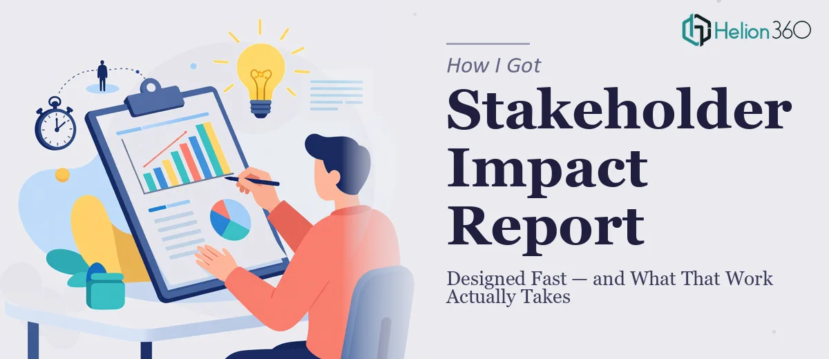
The Situation: A Stakeholder Report Due Tomorrow Morning
Our marketing team had spent the better part of a day working through campaign results, pulling data together, and trying to shape it into something coherent. The problem wasn't the content — we had plenty of it. The problem was that a polished, professional impact report needed to be in front of stakeholders the next morning, and what we had was a rough collection of slides that looked exactly like what it was: a rushed internal draft.
The stakes were real. This wasn't an internal team update — it was a formal presentation tied to a campaign review, and the people in the room would be making decisions based on what they saw. A cluttered, inconsistent deck sends its own message, and it's not a good one. I recognized quickly that getting this right wasn't optional, and that "right" meant far more than cleaning up fonts.
What I Found the Solution Actually Required
My first instinct was to see whether this was something we could push through internally overnight. A few hours of research into what a well-designed impact report actually involves made it clear that wasn't realistic — not if we wanted the output to look like it belonged in the room.
A properly designed marketing report presentation isn't just aesthetic tidying. It starts with narrative architecture: deciding which data tells the story, in what sequence, and what each slide's single job is. Then comes the visual layer — choosing chart types that match the data relationships, building a layout grid that creates visual consistency across every slide, and applying animation and transitions that guide attention without distracting from the message.
On top of that, cross-platform compatibility introduced its own constraints. The file had to render correctly on both Mac and Windows, which means font substitution risks, animation rendering differences, and embedded asset behavior all had to be accounted for. Each of those alone is manageable. All three together, under a tight deadline, pointed clearly toward one conclusion: this needed a specialist.
The Work That Needs to Happen
The foundation of a strong impact report is structural and narrative clarity. The work starts with auditing the source content — identifying which findings are primary, which are supporting, and which should be cut entirely. A well-built report typically follows a three-act flow: context and campaign objectives, performance data with interpretive framing, and forward-looking takeaways. Each slide should carry one idea. The execution friction here is that most raw content doesn't arrive pre-structured this way. Reorganizing it without losing nuance, while staying inside a tight slide count, requires judgment that takes experience to develop quickly under pressure.
Once the structure is set, the visual mechanics determine whether the data reads clearly or creates confusion. The right approach uses a defined layout grid — typically a 12-column structure — so that text blocks, charts, and callout figures align consistently from slide to slide. Typography follows a strict hierarchy: headline at 36pt, supporting text at 24pt, and captions or footnotes no smaller than 14pt for legibility across screen sizes. Chart selection matters too — bar charts for period-over-period comparisons, donut charts for proportional breakdowns, and line graphs for trend data. Getting these decisions wrong doesn't just look bad; it actively misleads the audience. A practitioner building this from scratch needs to lock in these rules before touching a single content slide, or the inconsistency compounds quickly.
Polish and cross-platform consistency are where many otherwise good decks fall apart. Animations, when used well, are purposeful — a fade-in on a key stat to give the presenter a beat, a sequential reveal on a multi-part diagram to control the narrative pace. The discipline is restraint: no more than one motion behavior per slide type, and transitions kept to a single consistent style across the deck. Cross-platform rendering adds another layer of friction. Fonts must be system-safe or embedded correctly, and SVG or PNG assets need to be tested to ensure they don't shift on Windows after being built on Mac. This validation pass alone takes hours if you're doing it methodically.
Why I Brought in Helion360 to Handle It
I didn't attempt to build this deck overnight. The scope was clear enough — narrative restructuring, full visual design, animation, and cross-platform testing — and the timeline was too tight to absorb a learning curve on any of it.
Helion360 handled the full project end-to-end. They took the raw content, restructured the story arc so the data landed in the right sequence, applied a clean and consistent visual system across every slide, and built in purposeful animations that enhanced the presentation without overcomplicating it. The file was delivered fast — done in a fraction of the time it would have taken our team to attempt even the design pass alone, let alone the structural work and compatibility testing on top of it.
What made the difference was that their team does this work every day. The tooling, the design conventions, the cross-platform checks — all of it was already in place. There was no ramp-up time, no trial and error on chart types, no guessing on what stakeholders respond to in a formal review setting.
What Was Delivered — and What I'd Tell Anyone in My Spot
What went into that stakeholder room the next morning was a clean, modern impact report that read like it had been planned from the start. The data had a clear narrative thread. The visuals were consistent and professional. The animations did exactly what they were supposed to do — guide the audience through the information without pulling focus. And it opened without a hitch on both the Mac in the conference room and the Windows laptop being used to present.
The outcome wasn't just a better-looking deck. It was a presentation that gave our team credibility in the room at a moment when credibility mattered. The content we'd worked hard to produce finally had a format worthy of it.
If you're looking at a similar crunch — a real deadline, a high-stakes audience, and source material that needs far more than a cosmetic fix — Helion360 is the team to engage. For similar challenges, you might also explore how others handled GA4 marketing presentations under tight deadlines. They delivered for me fast, handled the full scope, and brought the kind of execution depth this work genuinely requires.