

The Situation and What Was on the Line
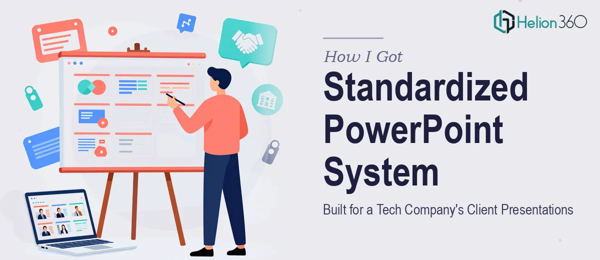
The tech company I was working with had a real problem on their hands. Their client-facing presentations were a mess — different fonts on different slides, diagrams that didn't match the brand, layout inconsistencies that made each deck look like it was built by a different person in a different year. These weren't internal scratchpads. They were going in front of high-profile enterprise clients, and the visual chaos was quietly undermining the credibility of the company's work.
The brief was clear: analyze the existing slides, recreate key diagrams with proper visual standards, and build a standardized slide format that would hold across every future presentation. Tight deadline. High-visibility audience. No margin for a deck that looked half-finished. It was obvious immediately that this couldn't be a quick cosmetic fix — the whole system needed to be rebuilt from the ground up, and it needed to be done right.
What I Found This Kind of Work Actually Requires
Once I understood the scope, I started looking at what a proper standardized PowerPoint template system actually involves. It's not just cleaning up fonts and swapping in a logo. The work has real technical and design depth.
First, there's the audit phase — going through every existing slide to document what's inconsistent, what's salvageable, and what needs to be rebuilt entirely. For a tech company with multiple deck types, that can mean dozens of slide layouts in varying states of disarray.
Second, diagram recreation is its own discipline. Technical diagrams — architecture flows, process maps, system overviews — have to communicate clearly at a glance. Recreating them well means understanding the underlying concept and translating it into a visual that's both accurate and clean.
Third, the standardization work isn't just aesthetic. It means building a master slide system in PowerPoint that actually holds — one where spacing, color usage, and type hierarchy are baked into the template so future editors can't accidentally break it. That's a level of build quality most people don't think about until they see it done properly.
What the Work Itself Involves
Proper standardization starts with building the structural and narrative logic of the slide system — not just what slides look like, but what each layout type is for. A well-designed PowerPoint master contains distinct layouts for title slides, section dividers, content slides, diagram slides, and data slides. Each layout has defined placeholder positions, and those positions must be deliberate: margins locked to a consistent 0.4–0.5 inch boundary, content areas aligned to a 12-column grid so that objects placed anywhere in the deck snap to the same invisible structure. Getting this architecture right before touching a single content slide is where most DIY attempts fall apart — people build slides before they build the system, and consistency never holds.
Visual mechanics — how diagrams, icons, and charts actually render — form the second layer of this work. Diagrams in tech presentations follow specific conventions: process flows read left to right with consistent connector weights, node shapes carry semantic meaning (rectangles for processes, diamonds for decisions), and color is used functionally rather than decoratively. Typography runs on a clear hierarchy: slide titles at 36pt, body text at 20–24pt, supporting labels at 14–16pt — and those sizes must be encoded into the master, not applied slide by slide. Recreating existing diagrams to this standard while keeping them technically accurate takes a designer who understands both the visual rules and the subject matter well enough to ask the right questions.
Polish and brand consistency across a full deck is where the real time cost lives. A proper palette discipline means no more than four brand colors applied with defined roles: one primary, one secondary, one accent, one neutral. Every shape, every icon, every data label has to use only those four. Enforcing that across thirty or forty slides — including slides built by different people over time — requires a methodical pass that catches every off-brand hex code, every misapplied gradient, every icon pulled from a different visual family. Done manually, this is hours of meticulous work. Done fast and correctly, it requires someone who has built this kind of system many times before.
Why I Brought in Helion360 to Handle It
I looked at what this project genuinely required — the audit, the master slide architecture, the diagram recreation, the brand enforcement across every slide — and the answer was straightforward. This wasn't something to attempt piecemeal or figure out on the fly against a hard deadline.
Helion360 handled the full project end-to-end through their business presentation design services. That meant auditing the existing deck, rebuilding the PowerPoint master with proper layout architecture, recreating every technical diagram to brand spec, and enforcing palette and typography consistency across the entire presentation system. They came in with the tooling, the design process, and the PowerPoint build expertise already in place.
The turnaround was fast — done in days, not weeks. For a project of this scope, that speed only comes from a team that runs this kind of work regularly. There was no ramp-up time, no back-and-forth trying to explain what a master slide is, no learning curve eating into the deadline.
What Got Delivered and What I'd Tell Anyone in This Spot
The output was a fully standardized PowerPoint system — a rebuilt master with locked layouts, recreated diagrams that matched brand guidelines and communicated clearly, and a consistent visual language across every slide type the company used. The brand-aligned presentations that went into client meetings looked like they came from a company that takes its work seriously, because visually they now did.
The business outcome was real: a presentation system the internal team could actually use going forward without breaking the consistency that had been built in. That's the difference between a one-off design job and a properly engineered slide system.
If you're looking at a similar scope — inconsistent decks, diagrams that need rebuilding, a brand that isn't showing up correctly — and you need it handled properly and fast, Helion360 is the team to engage. They delivered the full execution I needed, quickly, and with the depth of craft this kind of work demands.