

The Problem With Our Project Reports
When you're moving fast at a startup, consistency is one of the first things to slip. Every team member was building their own version of a project report — different fonts, different layouts, different color schemes. Some looked polished, others looked like they were put together in twenty minutes. The inconsistency was starting to show in client meetings, and it was creating more internal confusion than clarity.
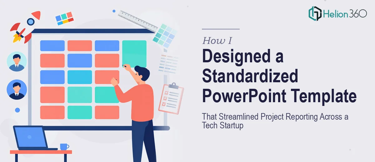
I took ownership of fixing it. The goal was straightforward: create a single PowerPoint template for project reports that everyone on the team could use, that looked professional, and that carried our brand identity consistently across every slide.
Why I Tried to Build It Myself First
I have enough working knowledge of PowerPoint to get around. I know how to set up slide masters, add placeholders, and apply theme colors. So I figured I could knock this out in a few days.
What I underestimated was the scope. A proper project report template is not just a few formatted slides. It needs a structured system — a cover slide, an executive summary layout, section dividers, data-heavy slides built for charts and metrics, appendix formats, and footnote styles. On top of that, everything had to work as an editable template that non-designers could use without breaking it.
I spent a few evenings trying to build it out. The slide master kept conflicting with individual slide overrides. The font scaling looked off on certain layouts. And when I tried to lock down the branded elements while keeping content areas flexible, the whole thing became a tangled mess. I was not short on effort — the problem was just more technical than I had anticipated.
Bringing In the Right Help
After hitting a wall, I came across Helion360. I explained the situation — a growing startup, an inconsistent reporting process, and a half-built template that needed real structure. Their team asked the right questions from the start: What types of content do project reports typically include? How many team members would be using it? What does the brand look like? Do you need editable charts or static visuals?
That level of detail told me they understood the real challenge. This was not just about making slides look good — it was about building a system that would hold up when people with different skill levels used it under deadline pressure.
What the Finished Template Actually Looked Like
Helion360 delivered a fully structured PowerPoint template built on a clean, locked slide master. The brand colors, typography, and logo placement were locked at the master level so no one could accidentally override them. The content areas — text boxes, image placeholders, chart zones — were kept fully editable and clearly labeled.
The template included a title slide, an executive summary layout, a progress and milestone tracker, a data and metrics slide with pre-built chart placeholders, a risk and issue log layout, a team section, and a closing slide. Each layout had a consistent visual logic — same margins, same heading hierarchy, same grid.
They also included a simple instruction slide inside the file itself, explaining which elements were editable and how to swap out the chart data. That small addition saved a lot of back-and-forth when we rolled it out to the rest of the team.
What Changed After We Rolled It Out
The difference was immediate. Within the first week, every project report going out looked like it came from the same organization. The client-facing versions felt polished and on-brand. Internal reports were easier to scan because everyone was following the same structure.
It also cut down the time each team member spent formatting their own reports. When the structure is already there, the focus shifts entirely to the content — which is how it should be.
A good PowerPoint template for project reports is not just a visual asset. It is a process tool. And building one that actually works at scale requires more than design skill — it requires thinking about how real teams use slides under real conditions.
If you are at the same point I was — knowing what you need but running into the limits of what you can build yourself — Helion360 is worth reaching out to. They handled the complexity I could not and delivered something the whole team could actually use.