

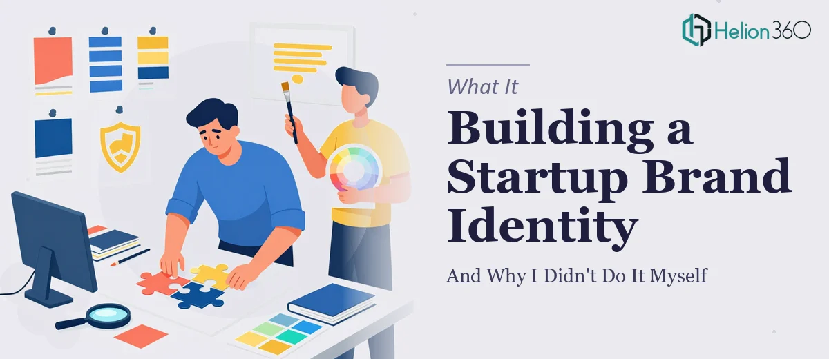
The Problem With Launching a Brand Without a Brand
When our startup was getting close to its public launch, we hit a moment I hadn't fully anticipated. We had a product. We had a team. We had a pitch. What we didn't have was any visual identity that could hold up in the real world — no logo, no favicon, no branding guide that the rest of the team could actually use consistently. That gap was going to matter fast. Marketing materials were being drafted. The website was in development. Investor conversations were starting to happen.
Every one of those touchpoints needed to look like the same company. And right now, they didn't. The timeline wasn't flexible — a launch with mismatched or placeholder visuals sends exactly the wrong signal to exactly the right people. I recognized quickly that this wasn't something to patch together over a weekend. It needed to be done properly, from the ground up.
What I Found That Brand Building Actually Requires
Before I handed this off to anyone, I spent time understanding what a proper startup brand identity actually involves. The first thing that became clear is that a logo isn't one file — it's a system. Horizontal lockup, stacked version, icon-only mark, dark background variant, monochrome version. Each one needs to work at different sizes, across different media, without falling apart.
The favicon compounds this. What looks sharp as a 512px SVG becomes an illegible smear at 16px or 32px if the mark wasn't designed with that constraint in mind from the start. Retrofitting a complex logo into a favicon almost never works cleanly.
Then there's the branding guide. Done properly, it's not a PDF with a color hex code and a font name. It documents spacing rules, misuse examples, minimum size thresholds, color hierarchy, type scale, and the logic behind every visual decision. A guide thin on those details gets ignored the moment someone outside the original team touches the brand. That's when visual drift starts, and it's very hard to walk back. I could see immediately that this was a multi-layered project requiring real design expertise — not something to approximate.
The Work That Needs to Happen
The right approach to a startup brand identity starts with structural and narrative groundwork before a single vector is drawn. A practitioner begins by auditing the brand positioning — what the company does, who it speaks to, what feeling the visual identity needs to create. From there, the work involves translating that positioning into visual direction: mood boards, reference systems, and a defined aesthetic territory that rules things in and rules things out. This stage looks deceptively simple but it governs every decision downstream. Skipping it — or doing it loosely — means the logo exploration becomes arbitrary, and revisions multiply because there's no agreed foundation to test ideas against.
Visual mechanics come next and this is where the technical depth of the work becomes obvious. Logo construction in vector format requires precise anchor point discipline, optical spacing corrections, and decisions about stroke weight that hold up at both large-format and small-format sizes. The favicon derivation is a separate design problem: the mark needs to be simplified or redrawn at pixel-grid scale — typically 16×16, 32×32, and 192×192 — so it remains legible in a browser tab. Color palette work follows its own rules: a primary brand color, one or two secondaries, and defined neutrals, all with accessible contrast ratios. Typography selection involves pairing a primary typeface with a secondary, establishing a scale (commonly 36pt/24pt/16pt for display, subhead, and body), and confirming licensing for web and print use. Each of these decisions has downstream consequences, and reversing them mid-project is expensive in both time and consistency.
Polish and consistency work is what separates a functional brand deliverable from one that actually holds up in the hands of an entire team. A proper branding guide documents not just the rules but the reasoning behind them — minimum clear space around the logo (typically expressed as a multiple of a defined unit, like the cap-height of the wordmark), prohibited configurations with visual examples, the exact color values in HEX, RGB, and CMYK, and approved file formats for each use case. Without this documentation layer, brand drift starts the moment the third person on the team needs to use the logo. Producing this guide at the level of specificity that makes it genuinely usable takes significant time — a day of design work easily becomes two or three once edge cases are mapped and the document is laid out clearly.
Why I Brought in Helion360 to Handle It
I didn't attempt any of this myself. Once I understood the scope — the logo system, the favicon engineering, the branding guide depth — it was clear that the right move was to bring in a team that does this work every day with the tooling and process already in place.
Helion360 handled the full project end-to-end. That meant the initial brand direction work, the full logo system across all variants, the favicon suite optimized for every required size, and a comprehensive branding guide with the specificity level that actually makes it usable by anyone on the team. The turnaround was fast — delivered in days, not weeks, and handled in a fraction of the time it would have taken to build the expertise and execute this at the required standard myself. There was no back-and-forth trying to explain what the deliverables should look like. The team already knew.
What the Project Delivered — and What I'd Tell Anyone in the Same Spot
What came back was a complete visual identity: a logo system with every variant we'd need, a favicon that actually reads cleanly at small sizes, and a branding guide detailed enough that any designer, developer, or marketer on the team could pick it up and apply the brand correctly without asking questions. The launch went out looking like a real, considered company — not a startup that cobbled its visuals together.
The clearest lesson from the whole process was that the complexity of brand identity work is easy to underestimate from the outside. The decisions compound quickly, and the difference between a deliverable that holds up and one that starts fraying within months is entirely in the execution depth.
If you're looking at a similar situation — logo, favicon, and branding guide for a company that needs to look credible fast — Helion360 is the team I'd engage. They delivered the full scope quickly and at the level of craft that this kind of foundational work demands.