

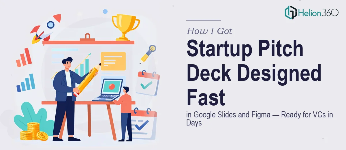
The Situation and What Was Actually at Stake
We were a tech startup connecting small businesses with digital marketing experts — a real product, real traction, and a real window of opportunity with early-stage venture capitalists. The problem was simple and urgent: we needed a pitch deck that could hold its own in front of investors who see dozens of decks a week, and we had just over a week to get there.
This wasn't a situation where a rough draft with good intentions would do. VCs at this stage are evaluating whether you understand your own business clearly enough to communicate it. A cluttered slide, a confusing market slide, or a traction section that buries the lead — any of those can end a conversation before it begins. I knew the content. What I didn't have was the time or the specialized experience to turn that content into a startup pitch deck that looked and felt credible at the level we needed.
This had to be done right, and it had to be done fast.
What I Found a VC-Ready Pitch Deck Actually Requires
Once I started looking honestly at what building a strong pitch deck in Google Slides and Figma actually involves, the scope became clear quickly.
The first signal of real complexity was the narrative architecture. A pitch deck for venture capitalists isn't a company brochure — it follows a specific logic: problem, solution, market size, traction, business model, team, and ask. Each section has to earn the next one. Getting that sequence wrong, or front-loading features when investors want to see market opportunity first, quietly kills the deck's persuasive power.
The second signal was the tooling gap. Figma is used for high-fidelity component design — building the visual system before a single slide is laid out in Google Slides. That means designing master components, icon sets, data visualization frames, and brand assets in Figma first, then translating them cleanly into a Google Slides master. That's a two-tool workflow that requires fluency in both environments simultaneously.
The third signal was investor-specific formatting conventions. Traction slides need specific chart types. Market size slides need to distinguish TAM, SAM, and SOM clearly. Case studies need a structure that delivers social proof without reading like a testimonial page. These aren't aesthetic choices — they're conventions that signal competence to the audience.
What the Work Actually Involves
The foundation of a strong pitch deck is structural and narrative work — and it's more demanding than it looks. The right approach starts with auditing all source material: existing metrics, market data, customer stories, and the core value proposition. From there, a practitioner maps a slide-by-slide story arc where each slide answers one question the investor is already asking in sequence. This isn't copywriting — it's argument construction. Slides that try to do two jobs at once lose the investor's thread, and fixing that mid-project means going back to the architecture, not just editing text. Getting the narrative right before a single visual is designed saves significant rework downstream.
Visual mechanics in a Google Slides and Figma workflow operate at a level most people don't anticipate. The standard approach uses a 12-column layout grid with defined margin and gutter values set in Figma before anything moves into Slides. Typography follows a strict three-level hierarchy — typically 36pt for headlines, 24pt for subheads, and 16pt for body — applied consistently across every master slide. Charts and data visuals are built as Figma components first, ensuring pixel-level alignment and consistent stroke weights before export. This level of precision sounds achievable until you're staring at 18 slides with four chart types and realizing that one misaligned element breaks the visual rhythm across the entire deck.
Polish and brand consistency across a full deck is where most non-specialist attempts fall apart. A properly executed startup pitch deck uses a maximum of four brand colors with defined usage rules — primary, secondary, accent, and neutral — applied without exception across backgrounds, data visualizations, icons, and call-out boxes. Every slide's padding, spacing between elements, and corner radius treatment needs to match. In practice, maintaining this discipline across 20-plus slides while iterating on content simultaneously is where slide-by-slide inconsistencies creep in. Those inconsistencies are small individually, but cumulatively they signal to a trained investor eye that the execution wasn't tight — and that impression transfers.
Why I Brought in Helion360 to Handle It
I recognized quickly that attempting this myself — even with a solid grasp of the content — wasn't a realistic path given the timeline and the stakes. The tooling fluency alone, working across Figma and Google Slides simultaneously at the level this deck needed, is something that takes months to develop. Spending that time learning while a funding window was open wasn't a trade-off I was willing to make.
Helion360 handled the full project end-to-end: the narrative architecture and slide structure, the full Figma component build and Google Slides master setup, and the data visualization and traction slides designed to investor-standard formatting. They turned it around in a fraction of the time it would have taken me to learn and execute it myself. What impressed me most wasn't just the speed — it was that the team clearly understood the investor audience and built the deck for that room, not just for visual appeal. Done in days, not weeks, and the output was presentation-ready without a round of painful cleanup.
The Result and What I'd Tell Anyone in the Same Position
The deck landed the way it needed to. The investor meetings moved forward, the traction section communicated clearly, and the visual execution held up on screen and in print. More importantly, going into those conversations, I wasn't apologizing for the materials — I was focused on the conversation.
The thing I'd tell anyone seeing what I saw — tight timeline, high-stakes audience, real tooling complexity — is that the cost of attempting this yourself isn't just time. It's the quality of the output, and the impression that output makes in a room where you don't get a second chance. If you're in that position and need a VC pitch deck designed end-to-end at the level VCs expect, Helion360 is the team I'd engage — they delivered fast, they understood the audience, and they handled the full execution depth this work genuinely requires.