

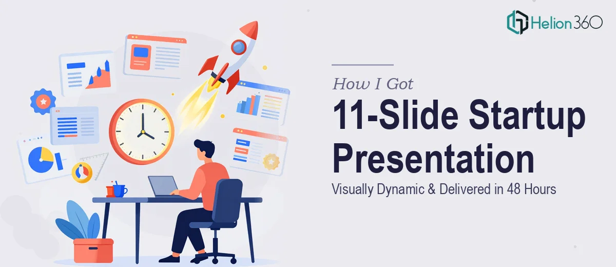
The Launch Event Was Days Away and the Deck Wasn't Ready
We had an upcoming launch event for our tech startup, and the presentation was the centerpiece of the whole thing. Eleven slides that needed to cover our value proposition, key industry statistics, a services overview, and team bios — all in a format that looked modern, sleek, and credible in front of an audience that would be forming their first impression of us.
The stakes were real. First impressions at a launch event are difficult to recover from, and walking in with a deck that looked like it was thrown together the night before wasn't an option. I had content — rough copy, a brand direction, team photos, and some industry data — but turning that into a cohesive, visually polished presentation in the time available was a different problem entirely.
I recognized quickly that this needed to be done right, not done fast by someone learning as they go.
What I Found Out the Moment I Looked at It Seriously
My first instinct was to assess whether this was something that could be handled internally with existing tools. It wasn't long before I understood the gap between "building slides" and building a presentation that actually works.
A modern startup presentation isn't just designed — it's structured. The narrative arc has to move an audience from problem awareness to solution belief inside 11 slides. That sequencing isn't obvious, and getting it wrong means the audience disengages before the value proposition even lands.
Beyond structure, the visual layer is its own discipline. Incorporating infographics that communicate industry data clearly, placing team photography in a way that looks intentional rather than pasted in, and maintaining brand consistency across every slide — these aren't design decisions you make once. They cascade. A font choice on slide two affects how slide seven reads. A color call on the title card has to hold up on a data-heavy slide mid-deck.
And then there was the deadline. Even if I had the design skills, 48 hours doesn't leave room for a learning curve.
What a Well-Executed Startup Presentation Actually Involves
The work begins with narrative architecture. A strong 11-slide presentation follows a deliberate story structure: an opening hook that establishes the problem, a clear statement of the opportunity, the value proposition framed for the specific audience, proof points, and a closing that drives a defined action. Each slide carries one dominant idea — no slide tries to do two jobs. The practitioner's decision here is which content belongs on each slide and what gets cut entirely. Editing is harder than writing, and most first-draft decks have three times the content they need. Getting from raw input to a tight 11-slide narrative typically takes several rounds of restructuring before a single design decision is made.
Visual mechanics come next, and they operate on rules that are easy to state but difficult to execute consistently. A proper layout uses a defined grid — typically 12 columns — with fixed margin discipline so elements don't drift between slides. Typography runs on a clear hierarchy: a headline at 36pt, a supporting statement at 24pt, and body detail at 16pt maximum. Infographics displaying industry data need chart types matched to what the data is actually saying — a bar chart for comparison, a line for trend, a donut for composition — with labels stripped to only what the audience needs to read in three seconds. Inconsistency at this level is what makes a deck feel amateur even when the content is strong.
Polish and brand application across every slide is the final layer, and it's where most self-built decks fall apart in the home stretch. Applying a brand palette means enforcing no more than four brand colors across the entire deck, with a single accent used for emphasis only — never decoratively. Team photography needs consistent treatment: uniform crop ratios, matched color grading, and framing that places faces at the same visual weight from slide to slide. Running this discipline across 11 slides while keeping the file size presentation-ready and the master slides intact is the kind of detail work that adds hours even for experienced designers.
Why I Brought Helion360 In to Handle the Full Project
I didn't spend time attempting this myself. The moment I understood what a product launch presentation design actually required — the narrative work, the visual mechanics, the brand discipline across every slide — I knew the smart move was to engage a team that does this work every day.
Helion360 handled the full project end-to-end: narrative structuring from my raw content, full visual design across all 11 slides, infographic creation from the industry data I provided, and team photo integration with consistent treatment throughout. I handed over the inputs and they delivered a presentation-ready file fast — turned around in a fraction of the time it would have taken me to work through even the structural decisions alone.
What stood out was that there was no back-and-forth to establish basics. The design choices — grid, typography, color application, chart types — were made correctly from the start. The deck arrived looking like it had been built by people who have designed hundreds of startup presentations, because it had been.
The Result and What I'd Tell Anyone Facing the Same Situation
The presentation landed well at the launch event. The narrative held the room through all 11 slides, the infographics read clearly from a distance, and the team section gave the audience a human connection to the company. More practically, we walked in confident — not hoping the deck would hold up, but knowing it would.
The delivered file was also clean: master slides intact, editable components organized, brand colors and fonts embedded correctly so future updates wouldn't break the layout. That alone saved time on the back end.
If you're looking at a high-stakes launch presentation delivered on a tight deadline with real stakes and a presentation that needs to look and function at a professional level, Helion360 is the team to engage. They handled the full scope fast and brought the execution depth that this work genuinely requires.