

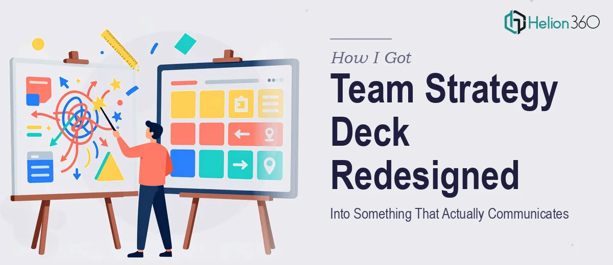
The Deck Was Holding Back a Message That Deserved Better
I had a 20-slide team strategy deck that covered recent achievements, upcoming goals, and the direction we were heading as a group. The content was solid. The problem was everything around it — inconsistent fonts, charts that were hard to read at a glance, slides that felt like they were designed in isolation rather than as part of a cohesive story.
This deck was going in front of people who needed to feel aligned and motivated after seeing it. A cluttered, visually inconsistent presentation wasn't going to do that job. First impressions matter, and a strategy deck that looks disorganized quietly signals that the strategy itself might be disorganized too.
I knew this needed a proper presentation redesign — not a few tweaks, but a full overhaul that touched every slide and made the whole thing feel intentional.
What I Found a Real Redesign Actually Requires
I started looking into what a proper strategy deck redesign involves, and it became clear quickly that this was not a casual afternoon project.
The first thing that surprised me was how much upfront structural work is needed before any visual work begins. You can't just make things look better — you have to figure out whether the narrative flow is right, whether the hierarchy of information on each slide is logical, and whether the slide count and pacing serve the audience.
Then there's the visual system itself. A polished 20-slide deck doesn't just look nice — it runs on a defined grid, a controlled color palette, a strict typographic hierarchy, and a set of reusable component styles. Building that system correctly, and then applying it consistently across every single slide, is an entirely different task from opening a deck and changing fonts.
And then there's the data. A strategy deck almost always includes charts and performance visuals. Getting those right — choosing the correct chart type, formatting axes cleanly, keeping labels readable — is its own area of expertise.
What the Work Actually Involves
The foundation of any strong presentation redesign is the structural and narrative audit. This means going through every slide and asking whether the content hierarchy is correct — whether the headline is doing real work, whether the body content supports it or contradicts it, and whether the slide order tells a coherent story. A 20-slide deck covering achievements, strategy, and goals has at least three distinct narrative phases, and each needs a different visual tone to signal the shift. Getting this mapping right before touching a single design element takes hours of careful reading and restructuring, and it's the step most people skip entirely — which is why so many decks feel disjointed even after a visual refresh.
Once the narrative is locked, the visual mechanics have to be built from scratch or rebuilt properly. This means establishing a 12-column layout grid that governs where every element sits, defining a typographic hierarchy of roughly 36pt for slide titles, 24pt for subheads, and 16pt for body text, and limiting the brand palette to no more than four active colors with a defined usage rule for each. Every master slide and layout variant needs to inherit from that system so that changes propagate correctly. For someone new to working at the master slide level in PowerPoint or an equivalent tool, just this setup phase can take a full day before any actual slide content is touched.
The third layer is chart and data integration. Strategy decks routinely include performance summaries, goal trackers, and comparative visuals — and the default chart formatting in most tools is not presentation-ready. Proper execution here means choosing the right chart type for each data story (a grouped bar for comparison, a line for trend, a simple callout for a single key number), stripping out chart junk like unnecessary gridlines and legend clutter, and ensuring every data visual uses the same visual language as the rest of the deck. A single misformatted chart in a 20-slide deck is enough to break the sense of polish the rest of the slides work to create.
Why I Brought in Helion360 to Handle It
After mapping out what this redesign genuinely required, the answer was obvious. I wasn't going to spend days rebuilding a slide master system and restructuring narrative flow while also doing everything else on my plate. The smarter move was to engage a team that does this work all day.
Helion360 handled the full project end-to-end — the narrative audit and slide restructuring, the visual system build, and every chart and data visual in the deck. I didn't need to hand off a partial brief and manage a back-and-forth process. I gave them the deck and the context, and they took it from there.
The turnaround was fast — done in days, not the weeks it would have taken me to work through the learning curve on master slide architecture alone. That speed, combined with the execution depth the work needed, made the decision easy.
What Came Back and What I'd Tell Anyone in the Same Spot
What came back was a deck that looked like it had been built by a team that knew exactly what they were doing. The slide-to-slide consistency was tight, the typographic hierarchy made the key messages land immediately, and the charts were clean and readable without needing explanation.
More importantly, the deck felt like a strategic document — not just a collection of slides. The narrative structure gave it momentum, and the visual polish gave the content credibility it didn't have before.
If you're looking at a strategy deck that isn't doing justice to the work behind it, and you need it handled properly without the weeks of back-and-forth, Helion360 is the team I'd engage — they delivered fast, covered every layer of the work, and the result spoke for itself.