

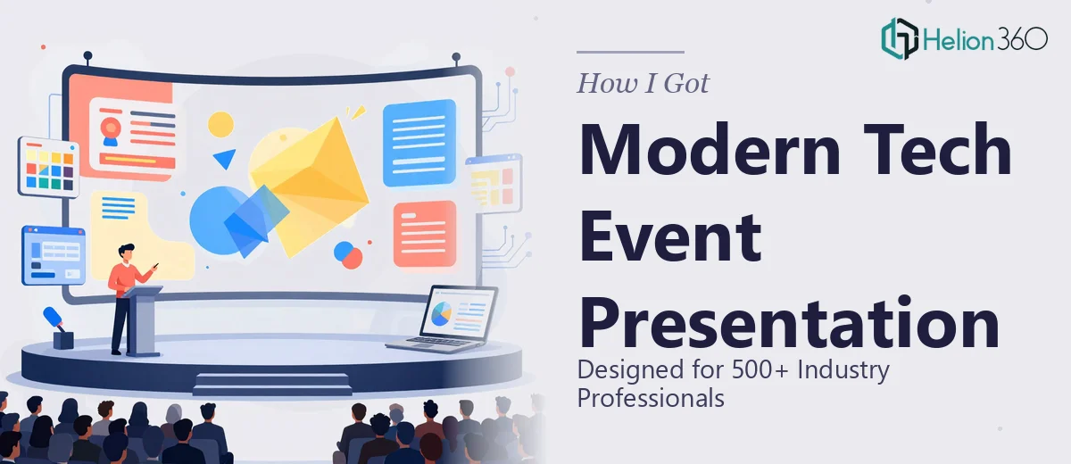
The Event Was Real, the Stakes Were Higher
We had a live event coming up — 500+ tech-savvy professionals in the room, a full speaker agenda, and a brand that needed to show up looking sharp on a large-format screen. The presentation wasn't just background decoration. It was carrying key messaging, product highlights, and innovation themes that the whole event was built around.
The rough slide outline existed. The key talking points were mapped. But translating that into a visually coherent, professionally designed tech event presentation was a different problem entirely. A deck that looks acceptable on a laptop looks flat and amateur when projected at scale. The audience would notice. And with a brand like ours on the line in front of that crowd, "good enough" was not a standard I was willing to settle for.
I recognized quickly that this needed someone who understood event presentation design at a professional level — not just someone who could make slides look cleaner.
What Doing This Well Actually Requires
Once I started looking into what a properly designed tech event presentation actually involves, it became clear this wasn't a weekend project.
The first thing that stood out was the resolution requirement. Event presentations are displayed at resolutions and aspect ratios that differ from standard slide decks — 1920×1080 minimum, often wider — and every graphic asset needs to be built or sourced at a quality that holds up at that scale. Low-res images that look fine in a slide preview will visibly degrade when projected on a 10-foot screen.
The second issue was brand consistency across what could be 30 to 50 slides. Maintaining a coherent visual system — same typeface hierarchy, same color palette application, same spacing logic — across that many slides without drift requires a disciplined design system, not just copying a style from one slide to the next.
The third signal was the infographic complexity. Highlighting key statistics and technology features in a way that reads instantly to a live audience — while still looking sophisticated — requires real information design skill. It's not about making a chart. It's about encoding the right data in the right visual form so a room full of people gets it in three seconds.
At that point, I stopped trying to figure out how to handle this internally.
What the Design Work Actually Involves
The structural work starts before a single slide is touched. Proper event presentation design requires auditing the rough outline and mapping a clear narrative arc — identifying which slides carry the big moments, which ones support context, and how the flow reads when a speaker is standing in front of it. Done well, the deck is organized into segments with intentional visual pacing: high-impact opener, information-dense middle sections, and a strong close. Getting this logic right before any visual decisions are made saves hours of rework later. Most people skip this step and pay for it when the deck feels disjointed despite looking polished on individual slides.
The visual mechanics are where most of the execution time lives. A professional tech event presentation works on a consistent layout grid — typically a 12-column structure — with a strict typographic hierarchy: display headings at 40–48pt, section headers at 28–32pt, body copy at 18–20pt, and captions no smaller than 14pt for large-screen legibility. Brand color application follows a defined palette with no more than 4 primary colors and 1–2 accent tones, applied consistently to signal slide type and importance. Building this as a master slide system — rather than manually styling each slide — is what makes large decks manageable. Setting up master slides that propagate correctly across 40+ slides, including layout variants, takes several hours for someone who does this regularly and much longer for someone who doesn't.
Infographics and data visualization for a live audience follow different rules than charts built for reports. The principle is immediate readability: a stat callout needs a single dominant number, a short label, and enough visual weight to be seen from the back of a room. Comparison charts should use no more than 3–4 data series. Icon-driven process flows work better than text-heavy diagrams when a speaker is talking over the slide. Each of these choices requires a practitioner who knows what reads under event lighting versus what reads on a screen — a distinction that is not obvious until you've seen a presentation fall flat in a live room.
Why I Brought in Helion360 to Handle It
I didn't attempt to build this internally and then look for help. I recognized early that the combination of scale, brand requirements, and event-specific design constraints made this the kind of work that needs a specialist team — one that already has the process, the asset library, and the design system discipline in place.
Helion360 handled the full project end-to-end. That meant taking the rough outline and messaging points, structuring the narrative flow, building the master slide system with the correct grid and typographic hierarchy, sourcing and adapting high-quality tech-relevant imagery, and producing the infographics from raw statistics. The full deck was delivered fast — done in days, not weeks — at a quality level that would have taken my internal team far longer to reach, if they could have reached it at all.
The turnaround alone was the deciding factor. With an event date fixed on the calendar, there was no margin for a slow iteration process.
What Was Delivered and What I'd Tell Anyone in My Position
The final deck was a fully designed, large-format-ready tech event presentation — consistent branding across every slide, high-resolution imagery, clean infographics that read instantly at scale, and a narrative structure that gave the speakers a deck they could actually present confidently. The event ran without a single visual hiccup, and the feedback on conference presentation design quality was immediate.
If you're looking at a similar situation — an event with a real audience, a brand that needs to show up professionally, and a deadline that doesn't move — Helion360 is the team I'd engage. They handled the full execution fast and brought the kind of design depth that high-impact keynote presentations genuinely require.