

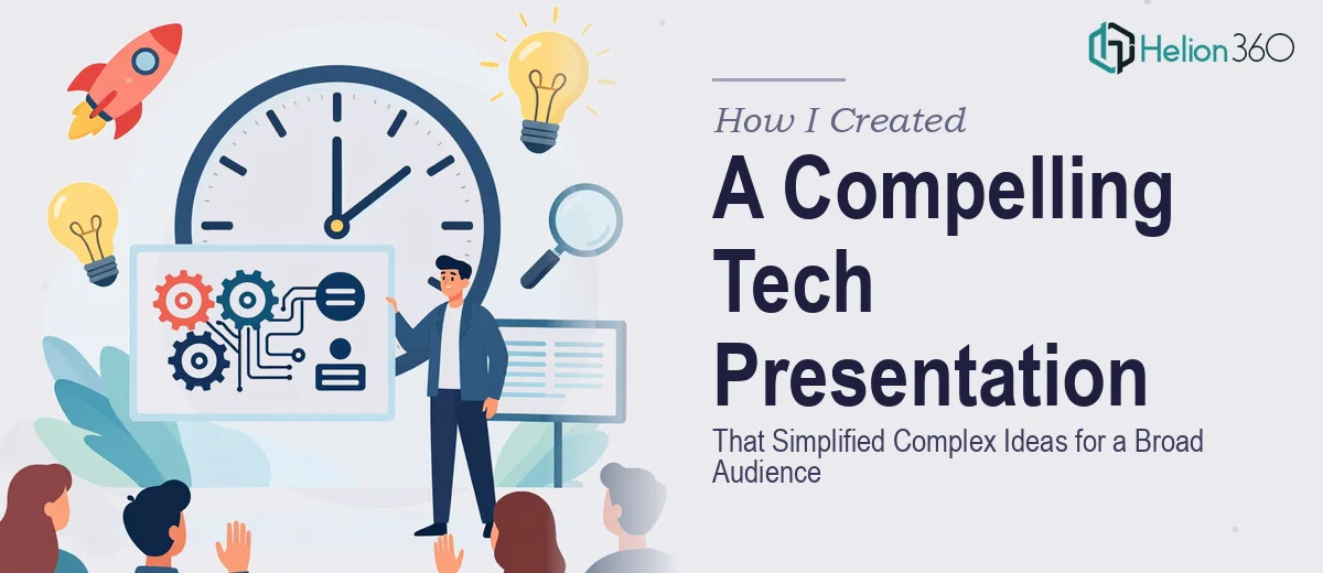
When a 10-Minute Slot Carries More Weight Than You Expect
I was working at a fintech startup with a genuinely strong product story — customer behavior insights, market sizing data, competitive positioning — and we had a 10-minute window in front of a cross-functional audience that included executives, sales leads, and non-technical stakeholders. The goal was simple to state and hard to execute: take a dense body of research and data and make it land clearly for people with very different levels of technical familiarity.
The stakes were real. This wasn't an internal debrief. Decisions about product direction and go-to-market sequencing were going to be influenced by how well the room absorbed what we were presenting. A slide deck that overwhelmed people with raw numbers, or one that oversimplified to the point of losing credibility, would both fail. I knew straight away that this needed to be done properly.
What I Found a Presentation Like This Actually Requires
My first instinct was to ask: how hard can it be to take existing research and put it into slides? The answer, once I started looking at what well-executed tech presentations for mixed audiences actually involve, was: considerably harder than it looks.
The core challenge isn't just design — it's narrative architecture. Complex data doesn't translate itself. Someone has to make decisions about which findings lead, which support, and which get cut entirely. For a 10-minute format, that means ruthless prioritization: typically no more than 8 to 12 slides, with each one doing exactly one job.
Beyond structure, there's the visual mechanics layer. Data that lives in spreadsheets or dashboards doesn't render clearly in a presentation without deliberate chart selection, labeling strategy, and layout decisions that work for a projected screen. And then there's the consistency layer — brand application, typography hierarchy, color discipline — all of which signal credibility to an executive audience before a single word is spoken. I could see that doing this well was not a weekend project.
What the Work Actually Involves
The starting point for a presentation like this is a narrative audit and story architecture pass. The raw inputs — market data, customer behavior analysis, competitive landscape findings — need to be mapped against a single through-line that a non-technical executive can follow in real time. The right approach uses a problem-solution-evidence arc: open with the business context, establish what the data reveals, and close on an implication that the audience can act on. Getting this architecture right before any visual work begins is what separates presentations that land from ones that confuse. It typically requires several rounds of sequencing decisions, and it's easy to get wrong when you're too close to the source material.
With the narrative locked, the visual mechanics work begins. For a tech presentation aimed at a broad audience, chart selection follows strict rules: bar charts for comparisons, line charts for trends over time, and no more than one primary insight per visual. Typography hierarchy runs at roughly 36pt for slide headlines, 24pt for supporting labels, and 16pt for footnotes or data sourcing — and that hierarchy has to hold consistently across every slide. A 12-column layout grid keeps content aligned and breathing, but setting it up correctly in master slides so it propagates without breaking takes time and precision. Practitioners working at this level also know that overloading a chart with secondary data series is one of the most common ways a technically rigorous presentation loses a general audience.
The final layer is polish and brand consistency applied at scale. A 10-slide deck still has dozens of individual elements that need to be checked: color palette discipline (typically no more than 4 brand colors in active use), icon style consistency, spacing uniformity, and slide-to-slide visual rhythm. This is where most self-built presentations fall apart — not on any single slide, but in the accumulated inconsistencies that signal the deck was assembled rather than designed. Getting this right requires working from a locked master template, reviewing at export resolution, and checking how every slide reads at actual presentation scale on a projected screen.
Why I Brought in Helion360 to Handle It
I recognized quickly that attempting this myself — or asking someone on the team to piece it together between other responsibilities — was going to produce a deck that looked like exactly what it was: a rushed internal effort. That wasn't going to work for the audience or the moment.
Helion360 handled the full project end-to-end. That meant taking the raw research inputs and market data, building the narrative architecture from scratch, executing the visual design against our brand standards, and delivering a presentation that was genuinely ready to go in front of an executive audience. They turned it around quickly — done in days, not weeks — which mattered because the window between when all the source material was ready and when the presentation needed to happen was tight.
What made the difference was that this kind of work is what their team does continuously. The tooling, the template systems, the design judgment for mixed audiences — it was already in place. The project didn't require any ramp-up time on their end.
The Result and What I'd Tell Anyone Facing the Same Situation
The final deck hit the 10-minute format precisely: 10 slides, one clear narrative arc, data visualizations that read immediately without explanation, and consistent brand application throughout. The executive audience tracked the argument without getting lost in the data, and the product direction discussion that followed was grounded in the findings rather than bogged down in trying to interpret what the slides meant.
The broader takeaway I'd share is straightforward: if your presentation is carrying real business weight — if the audience includes people who will form opinions based partly on how polished and credible the materials look — then the production quality is not a cosmetic detail. It's part of the communication. Getting the narrative architecture, visual mechanics, and consistency layer all right, simultaneously, under time pressure, is a specific skill set. If you're looking at a market research presentation and want it handled end-to-end without the weeks of learning curve, Helion360 is the team I'd engage — they delivered for me fast and brought the execution depth this kind of work genuinely needs.