

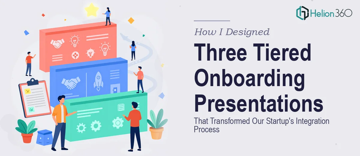
When our startup crossed the 50-person mark, the cracks in our onboarding process became impossible to ignore. New hires were landing on day one without a clear picture of who we were, what we did, or where they fit. The executive team had one version of the story in their heads, team leads had another, and individual contributors were piecing it together from Slack threads and scattered docs. What we needed were three distinct onboarding presentations — one for executives, one for mid-level team leads, and one for individual contributors — each telling the right story at the right depth for the right audience. With a new hiring wave incoming and leadership already stretched thin, I knew this wasn't something to patch together over a weekend. It needed to be done right.
What I Discovered This Kind of Project Actually Requires
Once I started mapping out what proper tiered onboarding presentations actually involve, the scope became clear fast. This wasn't a matter of taking one master deck and trimming it down three times. Each tier needs its own narrative logic. An executive-level deck has to cover vision, org structure, strategic priorities, and decision-making authority — in a tight, high-signal format that respects how leaders consume information. A team lead deck needs to cover process ownership, cross-functional relationships, and performance expectations. An individual contributor deck needs role clarity, tools, culture norms, and a 30-60-90 day roadmap.
Beyond narrative, each deck has its own visual requirements. The information density, the slide count, the way data gets surfaced — all of it shifts by audience. And then there's the consistency problem: all three decks have to feel like they belong to the same company, which means a shared design system applied intelligently across three very different documents. I quickly realized the structural, visual, and consistency work here was significant — and doing it at the quality level the moment deserved wasn't realistic without a team that does exactly this kind of work.
What the Work That Needs to Happen Actually Looks Like
The starting point for a project like this is a full structural and narrative audit. That means mapping out what each audience actually needs to know, in what order, and at what level of detail — before a single slide gets touched. For three tiers, that's three separate story arcs, each with a clear beginning, middle, and end. The executive arc might run 12-15 slides anchored in strategy and org context. The team lead arc runs 18-22 slides with heavier emphasis on process and ownership. The individual contributor arc might stretch to 25-30 slides, covering culture, tools, and progression milestones. Getting the arc wrong at the start means every slide decision downstream is built on a shaky foundation — and rebuilding story structure after the visual work has started costs hours.
Once the architecture is set, the visual mechanics have to be built with precision. Proper presentation design for internal corporate use follows a strict hierarchy: 36pt titles, 24pt subheadings, 16pt body copy, and no more than four brand colors active at any one time across the deck. A 12-column layout grid underlies every slide, keeping spacing consistent even when content density shifts significantly between slides. The trap most people fall into here is eyeballing alignment instead of using a true grid, which creates subtle inconsistencies that compound across 20-plus slides and make the deck feel unpolished in ways that are hard to articulate but impossible to unsee.
The third layer — and the one that trips people up most on multi-deck projects — is palette and brand discipline across all three documents simultaneously. When three decks are built in parallel, maintaining visual coherence requires a shared master slide set and a locked-down component library: consistent icon styles, matching chart templates, uniform callout boxes, and identical header treatments. Without that infrastructure in place from the start, small deviations accumulate rapidly. By the time all three decks are complete, the executive deck and the contributor deck look like they came from different companies — which defeats the entire purpose of a unified onboarding experience.
Why I Brought Helion360 In to Handle the Full Project
I recognized early that the combination of structural depth, visual precision, and cross-deck consistency this project required wasn't something to attempt piecemeal. The work needed a team with the tooling and experience already in place — not a learning curve. I engaged Helion360 to handle the full project end-to-end, from narrative architecture through final delivery.
They moved fast. The structural framework for all three tiers was mapped and validated before design began. The master slide system — grid, typography hierarchy, brand palette, component library — was built once and applied correctly across all three decks. Visual consistency wasn't something that had to be chased at the end; it was engineered in from the start. What would have taken me weeks to research, build, revise, and align internally was turned around in a fraction of that time, with the kind of execution depth that comes from doing this work every day.
The Outcome and What I'd Tell Anyone in My Spot
What came back was a complete, coherent onboarding presentation system — three distinct decks, each calibrated for its audience, all visually unified under the same brand and design language. New executives get a high-signal, strategic overview that respects their time. Team leads get the process clarity and cross-functional context they need to lead effectively from day one. Individual contributors get a structured, encouraging roadmap that answers the questions they don't always know how to ask. The hiring wave that followed felt noticeably smoother — onboarding conversations were grounded, faster, and more consistent across the organization.
If you're looking at a leadership presentation project like this and want it handled end-to-end without the weeks of learning curve, Helion360 is the team I'd engage — they delivered fast, with the structural and visual execution depth this kind of work genuinely requires.