

The Problem With a Feature-Heavy Deck
With a trade show coming up in less than a month, I knew our presentation needed work. Our existing slides were packed with technical details — API specs, integration diagrams, processing benchmarks. Useful information for engineers, but completely opaque for the business decision-makers walking the floor.
The challenge was not that the product lacked value. It was that the slides were speaking the wrong language for most of our audience. A trade show attracts a wide mix of people: product managers, executives, operations leads, and yes, technical evaluators too. A single slide deck needs to work for all of them at once.
I sat down to rework it myself. I knew the product well, so I assumed I could bridge that gap on my own.
Where the Self-Editing Process Broke Down
I started by pulling out what I thought were the most business-relevant points. I rewrote a few slides, simplified the language, and replaced one of the architecture diagrams with a flow chart. Progress, but not enough.
The core problem was that I was too close to the product. Every time I tried to cut a technical detail, I second-guessed myself — what if a developer in the audience asks about it? What if we lose credibility by oversimplifying? I kept adding things back.
I also struggled with visual structure. I could write the message, but translating it into a polished, consistent slide layout was taking more time than I had. The deck looked uneven. Some slides were clean and direct. Others still read like internal documentation.
With the demo day deadline approaching, I needed a different approach.
Bringing in a Team That Understood the Problem
After hitting that wall, I came across Helion360. I explained what I was trying to do — update a tech startup's trade show presentation to speak to both technical and non-technical audiences without losing the substance.
Their team asked the right questions up front. What outcomes were we promising? What does the audience care about at a trade show versus a sales call? What do we want someone to walk away knowing after 90 seconds at our booth?
Those questions helped clarify what the deck actually needed to do. It was not about removing technical content entirely. It was about sequencing it correctly — leading with outcomes, then supporting with evidence, then offering technical depth for those who wanted it.
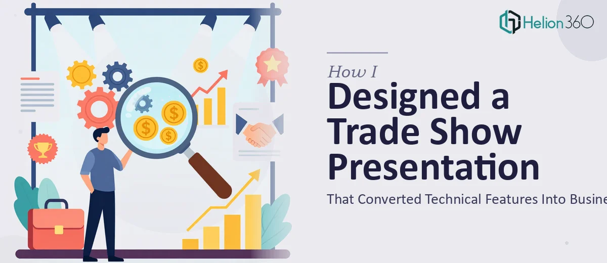
What the Redesigned Trade Show Presentation Looked Like
The final deck was structured around the business value first. Each new feature was introduced not by what it does technically, but by what problem it solves for the buyer. The technical specifics were still there — moved to supporting slides that a presenter could choose to show or skip depending on the audience.
The visual design was consistent throughout. A clean layout with clear typographic hierarchy made each slide readable at a glance. Data that previously lived in dense tables was reformatted into simple visuals that communicated the point in seconds rather than minutes.
Helion360 also flagged a few slides where the messaging was contradictory — places where the headline said one thing but the content underneath said something different. Small details that I had stopped seeing after staring at the same file for weeks.
What I Took Away From This Process
The experience reinforced something I already knew but had not fully applied: a trade show presentation is not a product manual. Its job is to open a conversation, not close a technical review.
The best trade show PPT design keeps the audience in mind at every slide — not just the most technically literate person in the room, but everyone who might be standing there. Leading with outcomes and reserving detail for follow-up is a structure that works across audience types.
I also learned that the hardest part of updating a deck you built is knowing what to let go of. That outside perspective — someone who has no attachment to what was already there — made the editing process faster and more decisive.
If you are in a similar position with an upcoming trade show and a presentation that feels outdated or misaligned with your audience, Helion360 is worth reaching out to — they handled exactly this kind of problem and delivered something that was genuinely ready to use.