

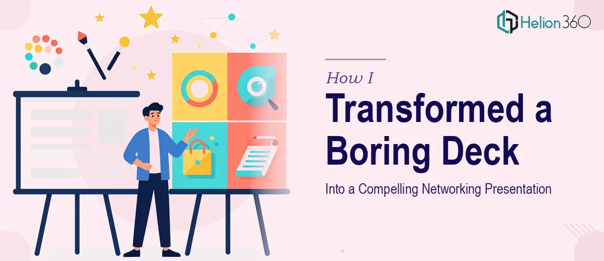
The Deck I Had Wasn't Going to Cut It
I had a conference coming up — the kind of professional networking event where first impressions happen in seconds and your materials either open doors or get forgotten. My existing PowerPoint deck was functional at best: a wall of bullet points, inconsistent fonts, and slides that looked like they were assembled in a hurry (because they were).
The stakes were real. I was presenting my research background and professional profile to a room of senior peers, potential collaborators, and decision-makers. A forgettable deck meant a forgettable impression, and that wasn't an outcome I could afford. I knew immediately that patching it myself over a weekend wasn't going to produce what this moment actually required. The work needed to be done properly.
What I Found a Professional Presentation Redesign Actually Requires
When I started looking into what a genuine presentation redesign involves, I realized quickly that it's not just about making slides look prettier. Done well, the process starts with a structural audit — someone has to evaluate whether the narrative flow actually serves the audience, not just the presenter.
Beyond structure, the visual mechanics are more demanding than most people expect. A properly designed deck uses a consistent layout grid, a controlled type hierarchy, and a color palette that stays disciplined across every slide. Then there's the question of content density — how much belongs on a single slide, when a visual should replace text entirely, and how to keep a technical audience engaged without oversimplifying.
The combination of narrative logic, visual design, and professional polish requires a specific kind of expertise. It's not something you develop in an afternoon, and the tools alone don't solve it. That's when I recognized this needed a team that does this work every day.
What the Work Actually Involves
The right approach to a presentation redesign starts with a full structural and narrative audit of the source material. Every slide gets evaluated against a single question: does this advance the story the audience needs to follow? In a networking or professional profile presentation, that story arc typically moves from context and credibility through to a clear, memorable value proposition. Restructuring this often means collapsing five cluttered slides into two tight ones, rewriting headline copy from descriptive labels into active statements, and sequencing information so that the audience arrives at the key message without friction. The content decisions alone take significant time and judgment to get right.
Visual mechanics are the next layer, and they carry their own complexity. Professional slide design operates on a layout grid — typically a 12-column structure — with a strict typographic hierarchy: title text around 36pt, supporting headers at 24pt, and body content no larger than 18pt. Color discipline means selecting a palette of no more than four brand-aligned hues and applying them consistently as signal, not decoration. Choosing the right visual treatment for each slide — whether that's a clean icon, a data visual, a full-bleed image, or structured white space — requires genuine design judgment. Someone new to this workflow will spend hours on alignment and spacing alone before anything looks intentional.
Polish and consistency across the full deck is where many self-built presentations fall apart. It's not enough for individual slides to look good in isolation — every element needs to behave predictably across the entire presentation. Master slide architecture, consistent margin application, uniform icon weights, and controlled image cropping all have to work together. A single misaligned element on slide 14 undermines the credibility built by slides one through thirteen. Getting this right across a 20-plus slide deck, with a cover, section dividers, content slides, and a closing, is a methodical process that requires attention at a level most people simply don't have time to sustain.
Why I Brought in Helion360 to Handle It
I didn't attempt the redesign myself. Once I understood what doing it properly actually involved, the decision to bring in Helion360 was straightforward. I needed the full job done — narrative restructuring, visual design, and final polish — not just a surface-level cleanup.
What made the difference was speed and depth of execution. Helion360 handled the end-to-end project: they audited the existing content and restructured the narrative arc, applied a clean visual framework with proper typographic hierarchy and a disciplined color system, and delivered a fully polished deck that held together across every slide. The turnaround was fast — done in days, not the weeks it would have taken me to learn the tooling and work through every decision myself. A team that handles presentation design work at this level every day simply moves faster and produces better output than anyone approaching it without that depth of practice.
The Result and What I'd Tell Anyone in the Same Spot
The finished deck was a different object entirely from what I started with. The narrative was tighter, the visual language was consistent and professional, and the slides communicated credibility in a way that a bullet-point list simply cannot. At the event itself, the deck did exactly what it needed to do — it opened conversations and made the right impression with the right people.
If you're looking at a similar situation — a presentation that needs to represent you at a high-stakes professional moment and you can see the gap between what you have and what it needs to be — consider a Resume Deck to strengthen your professional presence. You might also find value in learning how others have tackled similar challenges: read about transforming a resume into a visually engaging presentation and explore the process of designing compelling interview presentation decks. Helion360 is the team I'd engage for the full scope executed fast, and the execution depth they bring is exactly what this kind of work demands.