

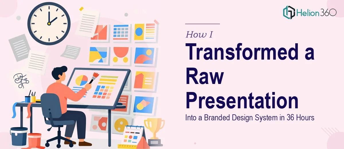
The Presentation Was Due and the Slides Were a Mess
I was sitting on a 20-slide deck that had been built in pieces by three different people over two months. Every slide looked like it came from a different company. Fonts clashed, colors were inconsistent, some charts were screenshots from spreadsheets, and the narrative thread was nearly impossible to follow. The deck was going in front of senior leadership in four days to support a significant strategic decision.
The stakes were clear: a poorly designed presentation doesn't just look unprofessional — it undermines the credibility of the findings inside it. Good data buried in a disorganized, visually incoherent deck gets dismissed. I knew immediately that patching this myself over a few evenings wasn't going to produce something that matched the weight of the moment. This needed to be done right, end-to-end, not just tidied up.
What I Found Out a Real Presentation Redesign Actually Requires
I started looking at what a professional presentation redesign actually involves at this level, and the complexity surfaced fast.
First, fixing a broken deck isn't a cosmetic job. The visual inconsistency was a symptom — the deeper problem was that there was no design system underneath it. No master slide architecture, no enforced type hierarchy, no locked color palette. Every slide was a one-off. Fixing the surface without building the system underneath just creates a new set of inconsistencies.
Second, the data slides were particularly problematic. Raw chart exports and table screenshots aren't presentation-ready. Charts need to be rebuilt natively in the presentation tool with proper axis labeling, consistent styling, and visual hierarchy that guides the eye to the insight — not to the noise.
Third, the narrative structure was fractured. Slides that were meant to tell a sequential story were disconnected from each other. Fixing that requires stepping back from slide-by-slide editing and working at the story architecture level — understanding what each slide is doing in service of the overall argument. That's not something you can rush.
What the Work of Doing This Well Actually Looks Like
The Work of Doing This Well
Building a proper design system for a presentation starts with the master slide architecture. The right approach involves establishing a 12-column layout grid, a locked type hierarchy — typically 36pt for primary headlines, 24pt for subheads, 16pt for body — and a palette capped at four brand colors with defined usage rules for accent, background, text, and data. Done correctly, this propagates across all slides automatically. For someone unfamiliar with master slide logic in PowerPoint or Google Slides, setting this up without breaking existing slide content is genuinely difficult — it takes a working knowledge of layout inheritance, placeholder behavior, and how slide-level overrides interact with the master. Even experienced users routinely lose hours here.
Rebuilding data slides is a separate discipline entirely. Each chart needs to be recreated natively rather than imported as an image, so it can be properly styled and updated. The practitioner's decision at this stage is which chart type accurately represents the relationship in the data — a clustered bar for comparison across categories, a line chart for trend over time, a dot plot when rank matters more than magnitude. Axis labels need to be trimmed, gridlines reduced to minimum necessary, and a single data point or headline callout added to direct the viewer's attention to the insight. Getting this right across 8 to 10 data slides in a consistent way, without any one chart looking like an outlier, takes longer than most people expect.
Polish and consistency across a full deck is where the work compounds. Once the structure and charts are right, every slide needs to be audited for margin alignment, text overflow, icon sizing, and color application. A professional standard here means every content block sits on the same invisible grid, every icon is drawn from a single family at the same optical weight, and no slide has a rogue font, misaligned element, or off-brand color. Applying that discipline across 20 slides — and then reviewing it at 100 percent zoom on a large monitor before sign-off — is methodical, time-intensive work that rewards expertise and penalizes speed.
Why I Brought in Helion360 to Handle It
I didn't attempt any of this myself. After understanding what the work actually required, it was obvious that the combination of design system expertise, data visualization skill, and polish discipline needed here was not something I could replicate in four days on top of my actual job.
Helion360 handled the full project end-to-end. That meant auditing the existing deck and rebuilding the master slide architecture from scratch, recreating all data charts natively with proper visual hierarchy and consistent styling, and applying brand-consistent polish across every slide in the deck. They turned the full project around in 36 hours — done in a fraction of the time it would have taken me to learn and execute the same level of work myself.
What made the difference was that this is exactly the kind of work Helion360 does every day. The tooling, the process, and the expertise are already in place. There was no ramp-up time, no trial and error, no version one that had to be thrown away.
The Result and What I'd Tell Anyone Facing the Same Situation
What came back was a cohesive, professionally designed deck that looked and read like a single team had built it with intention from day one. The data slides were clean and readable. The narrative structure was clear. The visual language was consistent from the first slide to the last. Leadership engaged with the content the way you want them to — focused on the findings, not distracted by the format.
The broader lesson from this was simple: a presentation redesign that involves fixing structure, rebuilding data visuals, and building a proper design system underneath is not a side-of-desk project. The mechanics are real and the execution bar is high.
If you're looking at a similar situation — a deck that needs full-scale redesign before a high-stakes meeting — Helion360 is the team to engage. They handled this end-to-end, delivered fast, and brought the kind of execution depth this work genuinely requires.