

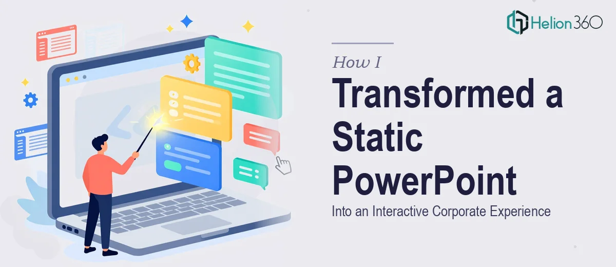
When Your Slides Don't Match Your Brand, People Notice
I was preparing for a series of trade show appearances and client meetings, and the deck we had on hand looked nothing like our website. Same company, completely different visual language. The website was clean, modern, and polished — the kind of first impression that builds trust immediately. The PowerPoint was a patchwork of old templates, inconsistent fonts, and placeholder visuals that hadn't been touched in years.
The stakes were real. These weren't internal reviews — they were live presentations in front of prospects who had likely already visited our site. If the deck felt like a different brand entirely, that disconnect would quietly erode credibility before a single word was spoken. I knew straight away that patching a few slides wasn't going to cut it. What was needed was a full brand-aligned PowerPoint design that carried the website's identity into every single slide.
What I Found Out This Actually Required
Before I made any moves, I spent time understanding what a proper brand-aligned PowerPoint design actually involves. The short answer: considerably more than swapping in a logo and picking a color.
The website had a defined visual system — specific hex values, a type hierarchy with particular weights and sizes, a grid that gave everything its spacing logic, and a photographic style that was consistent across every page. Translating that into a presentation format isn't a copy-paste exercise. Presentation software has its own constraints around text rendering, image compression, and master slide architecture that a web designer never has to think about.
I also realized that the presentation needed to work across contexts — displayed on a laptop in a one-on-one meeting, projected on a large screen at a trade show, and potentially shared as a PDF leave-behind. Each context has different requirements for contrast, legibility, and layout density. A design that looks sharp in one setting can fall apart in another. That complexity alone told me this wasn't a weekend project.
What the Work Actually Involves
The foundation of any brand-aligned presentation is the master slide system. Done correctly, this means building a library of layouts — title slides, section dividers, content slides, data slides — that all inherit from a single source of truth. The type hierarchy should be locked in at the master level: typically something like 40pt for headlines, 24pt for subheads, and 16pt for body copy, all using the exact brand typeface. Getting this propagation right so that updates to the master cascade cleanly through every layout takes real knowledge of how presentation software handles slide inheritance, and a single misstep in the master means hours of cleanup across dozens of slides.
Visual mechanics are where the gap between a website and a presentation widens most sharply. A website can use fluid layouts, hover states, and responsive grids. A presentation lives on a fixed canvas — typically 16:9 at 1920×1080 pixels. The work involves establishing a consistent layout grid (commonly a 12-column structure with defined gutters) and then making deliberate decisions about image treatment, icon style, and whitespace ratios that mirror the website's aesthetic without literally copying its web-specific layouts. Every visual element — photography crop style, illustration weight, button-like callout shapes — needs to be evaluated for how it reads on a projected screen versus a monitor, and adjusted accordingly.
Brand consistency across a multi-slide deck is the part that quietly consumes the most time. It's not enough to get the first ten slides right. Every slide needs the same padding from the edge, the same alignment between text columns and image blocks, and the same application of the accent color palette — typically no more than four brand colors deployed with a clear hierarchy of dominant, secondary, and accent use. The execution friction here is cumulative: one misaligned element, one off-brand color applied to a chart axis, or one inconsistent use of bold disrupts the sense of craft the entire deck is supposed to communicate. Checking every slide individually, at full resolution, is not a quick task.
Why I Brought in Helion360 to Handle It
I recognized quickly that I didn't have the combination of time, design tooling, and presentation-specific expertise to execute this at the level it needed. This wasn't a situation where a good-faith effort would produce a good result — the gap between a passable deck and a genuinely polished brand-aligned presentation is visible to any audience that has already seen the website.
Helion360 handled the full project end-to-end. That meant auditing the existing website's visual system and extracting the design tokens — colors, type styles, spacing ratios, image treatment guidelines — and then building the complete master slide architecture from scratch. They also handled every content slide, applying the grid system consistently, sourcing and treating photography to match the brand's visual tone, and building reusable chart and data layouts that stayed on-brand even when the content changed. The whole thing was delivered fast — done in days, not the weeks it would have taken me to learn the tooling and work through every slide myself. The speed came from a team that does this work every day, with the process and expertise already in place.
The Outcome, and What I'd Tell Anyone in the Same Position
What came back was a deck that felt like a natural extension of the website — the same visual rhythm, the same confidence in the layout, the same sense of craft. At the trade show, the feedback from prospects was immediate: the materials looked professional and consistent. In client meetings, the slides reinforced the brand rather than quietly undermining it. The presentation became a tool we could rely on, not something we had to apologize for.
The lesson I'd pass on is simple: if the presentation needs to represent the brand at the level your website already does, the execution depth required to get there is real. Don't underestimate it, and don't assume a few hours of editing will close the gap.
If you're looking at the same situation — a polished website and a deck that doesn't match it — and you need it handled end-to-end without the learning curve, Helion360 is the team I'd engage. They delivered fast and brought exactly the level of execution this kind of work demands.