

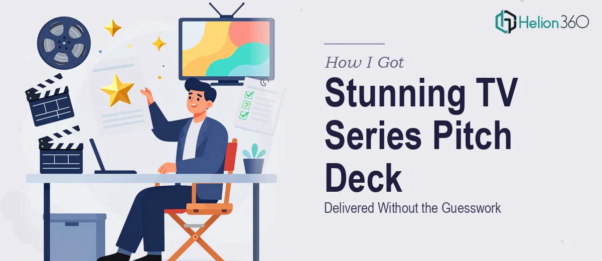
The Presentation That Had to Work — or the Show Wouldn't Get Made
We had a TV series with real momentum behind it. A premiere date was approaching, industry events were on the calendar, and the conversations we needed to have — with investors, partners, and distribution executives — were starting soon. The problem was that we had no polished, investor-ready materials to walk into those rooms with.
The ask was clear: a look book and pitch deck that would capture the visual world and narrative direction of the show, and make the right impression in high-stakes meetings. Not a rough concept document. Not a mood board stitched together in a slide template. Something that looked like it came from a production that knew exactly what it was doing and was ready to be taken seriously.
I knew immediately that this wasn't something to wing. The audience for these materials — people who evaluate entertainment pitches for a living — can tell within seconds whether a presentation was built with real intent or thrown together. It needed to be done right, which meant understanding what doing it well actually required.
What I Found Out: This Is Not a Slide Deck — It's a Visual Argument
Once I dug into what a professional TV series pitch deck and look book actually involve, the scope became clear fast. This is not a business presentation with a few nice photos dropped in. It's a carefully constructed visual and narrative document that has to do several things simultaneously: establish a distinct aesthetic world, communicate tone and genre at a glance, tell a story about the show's commercial viability, and hold the attention of people who've seen hundreds of these.
The look book component alone carries significant weight. It needs to define the show's visual language — color palette, cinematographic references, character archetypes, setting mood — in a way that feels intentional and cohesive, not assembled. And the pitch deck structure has its own conventions: logline, format, audience profile, competitive landscape, team credentials, and a clear ask.
What made this complex wasn't any one element. It was that every slide had to serve both functions at once — communicating information and projecting a brand identity that felt cinematic and credible. That's a specific skill set, and it became obvious quickly that it sat well outside the territory of standard presentation design.
What the Work That Goes Into a Project Like This Actually Looks Like
The foundation of a TV series pitch deck is narrative architecture — and getting that structure right is harder than it appears. The work involves auditing all the source material (scripts, treatment documents, visual references, talent bios) and mapping a logical story arc across typically 15 to 25 slides. The opening slides need to establish the show's world within seconds; the middle section has to build the commercial case without losing the creative energy; the closing slides need to land a clear, confident ask. Practitioners sequence this arc deliberately, knowing that the first three slides either earn the next ten or lose the room. Getting this flow right from raw source material takes significant editorial judgment and multiple rounds of structural revision.
The visual mechanics of an entertainment look book operate on different rules from a standard corporate deck. Proper execution uses a restrained palette — typically two to three dominant tones drawn from the show's intended cinematography — applied across a 12-column grid with strict typographic hierarchy: display titles at 48pt or above, section headers at 28-32pt, body annotations at 14-16pt. Imagery selection is not decorative; each photo or frame must reinforce a specific tonal cue, and the relationship between image, negative space, and text block has to feel considered. Getting this right across 20-plus slides, without a single layout breaking the visual grammar, requires both aesthetic judgment and technical discipline that takes years to develop.
Polish and brand consistency across the full deck is where most self-assembled presentations fall apart. Proper execution means every slide — from the logline page to the financial ask — shares the same color application rules, the same shadow and texture language, the same icon and graphic style. Even small inconsistencies (a heading that's two shades off, a margin that shifts by six pixels) signal to a trained eye that the materials weren't professionally built. Propagating a fully locked master-slide system through a 20-slide deck, accounting for every layout variant, is painstaking work. For someone without the templates, tooling, and muscle memory already in place, it can easily consume days.
Why I Brought Helion360 In to Handle the Full Project
I didn't attempt any of this myself. After understanding what the work actually involved — the narrative architecture, the visual mechanics, the consistency discipline — it was immediately clear that engaging the right team was the only move that made sense given our timeline.
Helion360 handled the project end-to-end: content restructuring from our raw materials, full visual design of both the look book and the pitch deck, and brand consistency locked across every slide. They turned the project around quickly — done in days, not weeks — which mattered a great deal given our event schedule. What I valued most was that they came to this with the expertise and tooling already built in. There was no ramp-up, no learning curve on their end, no back-and-forth to explain what an entertainment pitch document needs to feel like. They understood the conventions of the format and executed against them with precision.
What Came Back — and What I'd Say to Anyone Facing the Same Brief
What came back was a presentation that looked like it belonged in the room. The look book established a clear visual world for the series — coherent, cinematic, and distinct. The pitch deck made a structured, confident case for the show without losing the creative energy that makes the project worth backing. It held together as a single piece of communication, not a collection of slides.
The conversations at the first event went differently than they would have with rough materials. People engaged with the deck rather than reading past it. The visual identity gave them something to hold onto and respond to. That's the outcome a professionally built TV series pitch deck is supposed to produce — and it's not something you can manufacture by spending a weekend in a slide editor.
If you're looking at a similar brief — a show, a format, a creative project that needs to win real rooms — and you want the work handled end-to-end without the weeks of learning curve, Helion360 is the team I'd engage. They delivered fast and brought exactly the kind of execution depth this type of project demands.