

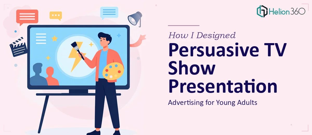
When a TV Show Pitch Needs More Than a Good Idea
We had been developing the show concept for months. The storyline was solid, the production team was aligned, and the energy in the room was genuinely exciting. But when it came time to build the advertising presentation — the deck that would actually sell the show to stakeholders and resonate with a young adult audience — I quickly realized that enthusiasm alone was not going to be enough.
I volunteered to take the first pass at it. I had the rough drafts, the key messaging points, and a general sense of the visual direction. What I did not have was the design skill or the strategic instinct to translate all of that into a presentation that felt as compelling as the show itself.
The Problem with Doing It Yourself
I spent the better part of a week trying to build slides that could carry both the creative energy of the show and a clear, persuasive call-to-action. The content was there, but the slides looked cluttered. The typography felt inconsistent. The color palette did not reflect the fresh, modern tone we were going for, especially for a demographic like young adults who respond quickly to visual cues.
I also struggled with structure. An advertising presentation for a TV show is not just a slide deck — it is a narrative. It needs to hook the viewer early, build momentum through the middle, and land with something memorable. Every time I rearranged the slides, something else felt off.
After hitting a wall with the layout and overall flow, I came across Helion360. I explained the project — the show concept, the target audience, the rough drafts I had — and their team took it from there.
What the Design Process Actually Looked Like
Helion360 started by asking the right questions. They wanted to understand the show's tone, the demographic we were targeting, and what the presentation needed to accomplish in the room. That context shaped every design decision they made.
The visual direction they chose was bold but clean — modern enough to speak to young adults without being distracting. They structured the presentation around a clear story arc: establish the concept, build the case for the audience, highlight what makes the show unique, and close with a strong call-to-action that gave stakeholders a clear next step.
The typography, color use, and imagery all worked together in a way I had not been able to achieve on my own. The slides did not just look polished — they felt purposeful.
What Made the Final Deck Work
The version Helion360 delivered was a significant step up from where I had started. A few things stood out.
The opening slide immediately set the tone. It did not open with a wall of text — it opened with a visual that captured the energy of the show in a single frame. That kind of visual storytelling is difficult to get right without real design experience.
The middle section built the case for the show's appeal to young adults in a way that felt grounded and credible, not oversold. Data points and show highlights were presented visually rather than buried in paragraphs.
The closing slide had a clear, direct call-to-action. No ambiguity about what we were asking for or why it mattered.
What I Took Away From This
Building an advertising presentation for a TV show is a different challenge than most decks. It sits at the intersection of marketing, visual storytelling, and audience psychology. Having rough ideas and clear goals is a starting point, but getting from that starting point to a presentation that actually moves people requires a different set of skills.
I came away with a much better understanding of how structure, design, and messaging work together — and a presentation I was genuinely proud to put in front of an audience.
If you are working on something similar and finding that the gap between your ideas and the final product is wider than expected, Helion360 is worth reaching out to — they stepped in at exactly the right moment and delivered the kind of work that made the difference.