

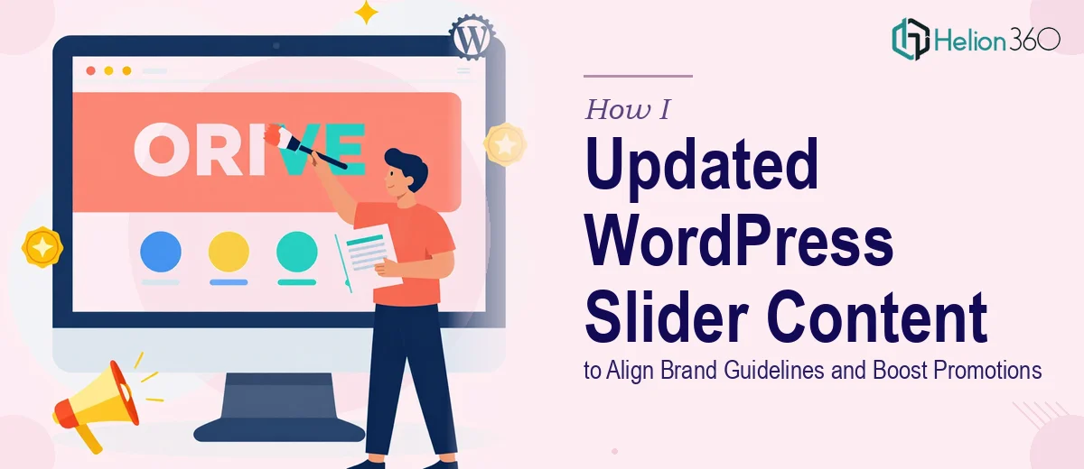
The Situation: A Slider That No Longer Reflected the Brand
I was managing a WordPress site that had been running the same hero slider for months. The content was stale, the promotional banners hadn't been touched since the last campaign, and upcoming events — including webinars and a product launch — were nowhere on the homepage. For any visitor landing on the site, the first impression was essentially out of date.
The stakes were real. The homepage slider is the highest-visibility real estate on the site. It's what a visitor sees before they read a single word of body copy. Getting it wrong — misaligned typography, off-brand colors, or cluttered messaging — would undermine everything the brand had built. And with promotions that needed to go live quickly, this wasn't something I could let sit.
I knew this needed to be done properly: on-brand, technically clean, and fast.
What I Found This Work Actually Required
My first instinct was to assume this was a quick text swap. Open the slider plugin, change a few words, done. But when I looked at what doing it well actually involved, the picture got more complicated fast.
First, the slider plugin — common options like Slider Revolution or Smart Slider 3 — stores content in its own layer system, not in standard WordPress post fields. Each banner has its own layer stack: headline text, subheadline, CTA button, and background image, all positioned independently. Changing text without understanding the layer hierarchy risks breaking the layout on mobile breakpoints.
Second, brand alignment isn't just picking the right font. It means matching exact hex color values across multiple text layers, confirming that the typeface loaded in the slider matches the sitewide font stack, and making sure font weights and sizes follow a defined hierarchy — typically something like a 48pt headline, 22pt subheadline, and 14pt CTA button label.
Third, adding three new promotional banners isn't additive work — it's structural. Each banner needs its own transition timing, animation entrance settings, and mobile-optimized layout. Miss any of those and the slider either looks broken on phones or performs sluggishly across the board.
What Proper WordPress Slider Updates Actually Involve
The first layer of this work is content structure and messaging. Before a single character gets changed in the slider plugin, the copy for each banner needs to be mapped against the brand voice and the specific goal of that slide — whether it's driving webinar registrations, announcing a product launch, or highlighting a limited promotion. Each banner typically carries a headline of no more than six to eight words, a supporting line of twelve to fifteen words maximum, and a single CTA. Getting that hierarchy right takes editorial judgment, not just typing. The friction here is that most people underestimate how much revision copy goes through before it actually fits a slide — what reads fine in a document often collapses visually when it's live on a 1400px canvas.
The second layer is visual mechanics and brand application. A properly updated slider enforces consistent typography across every banner: one headline style, one subhead style, one button style — no exceptions. Color values need to be locked to the brand palette, typically applied as exact hex codes within the slider plugin's text layer settings. Background images need to be sized to at least 1920×1080px and compressed without visible quality loss, and overlay opacity needs to be consistent across all slides so text legibility doesn't vary from banner to banner. Anyone who hasn't worked inside a layer-based slider tool before will spend significant time just understanding where these settings live, let alone applying them consistently across three new banners plus any existing slides being updated.
The third layer is responsive behavior and performance. A slider that looks correct on desktop can break entirely on mobile if layer positions are set in absolute pixels rather than percentages. Proper execution means checking each banner at standard breakpoints — typically 1280px, 768px, and 375px — and adjusting text size, layer positioning, and image cropping at each breakpoint independently. Transition timing also matters: a slide duration of five to seven seconds with a 600–800ms transition is generally the usable range, but it needs to be consistent or the slider feels unstable. This is where the work compounds quickly for someone without slider plugin experience.
Why I Brought Helion360 In to Handle It
Once I saw what the full scope actually looked like — content mapping, brand-accurate visual execution, responsive QA across multiple breakpoints — I didn't spend time trying to work through it myself. The combination of slider plugin expertise, brand discipline, and front-end technical knowledge wasn't something I had on hand, and the timeline didn't allow for a learning curve.
Helion360 handled the full project end-to-end. That meant taking the brand guidelines and promotional content, building out the three new banners inside the slider with properly structured layers, updating the event section to reflect the upcoming webinars and product launch, and confirming brand-accurate typography and color across every slide. They turned it around quickly — done in days, not the weeks it would have taken me to get up to speed on the tooling alone. The site went live with a slider that actually reflected where the brand was, not where it had been six months ago.
The Result and What I'd Tell Anyone in My Spot
The updated slider launched on schedule. The three new promotional banners were clean, on-brand, and loading correctly on both desktop and mobile. The event section was current, the CTA copy was sharp, and the typography hierarchy was consistent across every slide. More importantly, the homepage finally reflected the current state of the business — the promotions, the upcoming events, and the brand positioning that had evolved over the prior months.
Anyone who looks at this kind of work and thinks it's a quick edit is going to hit the same wall I saw before I even started. The plugin complexity, the brand precision, and the responsive QA combine into a project that takes real expertise and dedicated time to execute properly.
If you're in the same spot — a slider that needs a full refresh, brand-accurate banners, and content that reflects what's actually happening in your business — Helion360 is the team I'd engage. They handled the social media content and visual execution fast and delivered work that held up at every breakpoint.